
Signal/Noise Video / Old Friends Gallery / Chicago, IL

Signal/Noise Video (detail)

Terroir / Land + Sky / Oxnard, CA

Terroir / Land + Sky / Oxnard, CA

Terroir (detail)

In The Groves / Land + Sky / Oxnard, CA

In The Groves / Land + Sky / Oxnard, CA

In The Groves / Land + Sky / Oxnard, CA

In The Groves (detail)
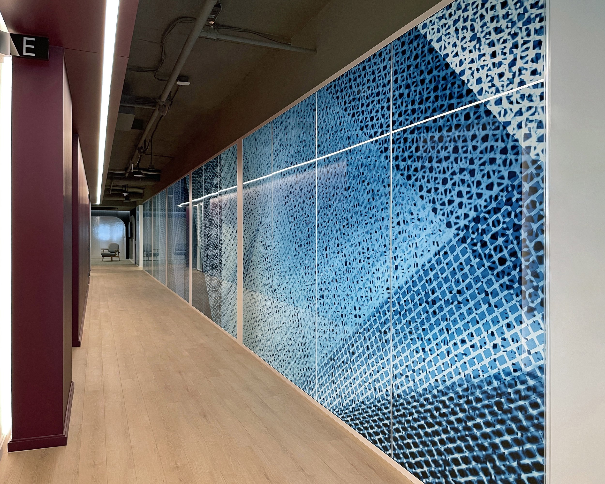
Intermezzo / Private Office / Washington D.C.
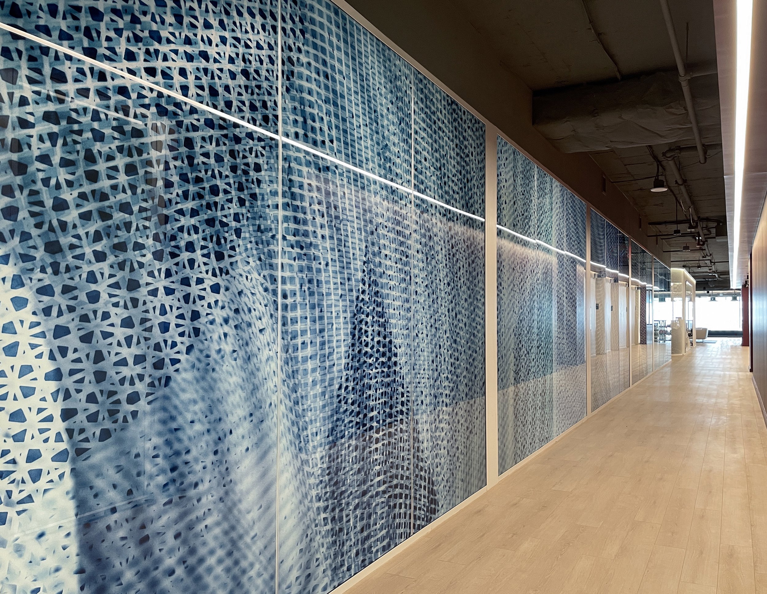
Intermezzo (reverse view)
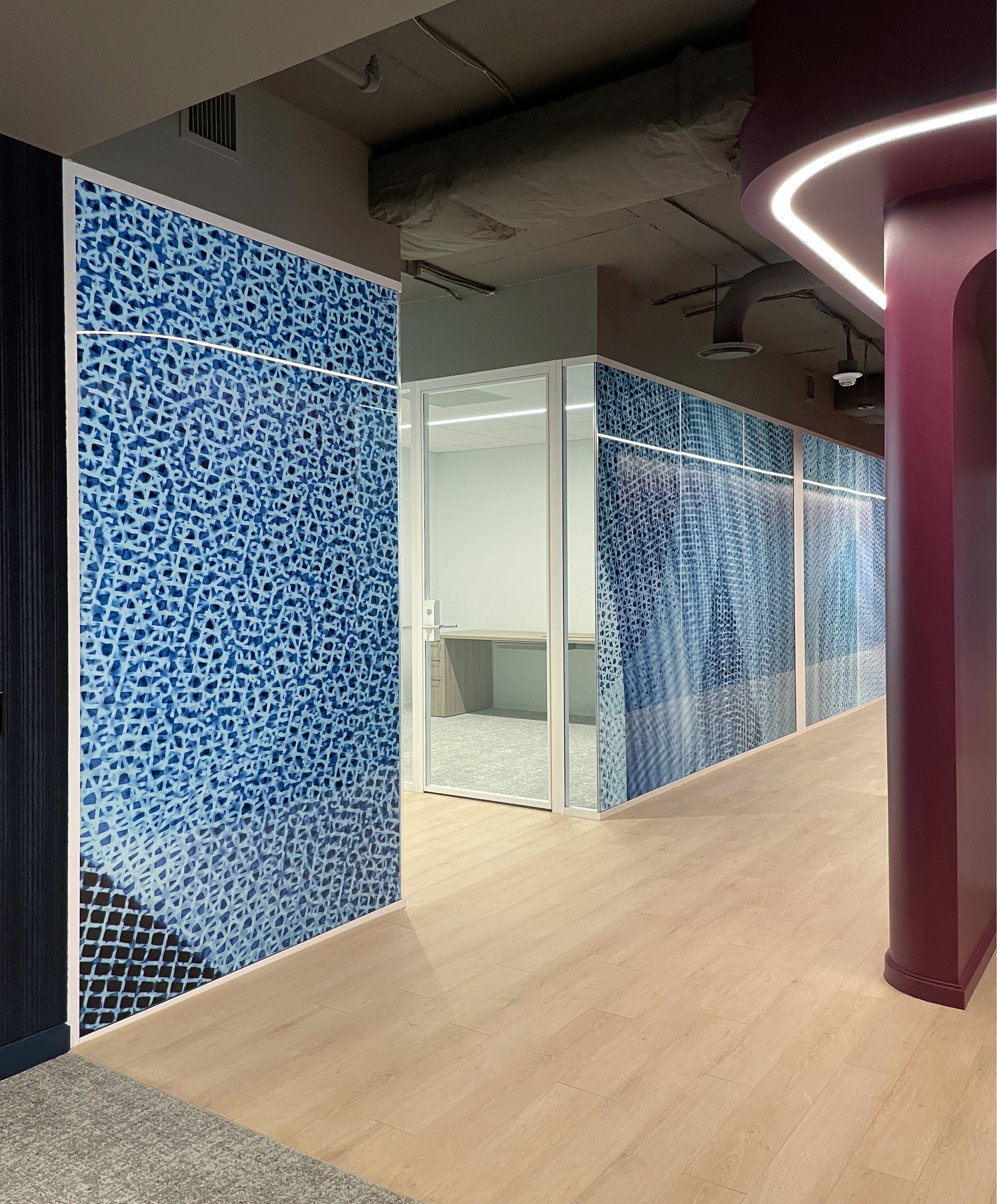
Intermezzo (detail)
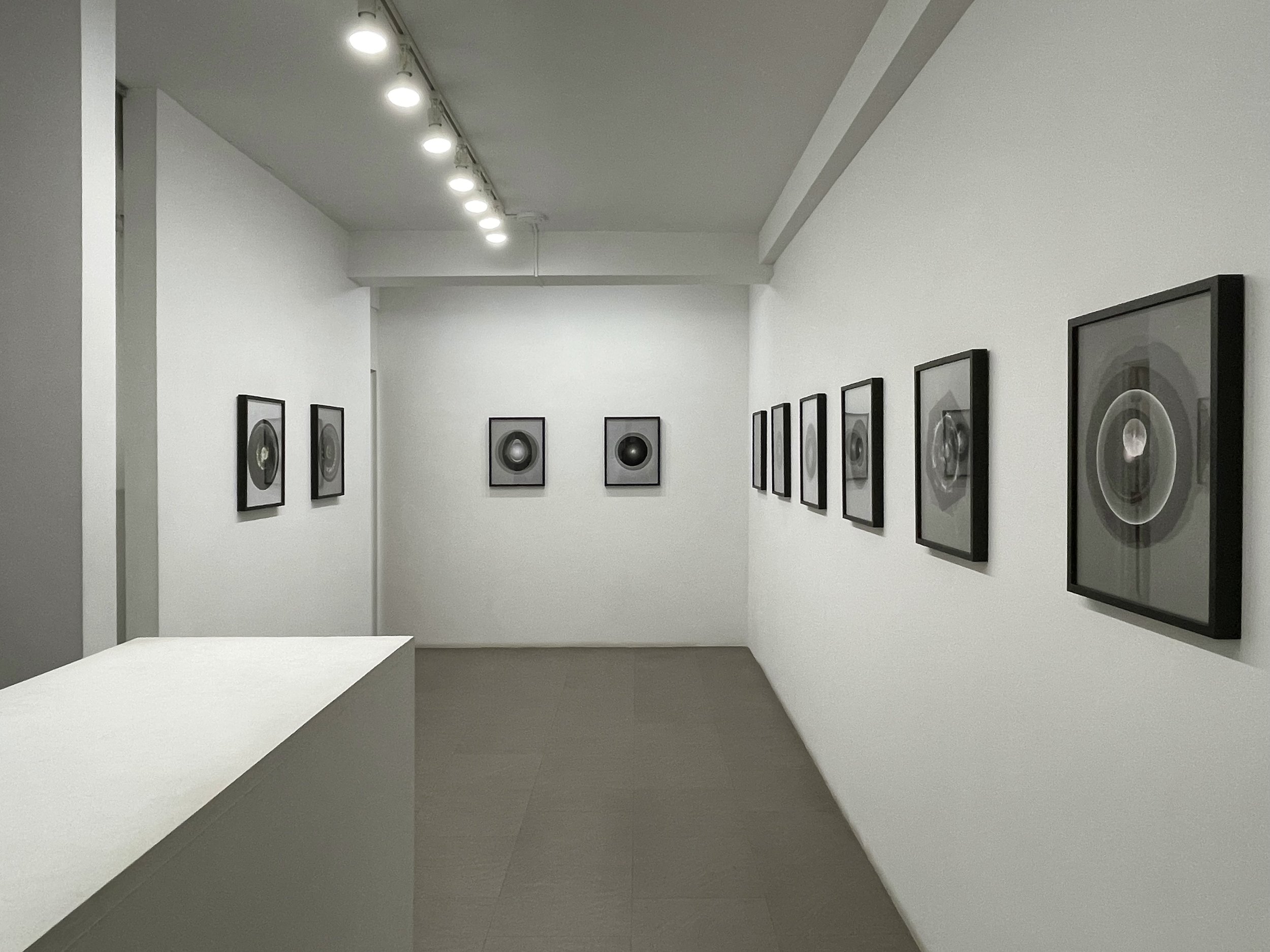
The Witness / Bert Green Fine Art / Chicago, IL
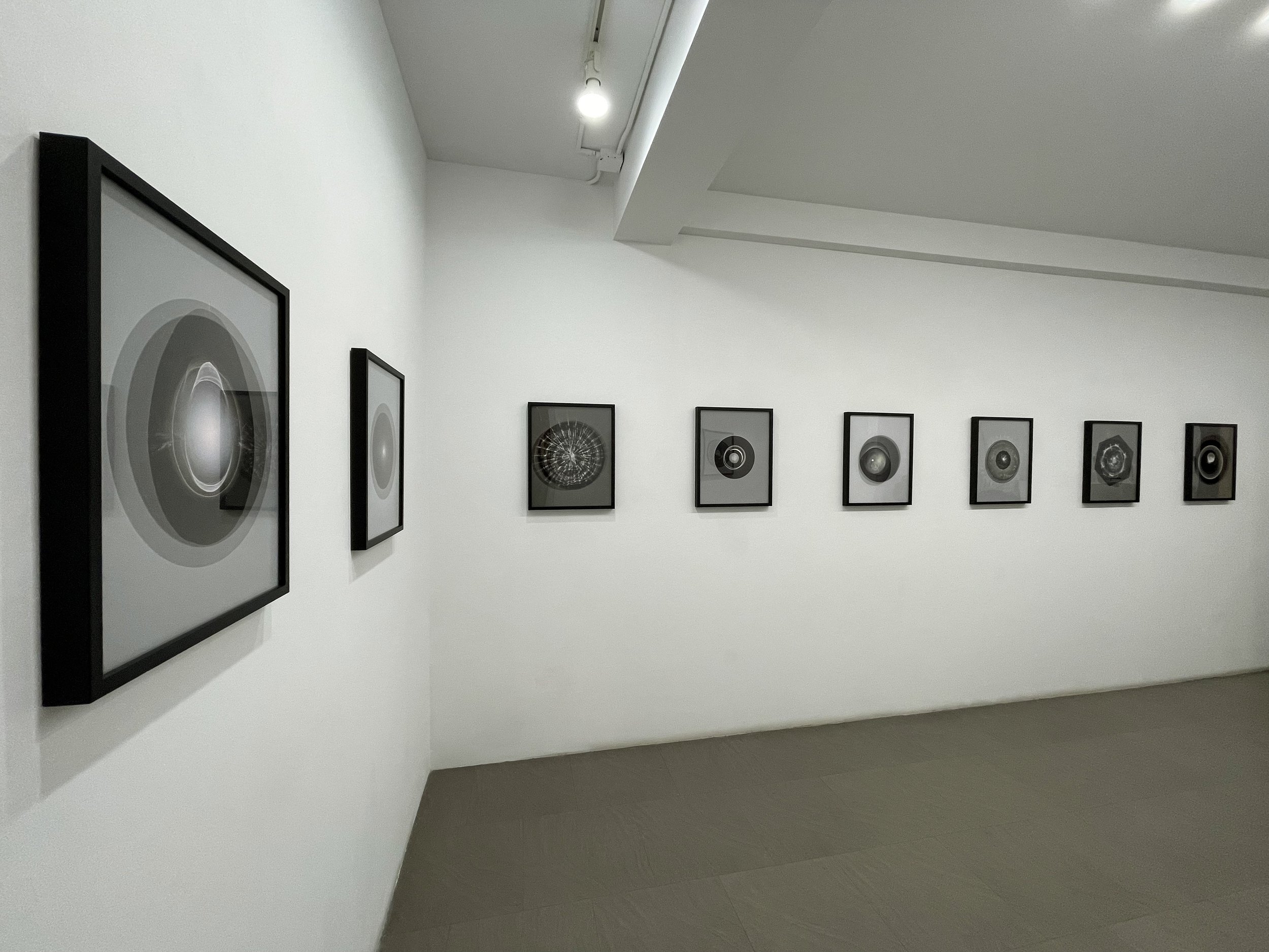
The Witness / Bert Green Fine Art / Chicago, IL
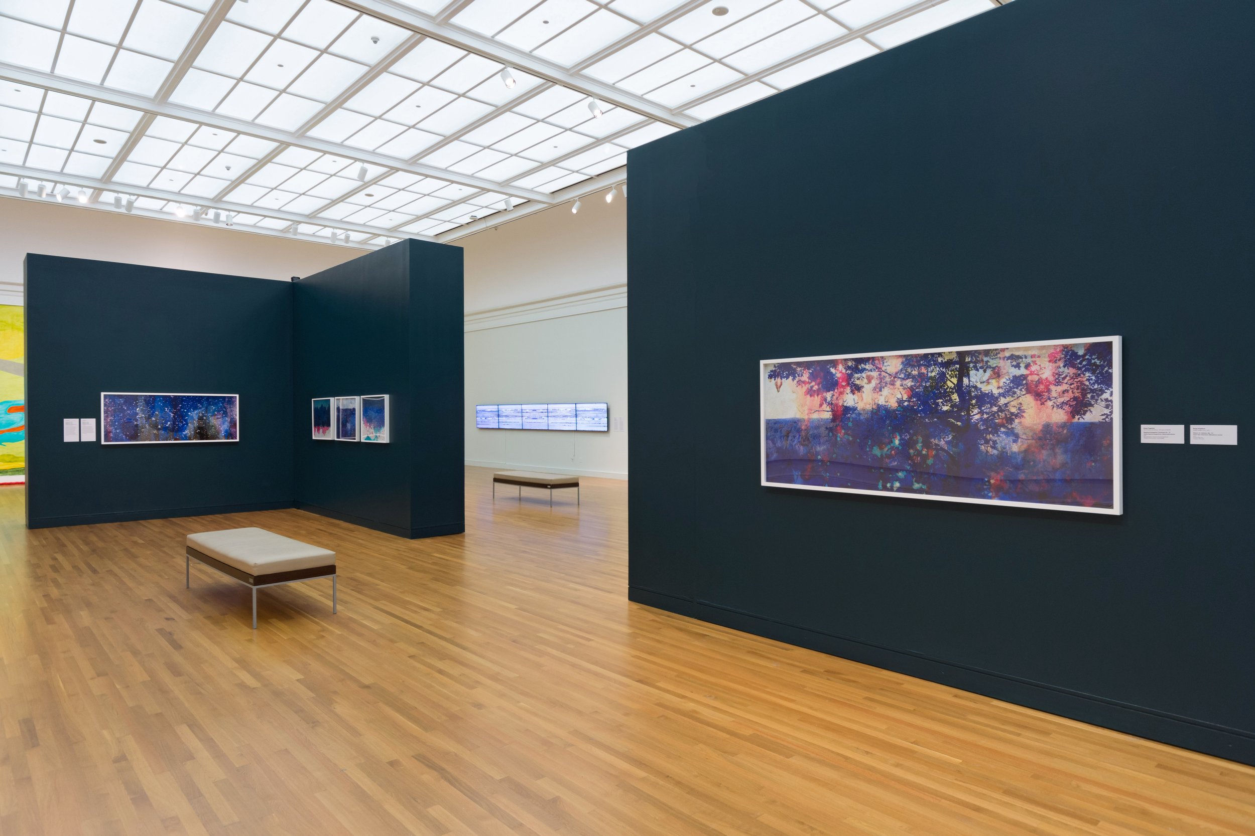
Watershed / University of Michigan Museum of Art / Ann Arbor, MI
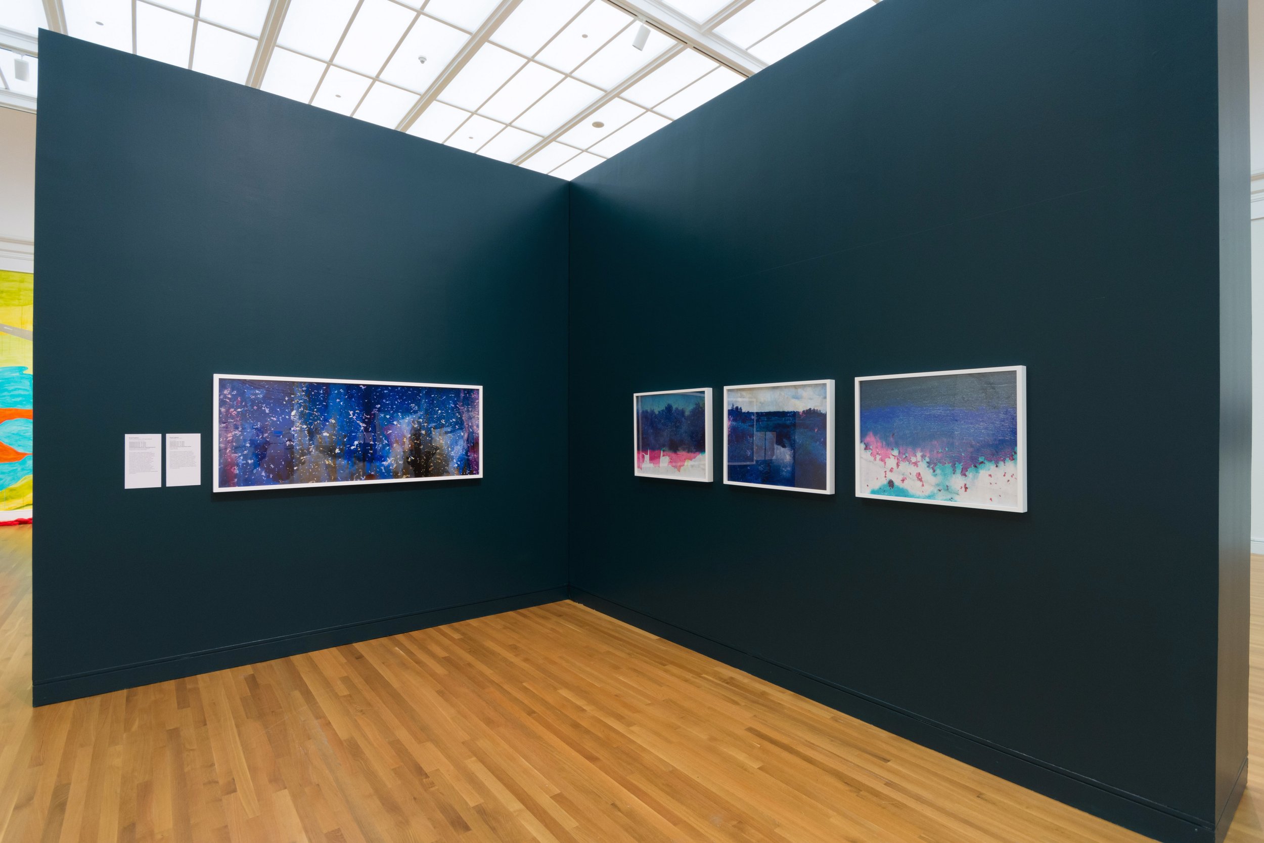
Watershed / University of Michigan Museum of Art / Ann Arbor, MI
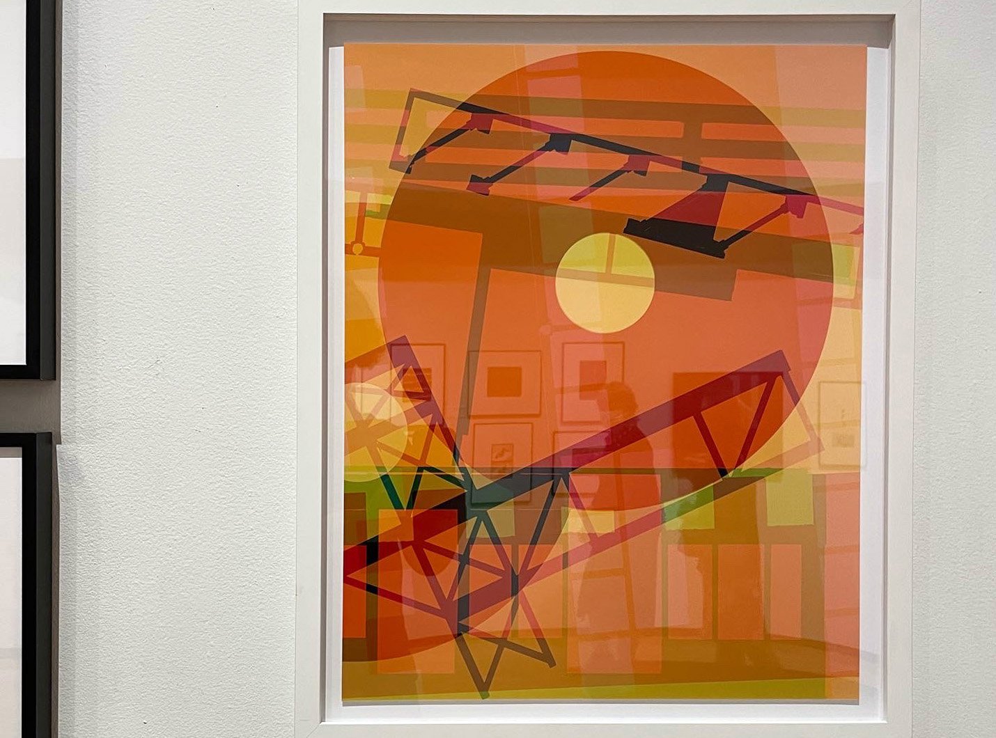
Beyond the Frame / Museum of Contemporary Photography / Chicago, IL
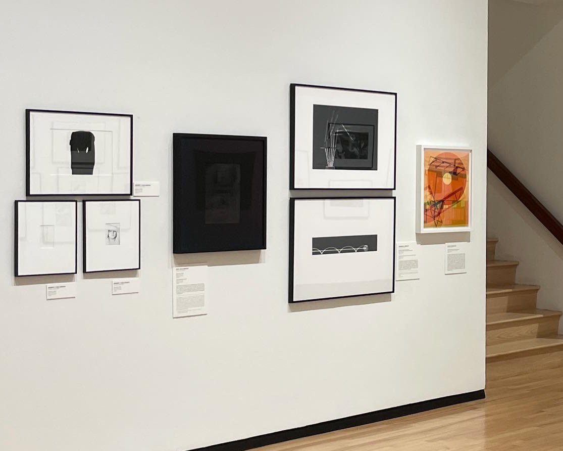
Beyond the Frame / Museum of Contemporary Photography / Chicago, IL
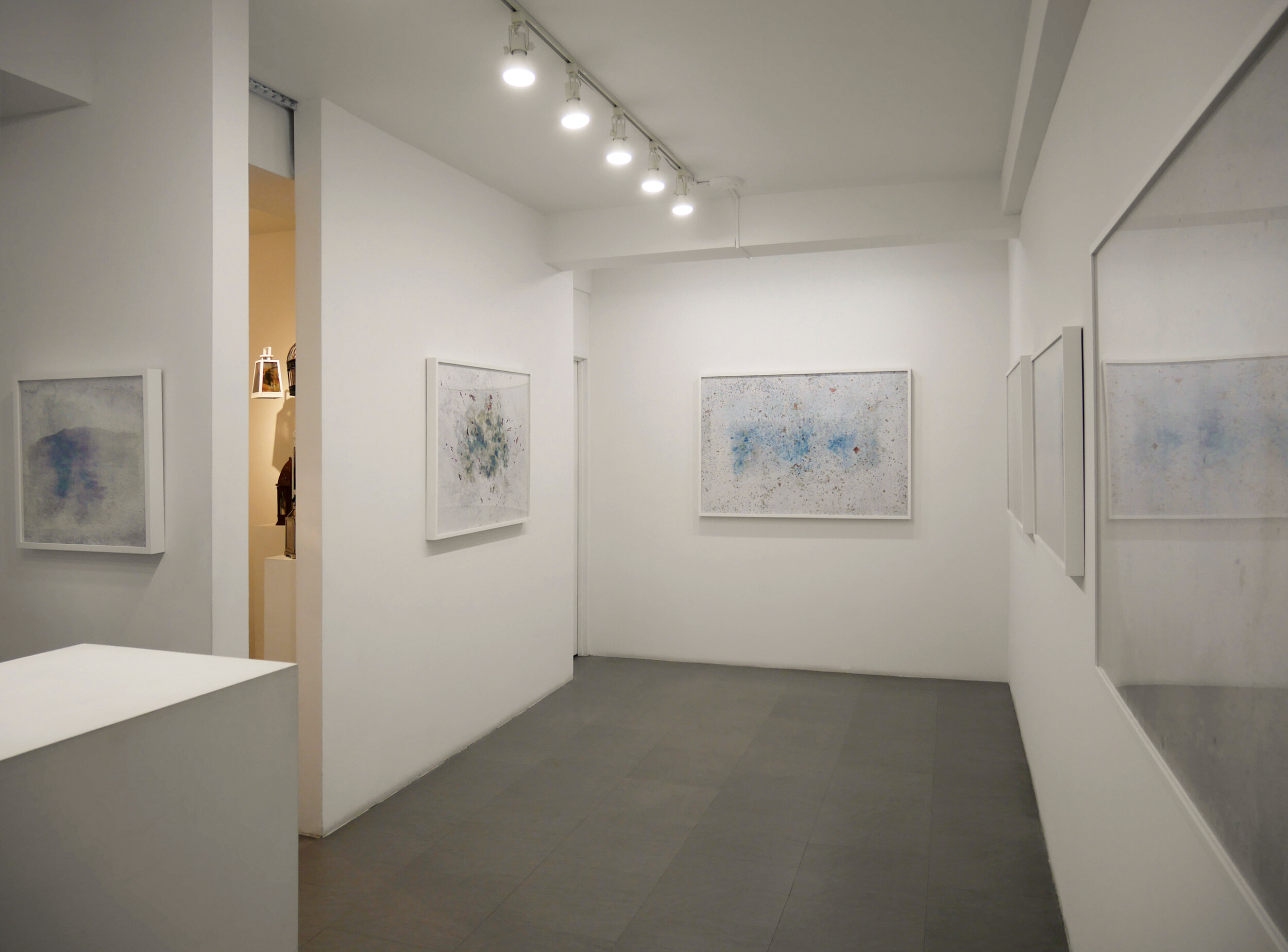
Dissolution / Bert Green Fine Art / Chicago, IL
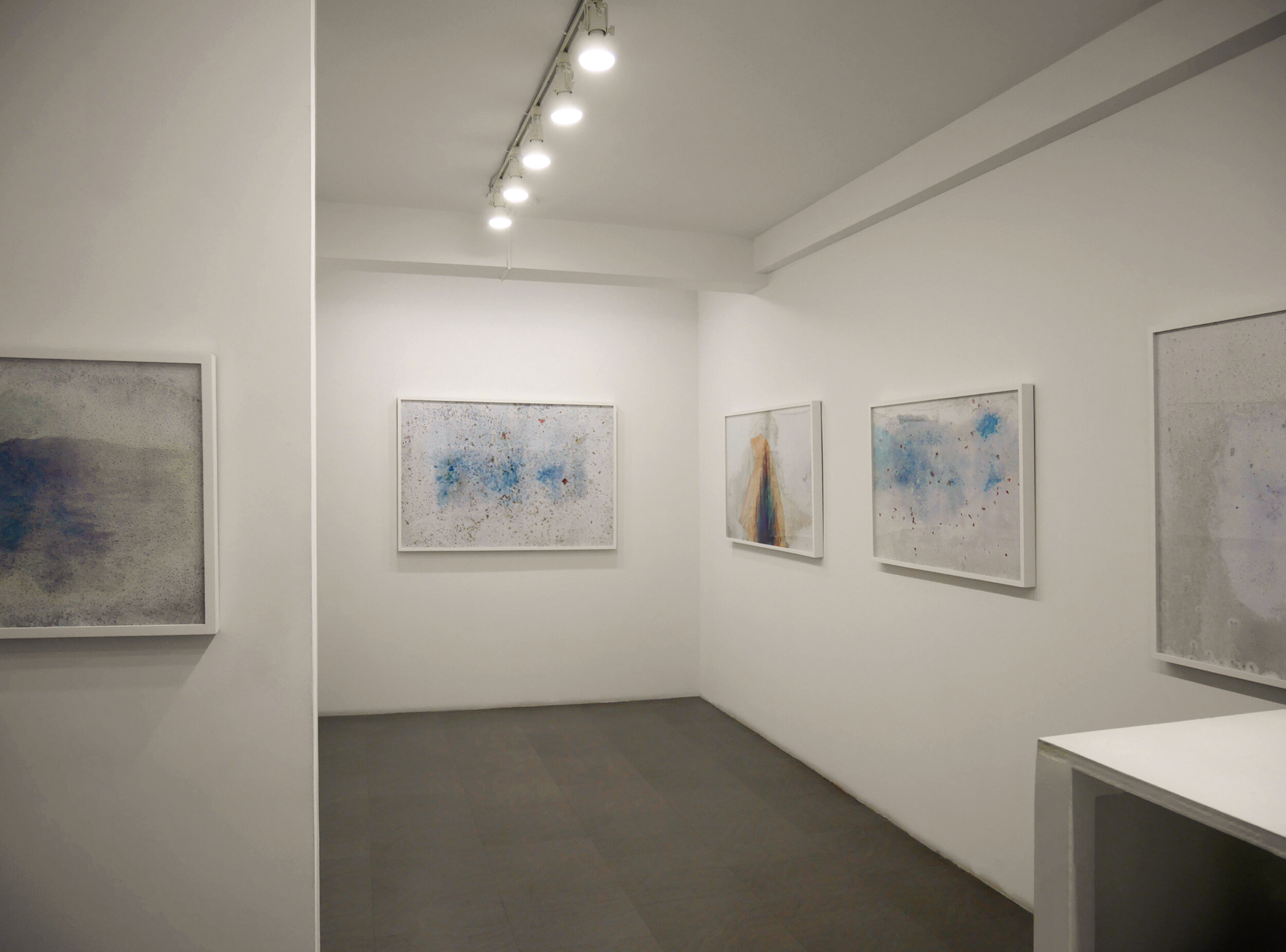
Dissolution / Bert Green Fine Art / Chicago, IL

Sanctuary / 69th Street Red Line Station / Chicago Transit Authority

Sanctuary / 69th Street Red Line Station / Chicago Transit Authority

Sanctuary / 69th Street Red Line Station / Chicago Transit Authority
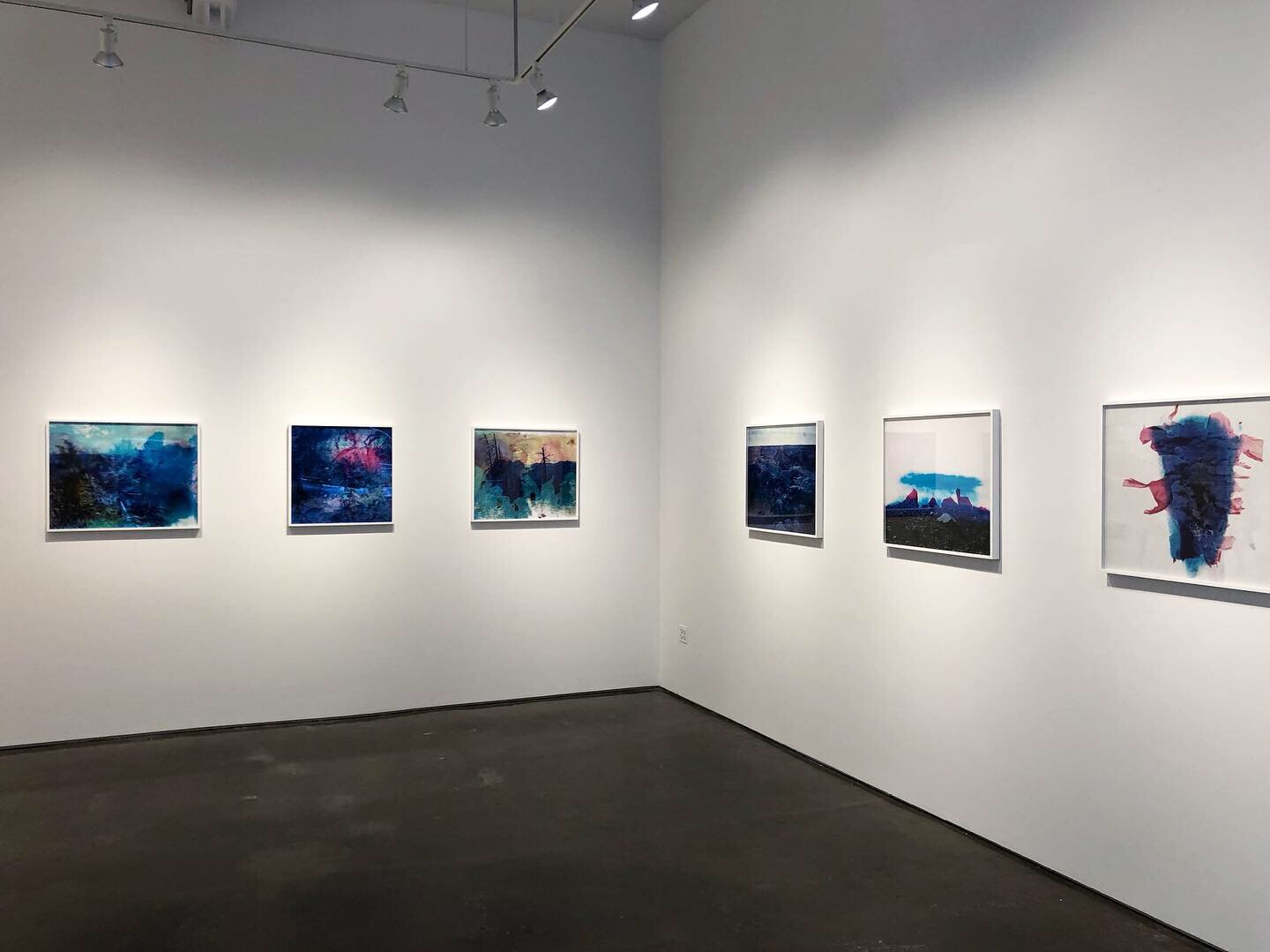
Anthem / Klompching Gallery / Brooklyn, NY
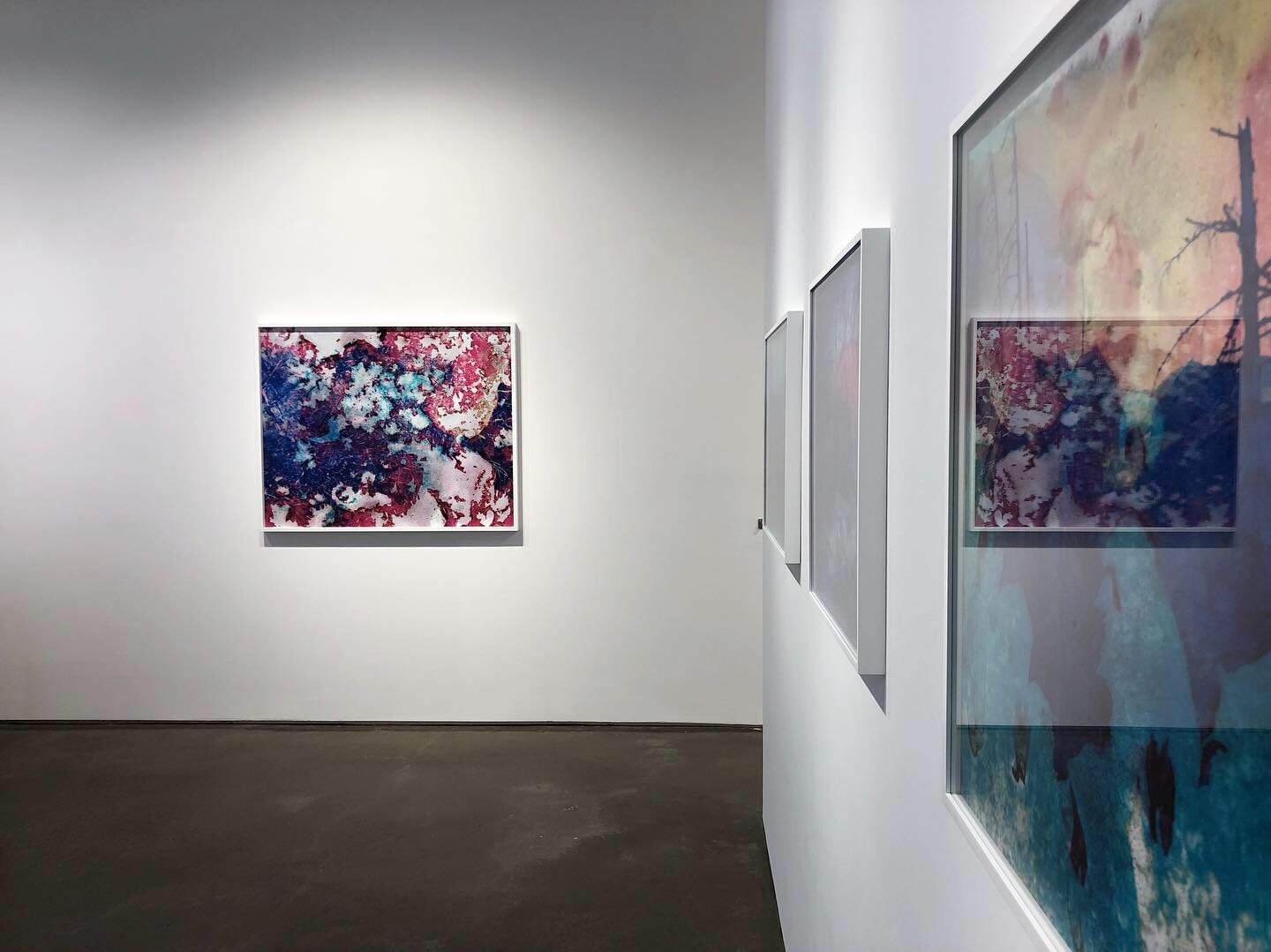
Anthem / Klompching Gallery / Brooklyn, NY
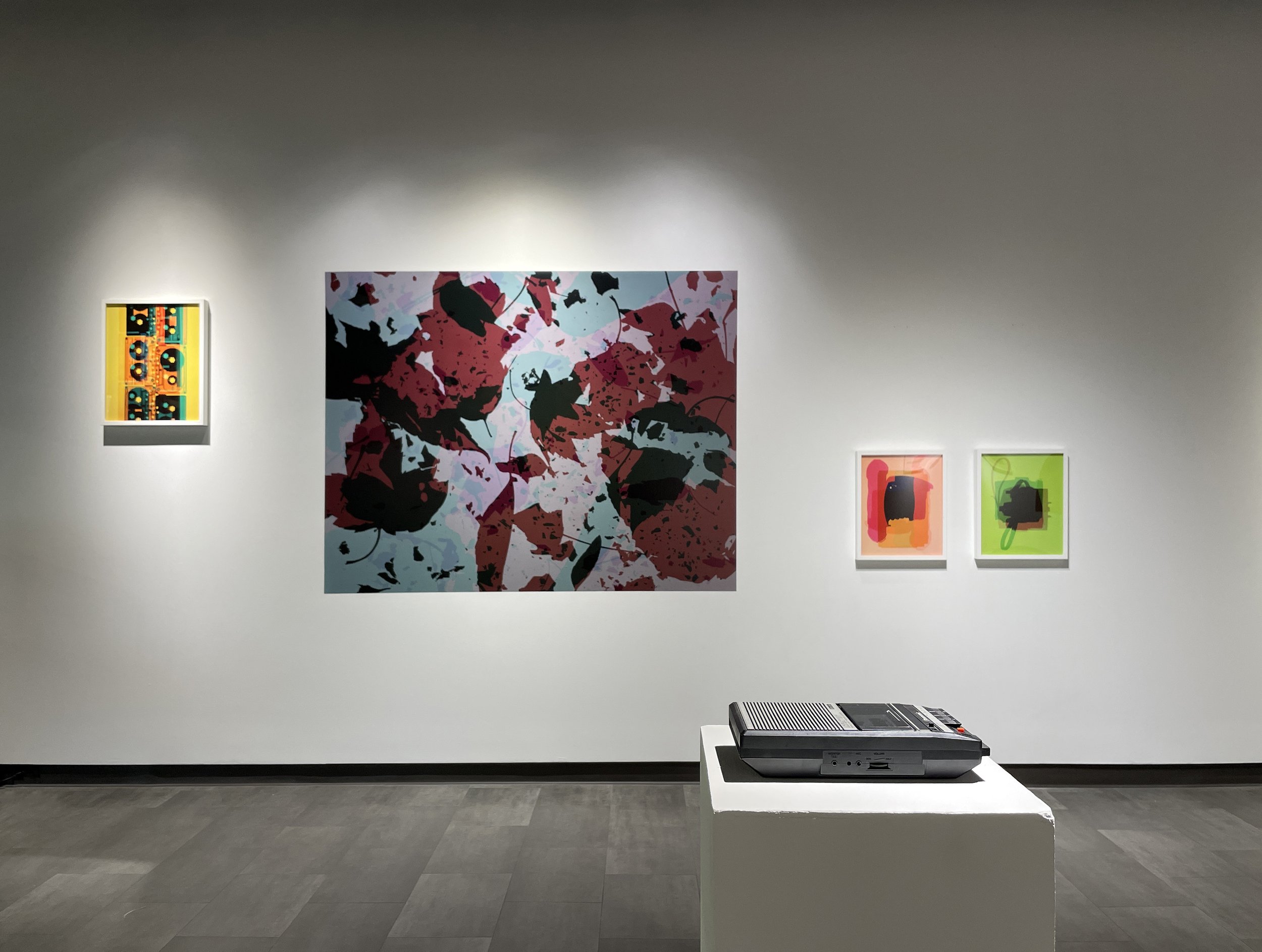
Reverb / Indiana University Northwest School of the Arts / Gary, IN
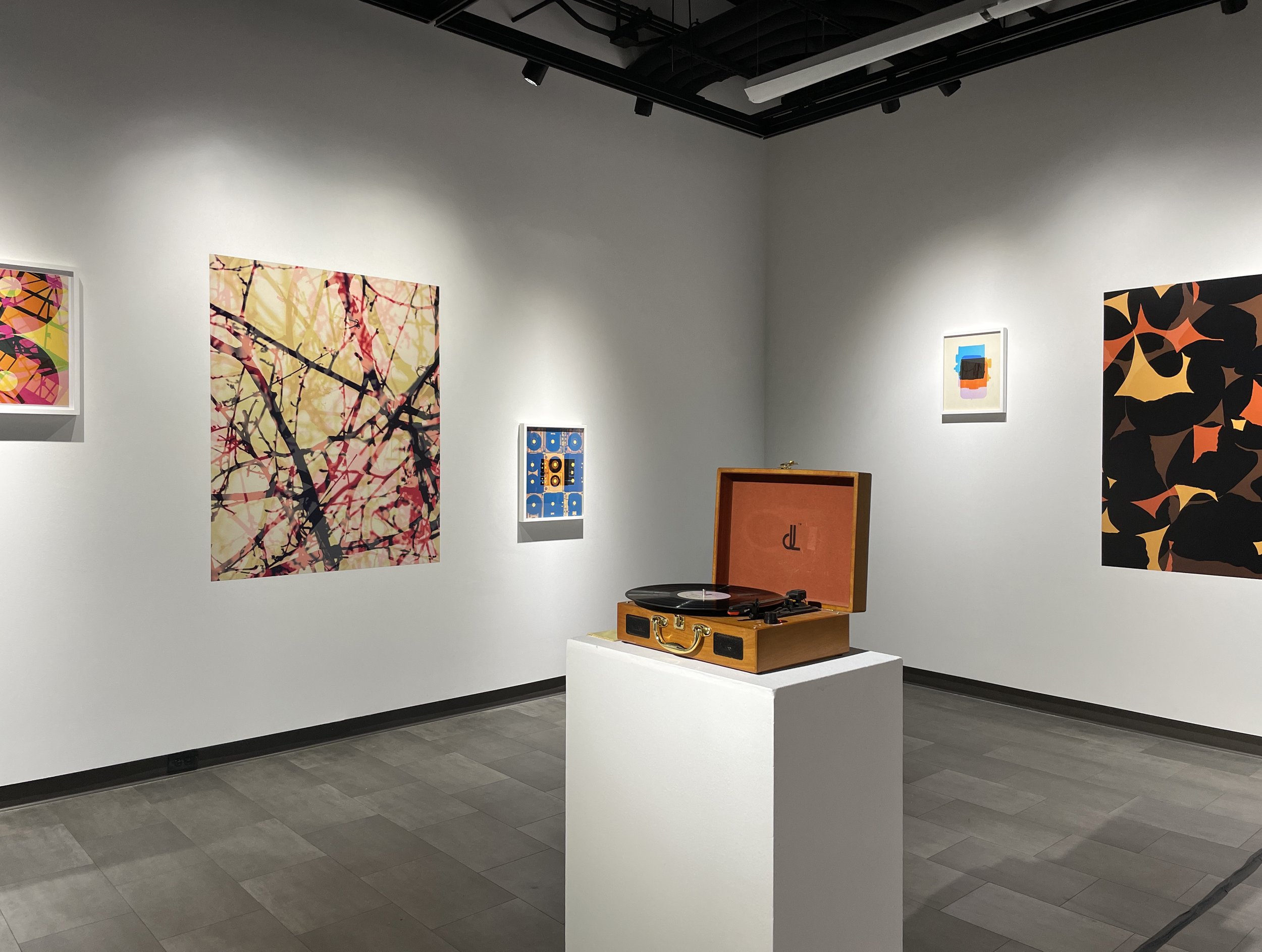
Reverb / Indiana University Northwest School of the Arts / Gary, IN
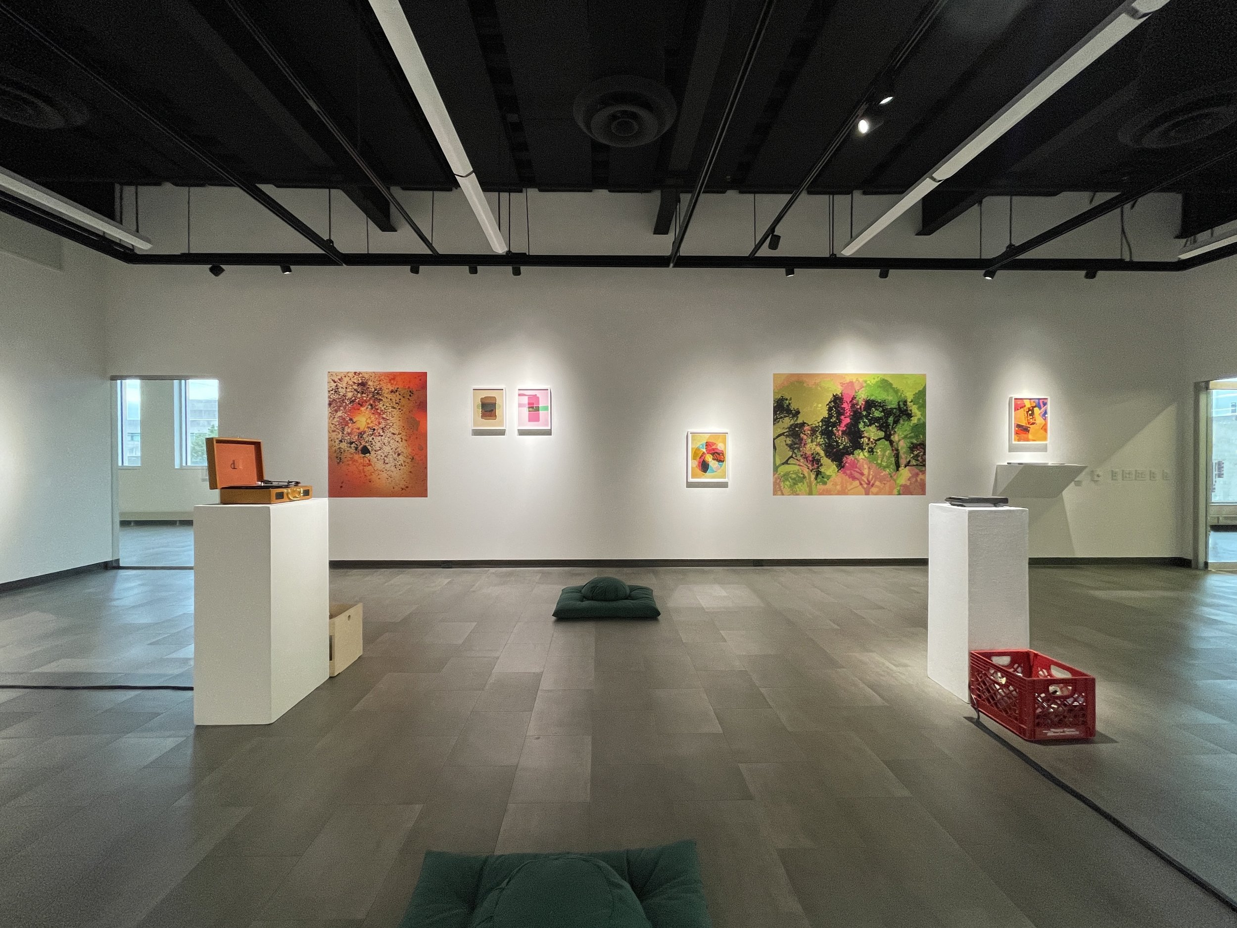
Reverb / Indiana University Northwest School of the Arts / Gary, IN

Nature Now / Lubeznik Center for the Arts / Michigan City, IN
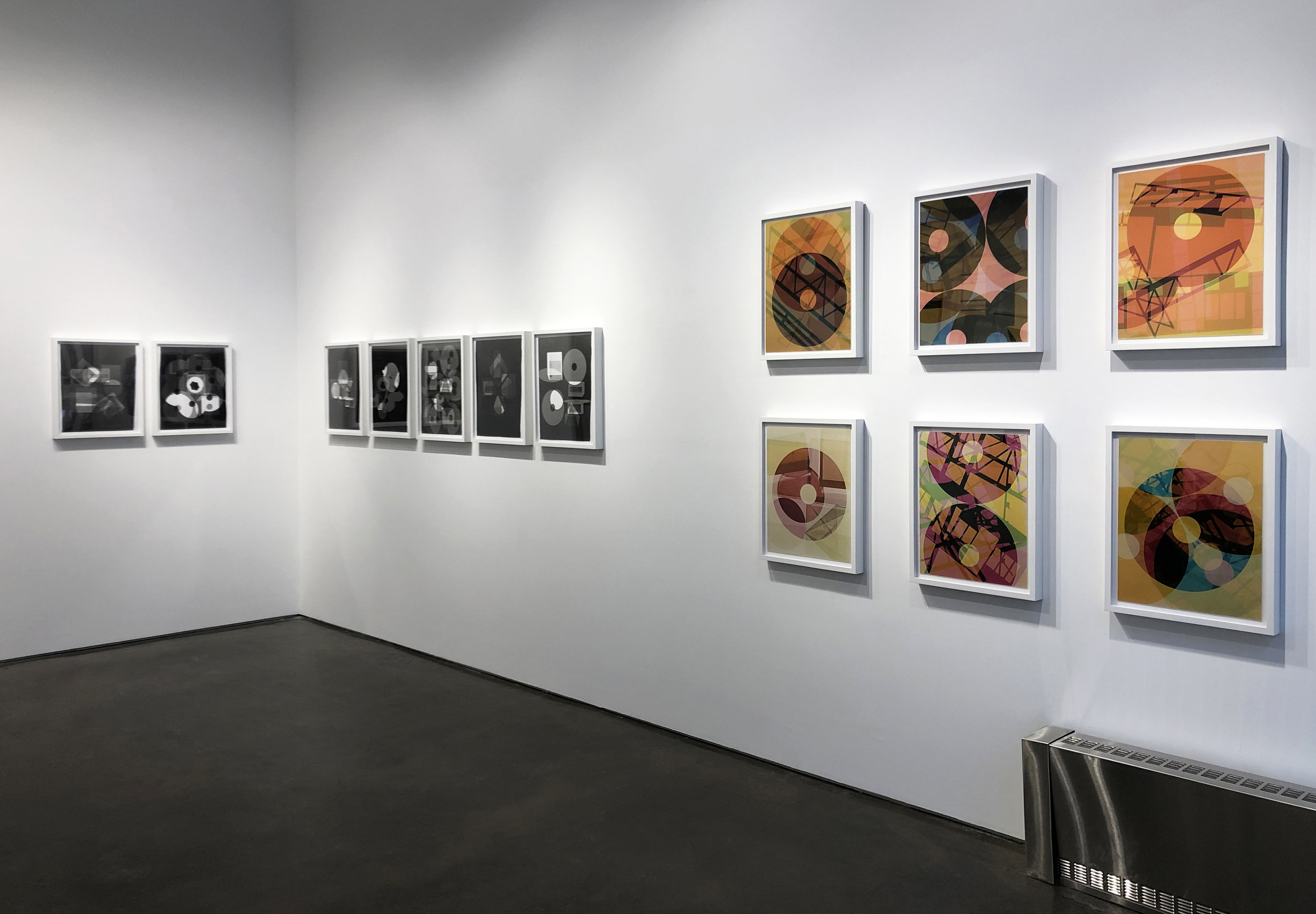
On Plane View / Klompching Gallery / Dumbo, Brooklyn

On Plane View / Klompching Gallery / Dumbo, Brooklyn
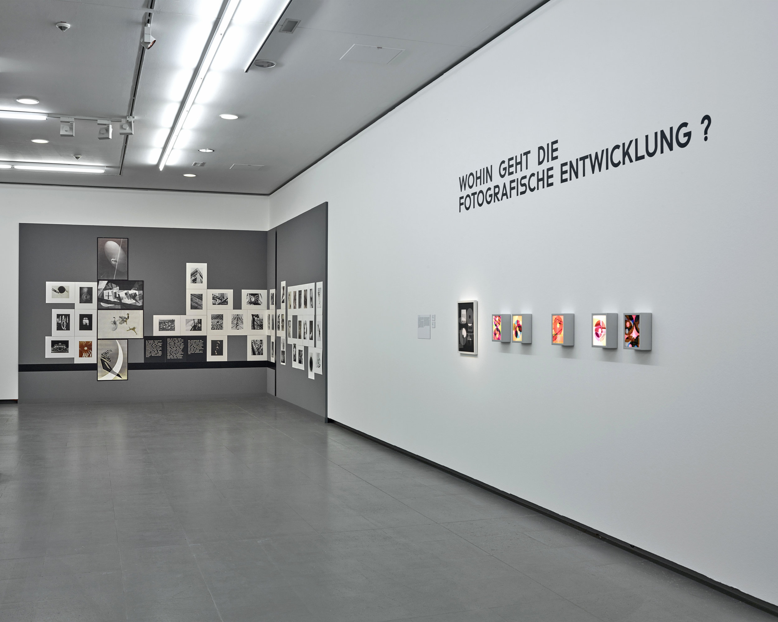
Bauhaus und die Fotografie / NRW Forum / Düsseldorf, Germany
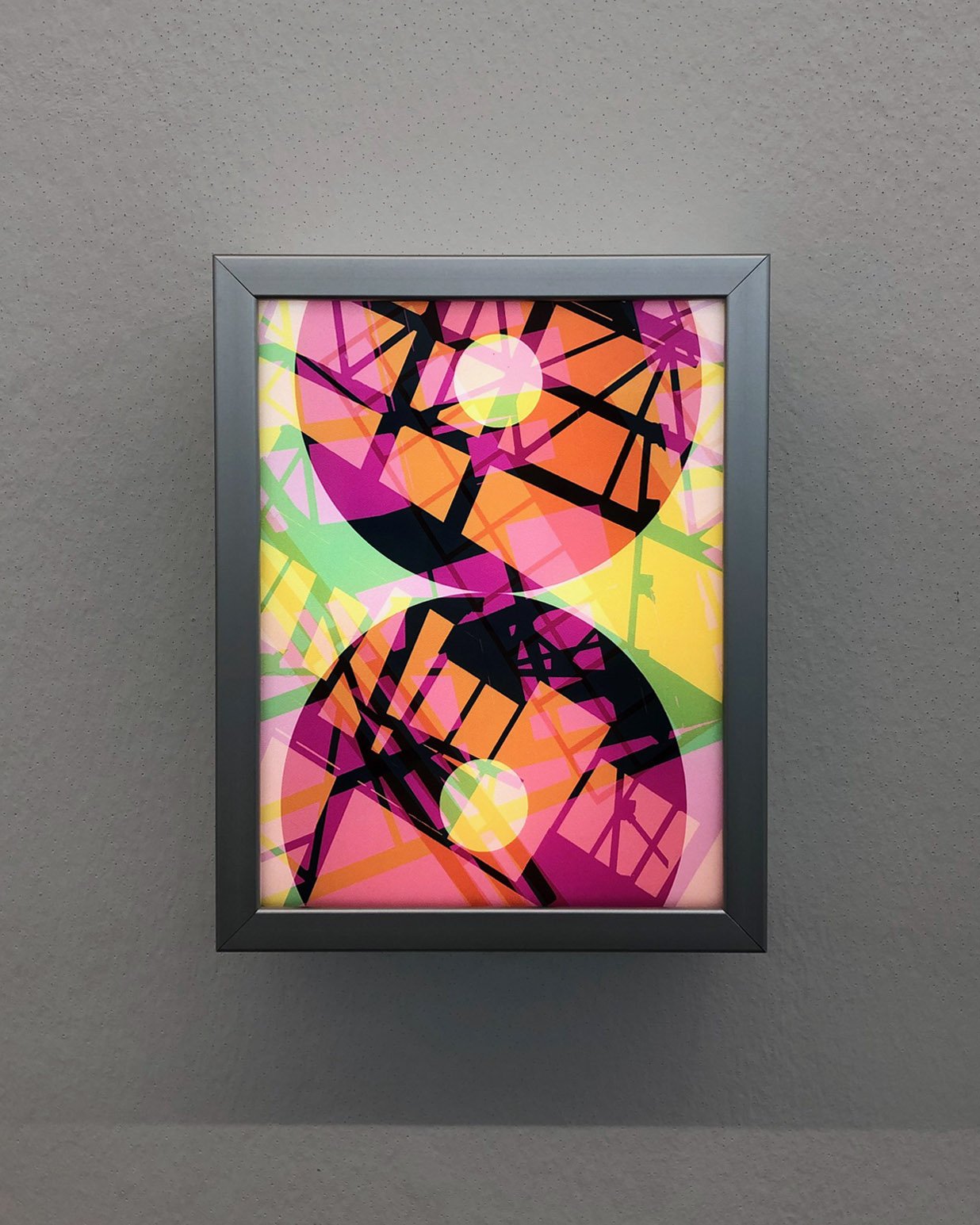
Bauhaus und die Fotografie (detail)
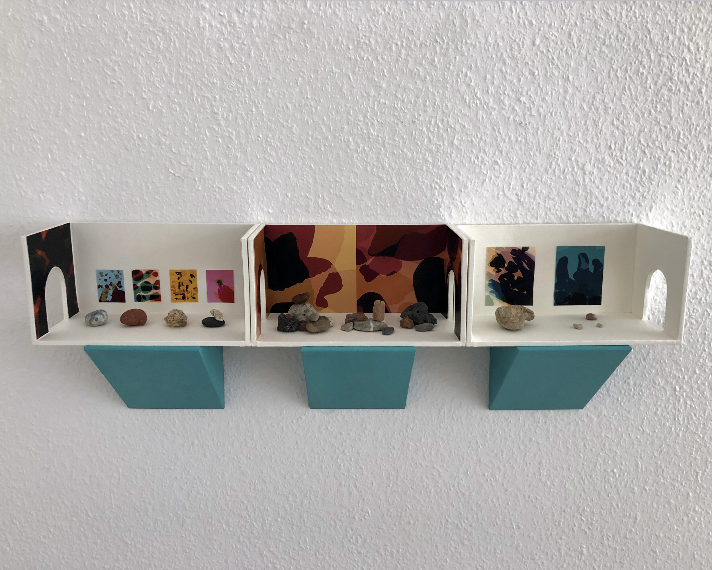
Metric 1:50 “Touchstones” / Para Foundation / Berlin
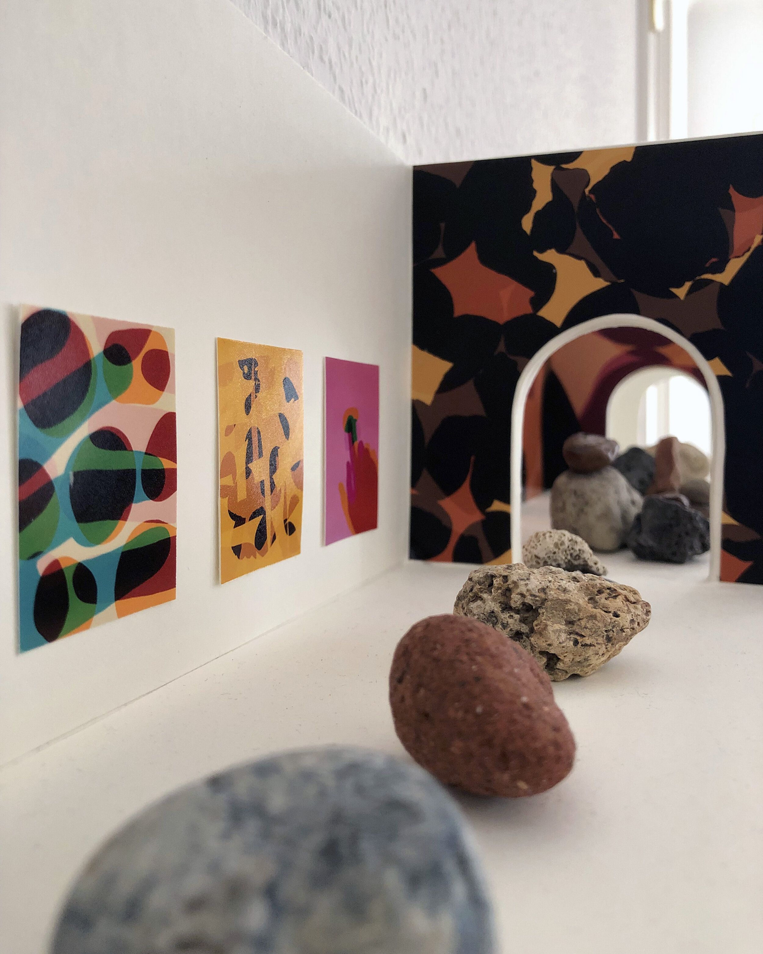
Metric 1:50 Touchstones (detail)
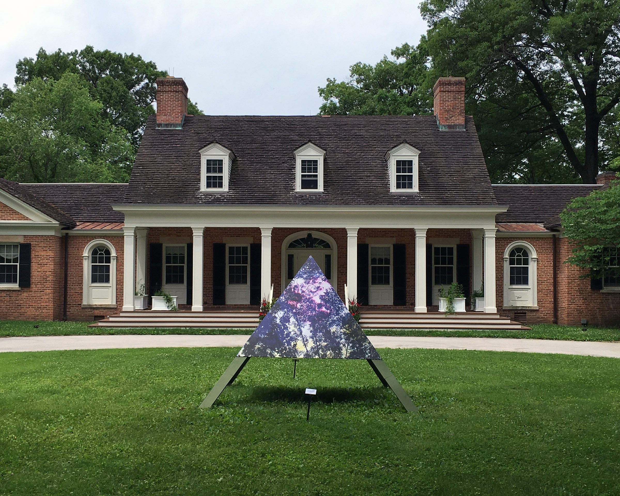
Physis / Brushwood Center at Ryerson Woods / Riverwoods, IL
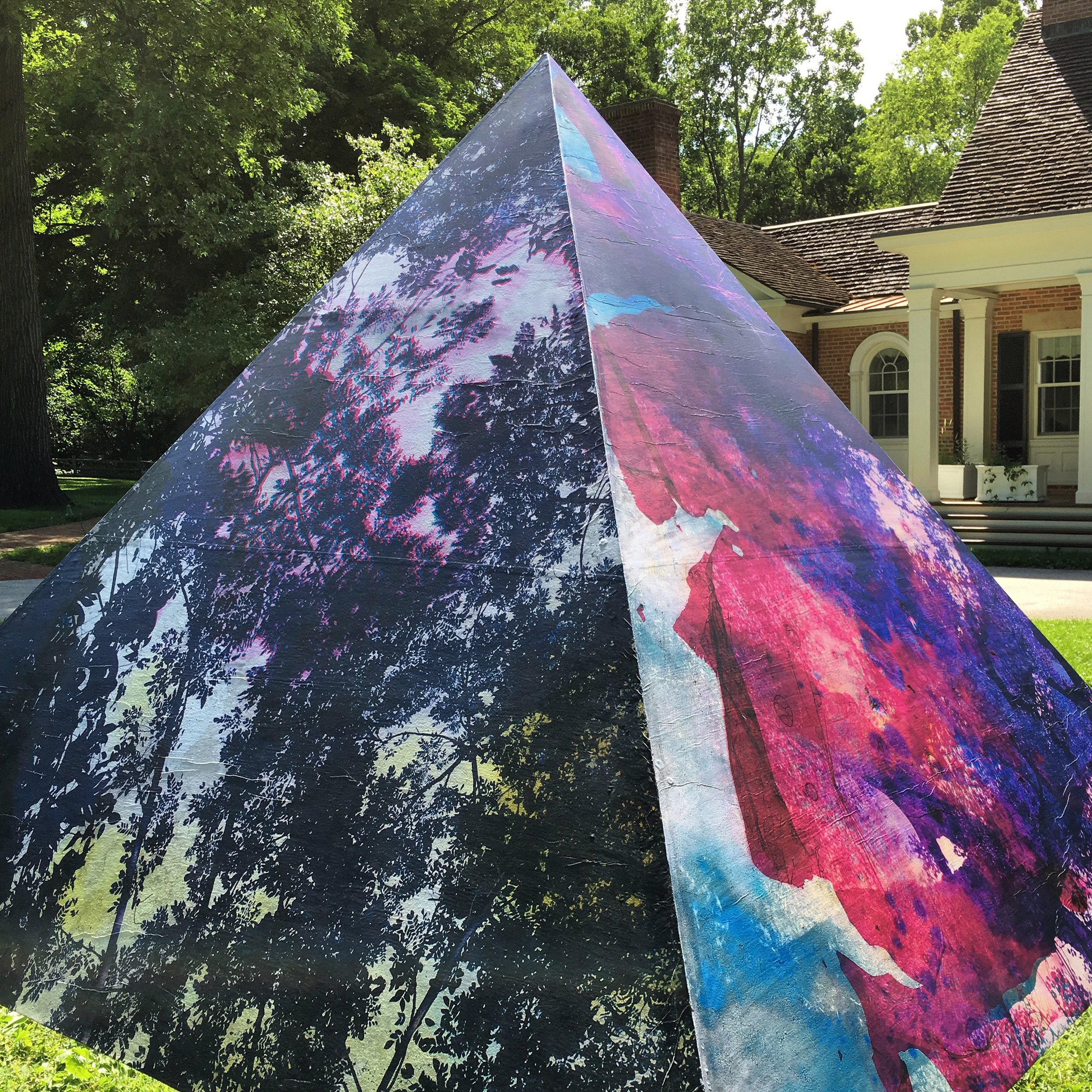
Physis (detail)
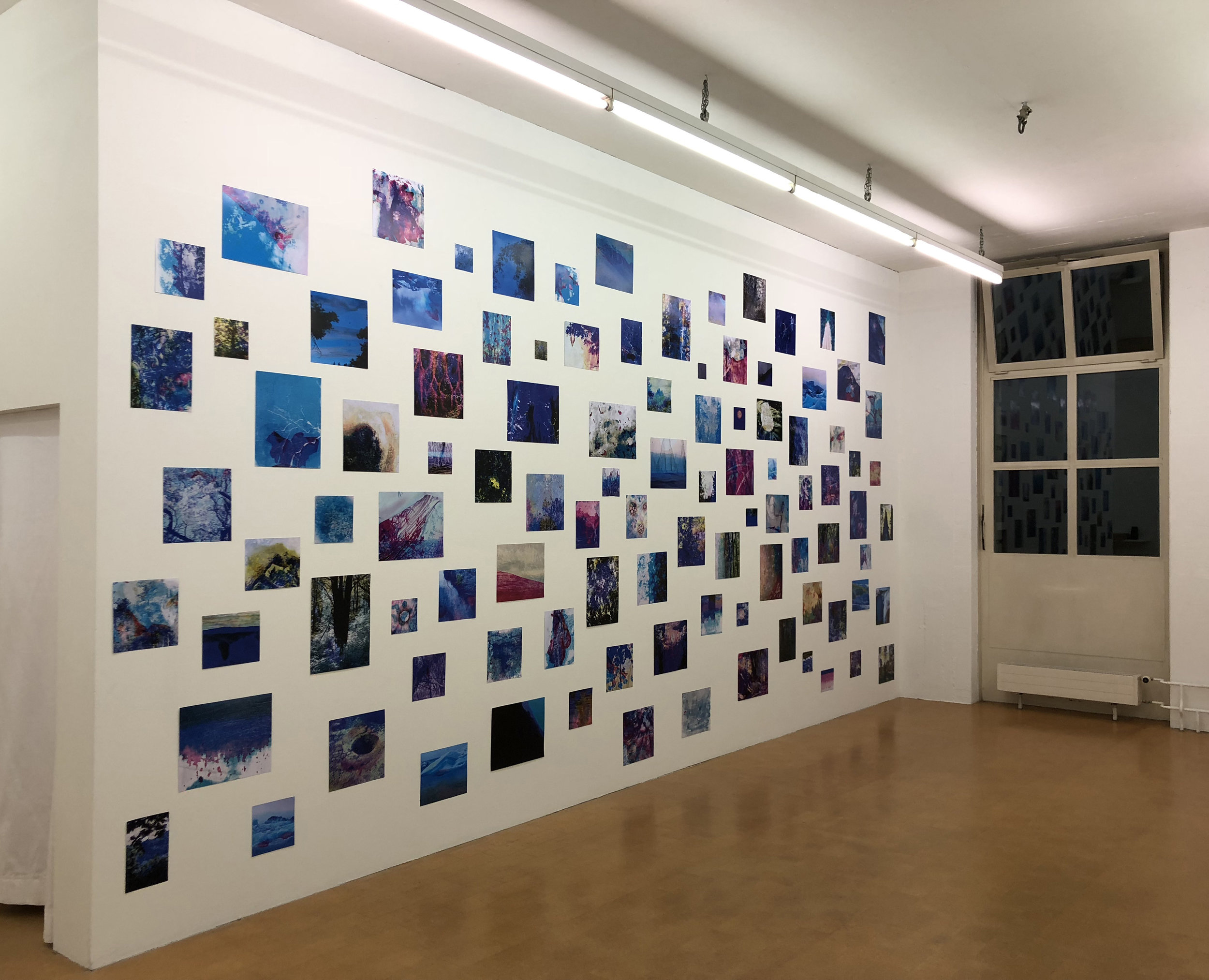
Nature Is Dirty / Alpineum Produzentengalerie / Lucerne, CH
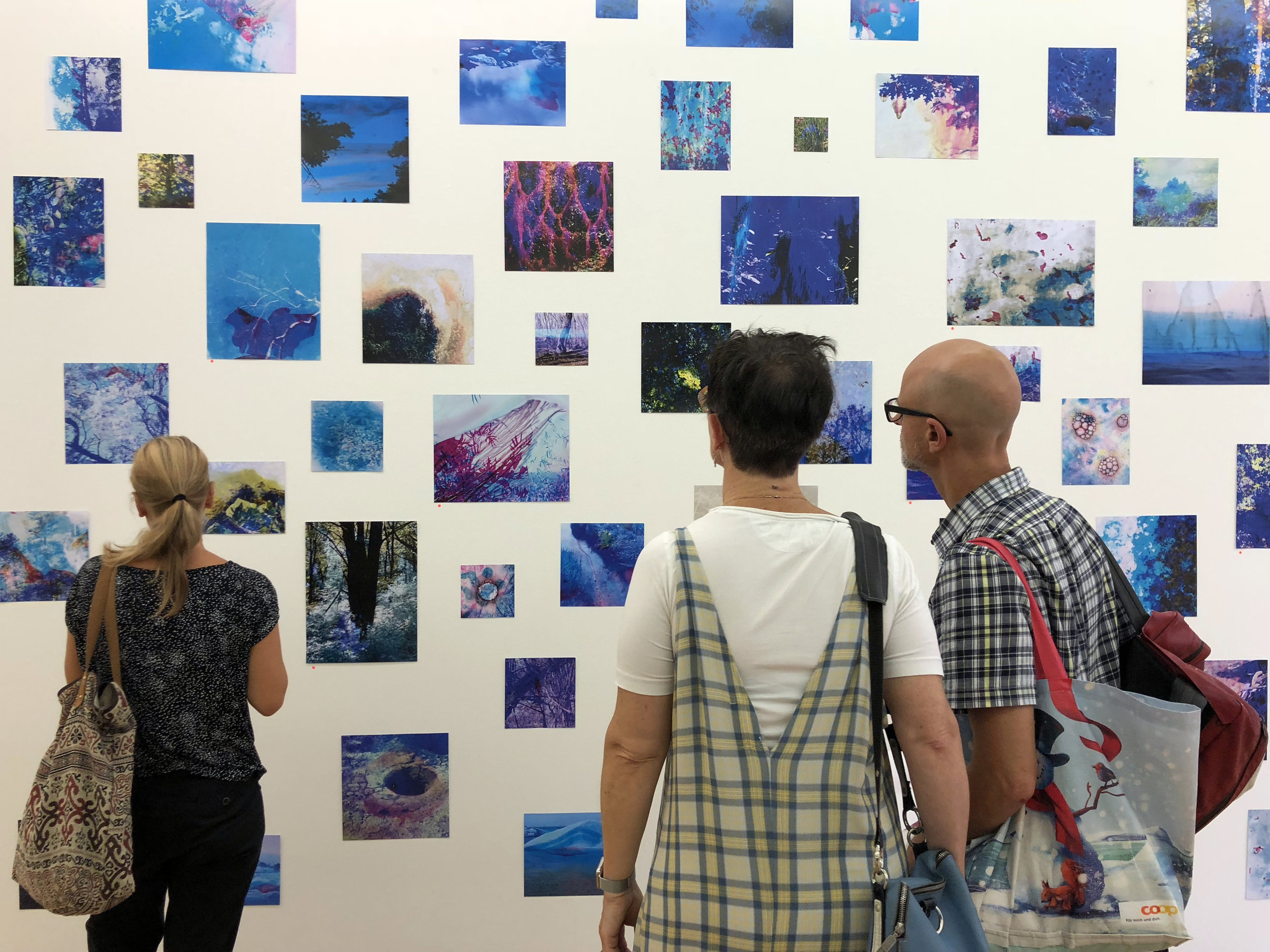
Nature Is Dirty (detail)
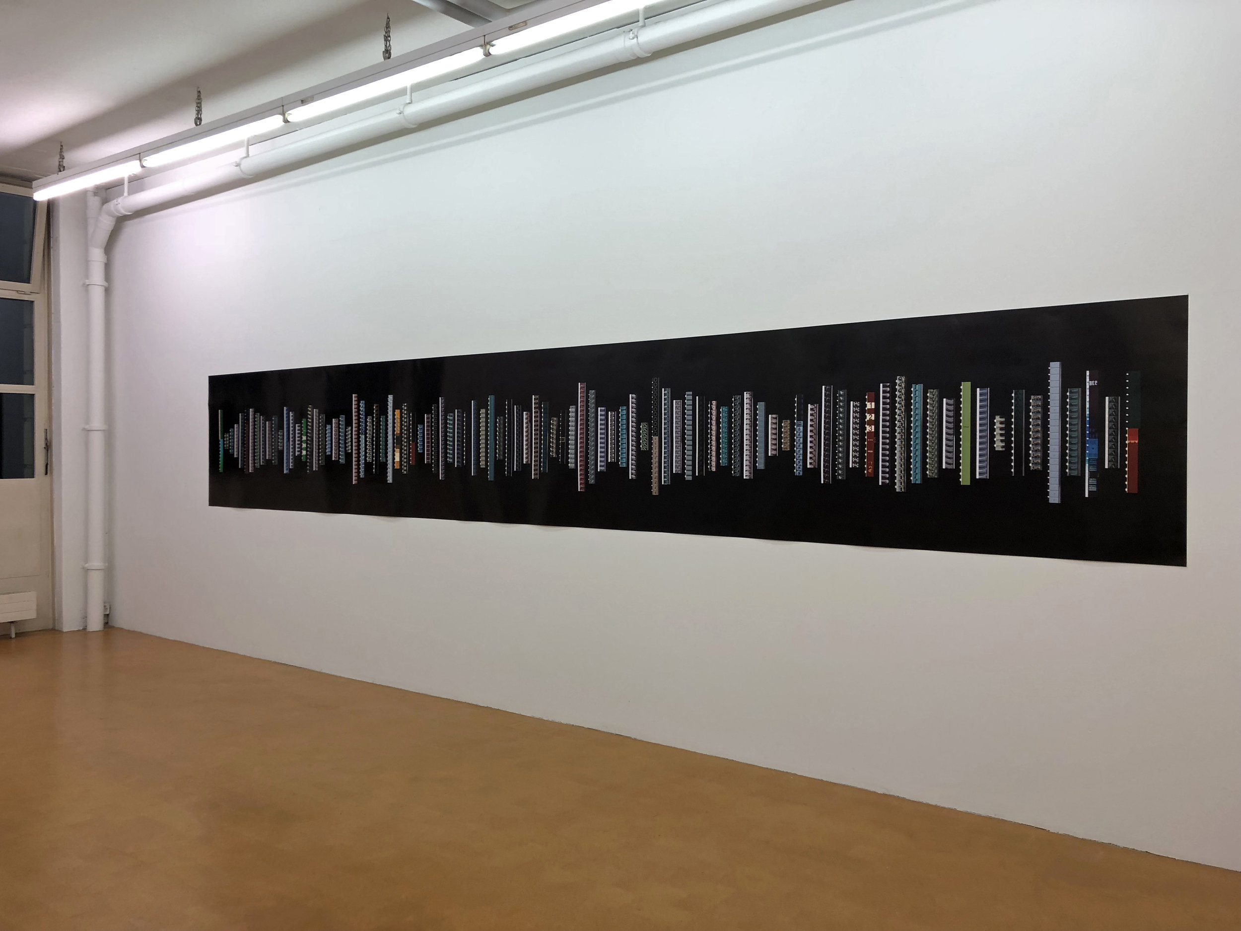
A Future for Birds and Fish / Alpineum Produzentengalerie / Lucerne, CH
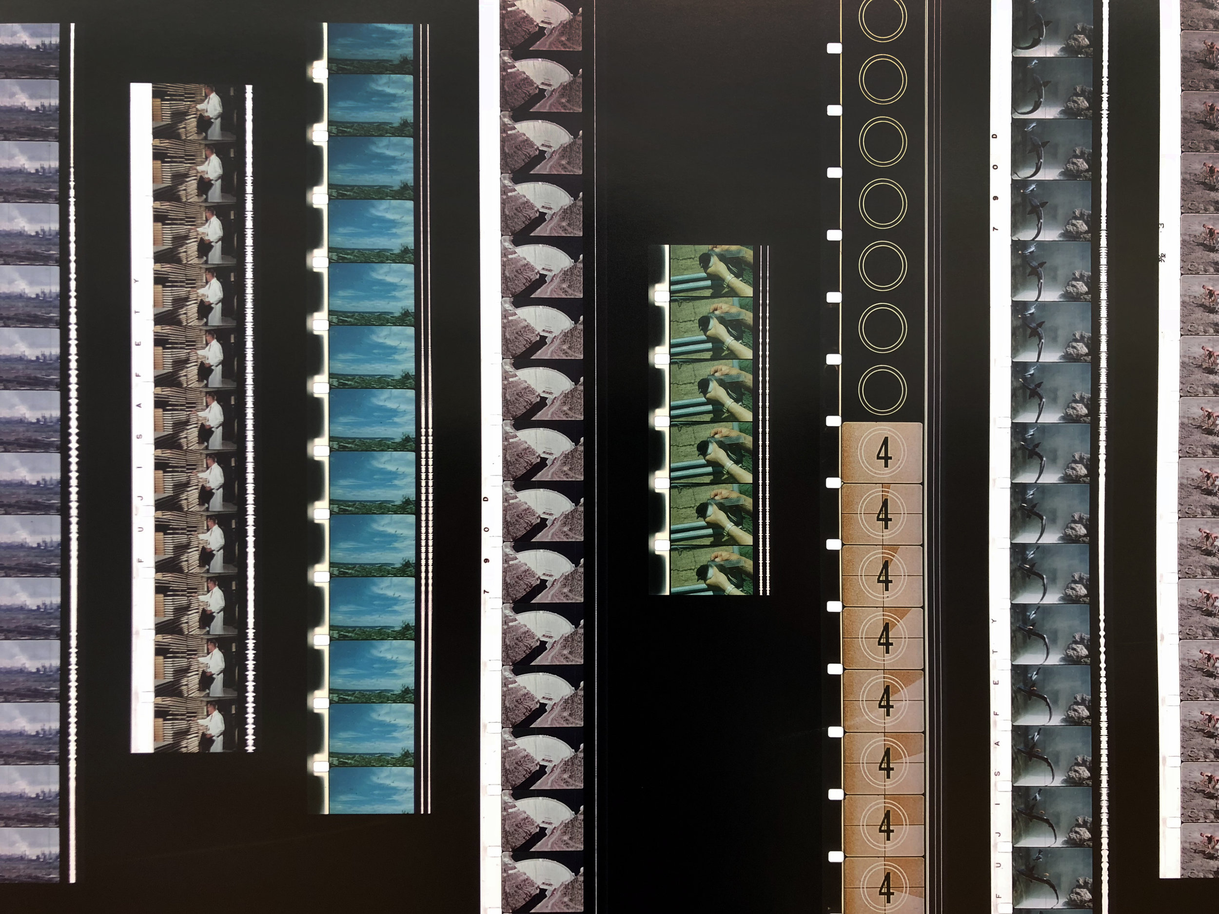
A Future for Birds and Fish (detail)
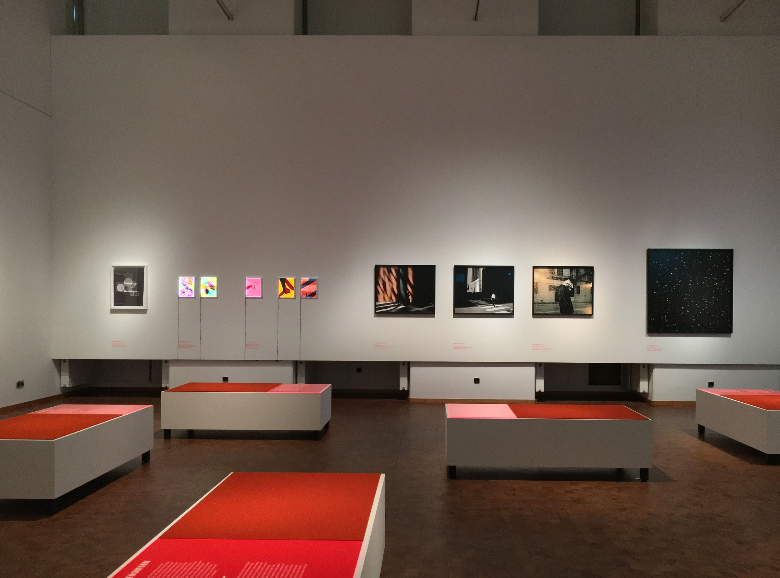
New Bauhaus Chicago: Experiment Photography and Film / Bauhaus Archiv Museum / Berlin
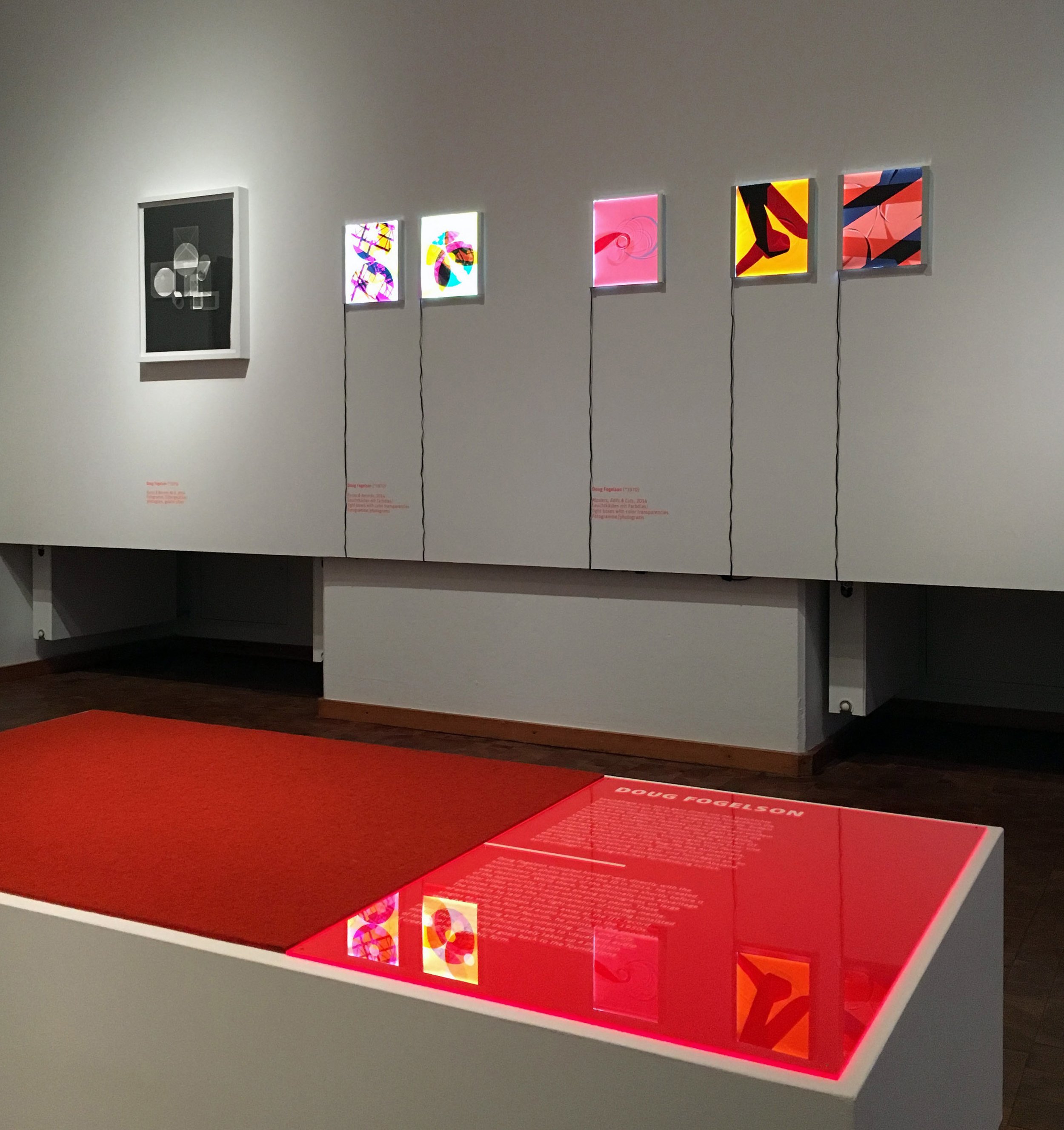
New Bauhaus Chicago: Experiment Photography and Film (detail)

New Bauhaus Chicago: Experiment Photography and Film (detail)
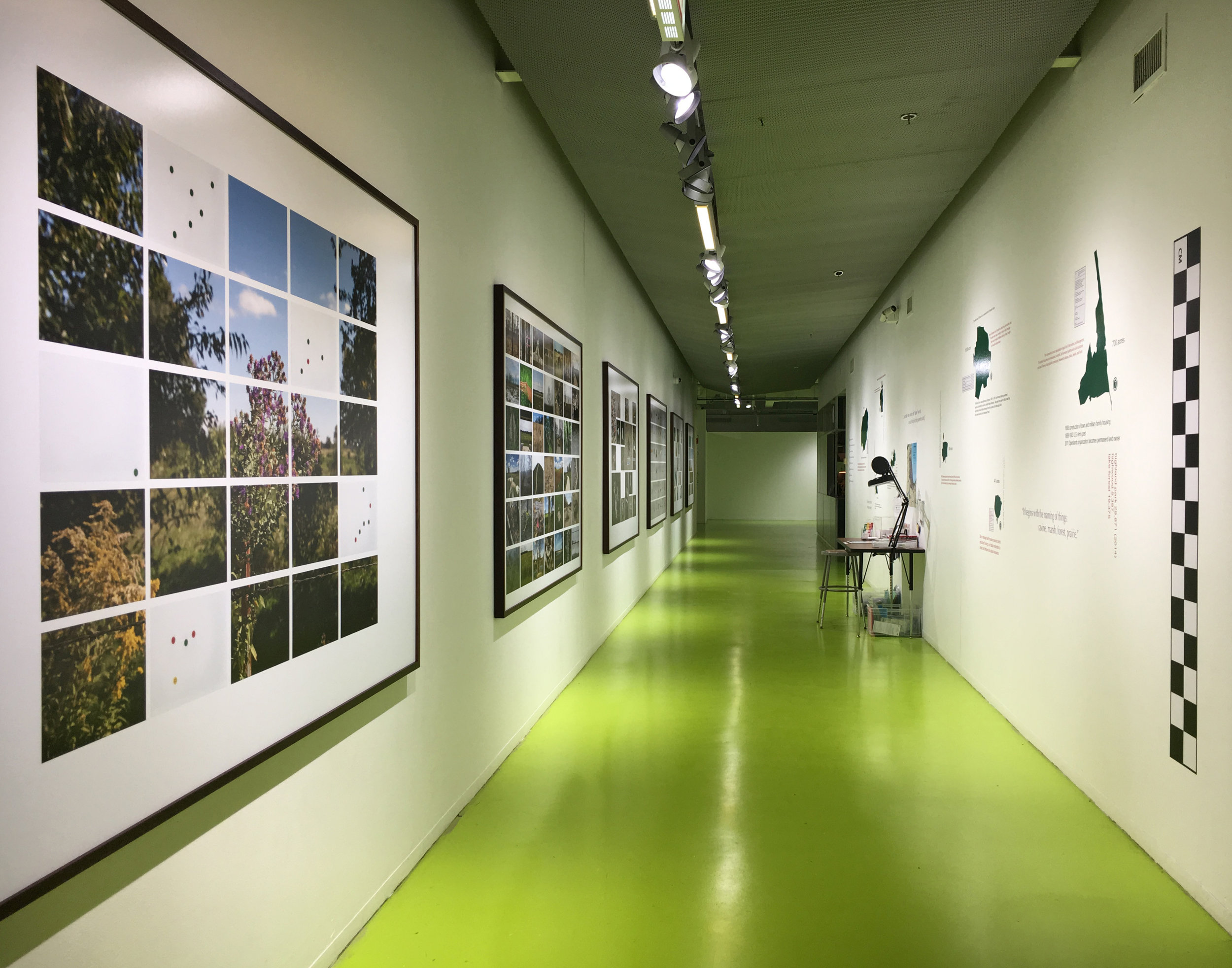
Open Land Art & Fact Team (O.L.A.F.T.) / Hyde Park Art Center / Chicago, IL
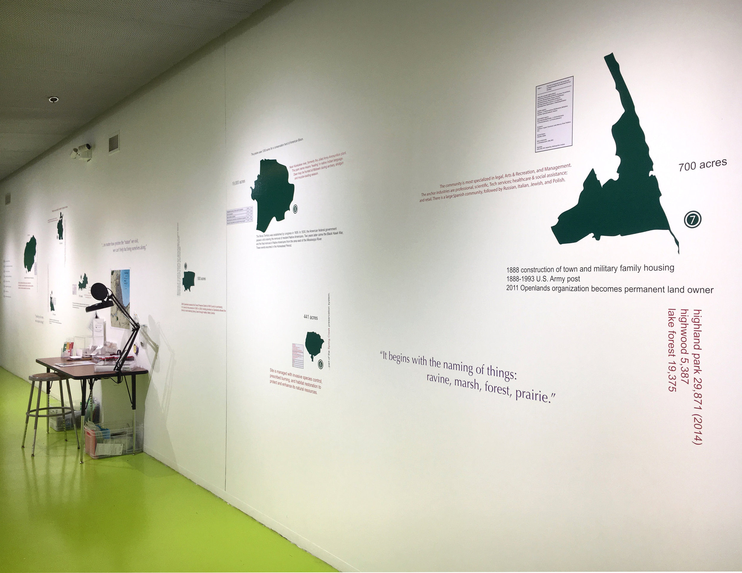
Open Land Art & Fact Team (O.L.A.F.T.) / Hyde Park Art Center / Chicago, IL
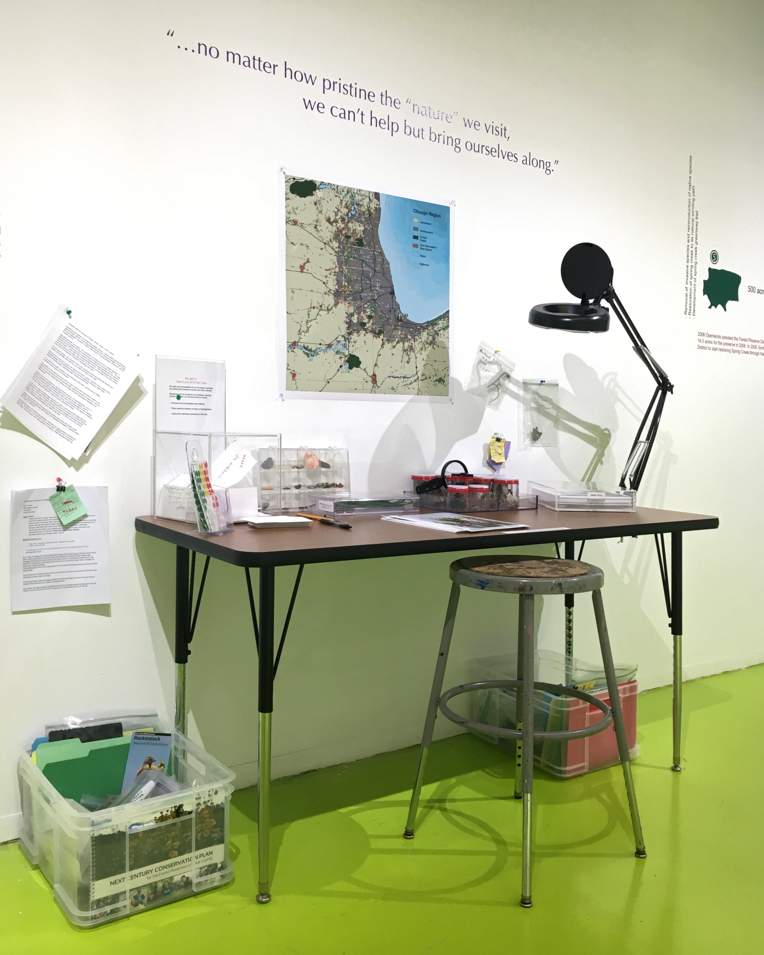
Study Desk / Open Land Art & Fact Team (detail)
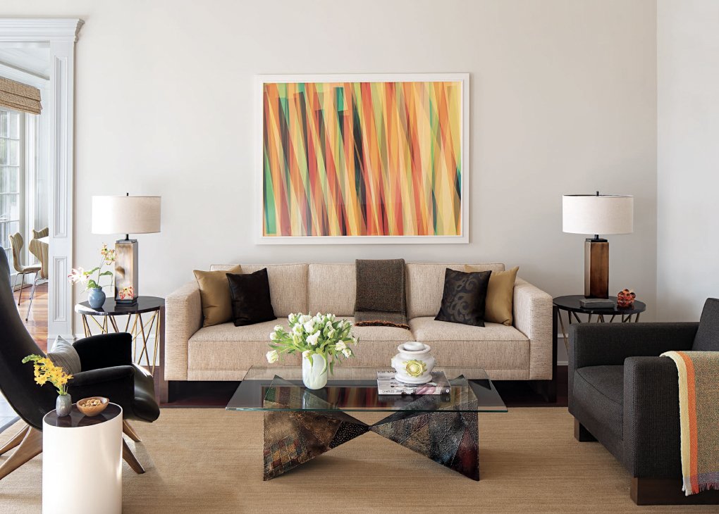
Color Photogram (private residence)
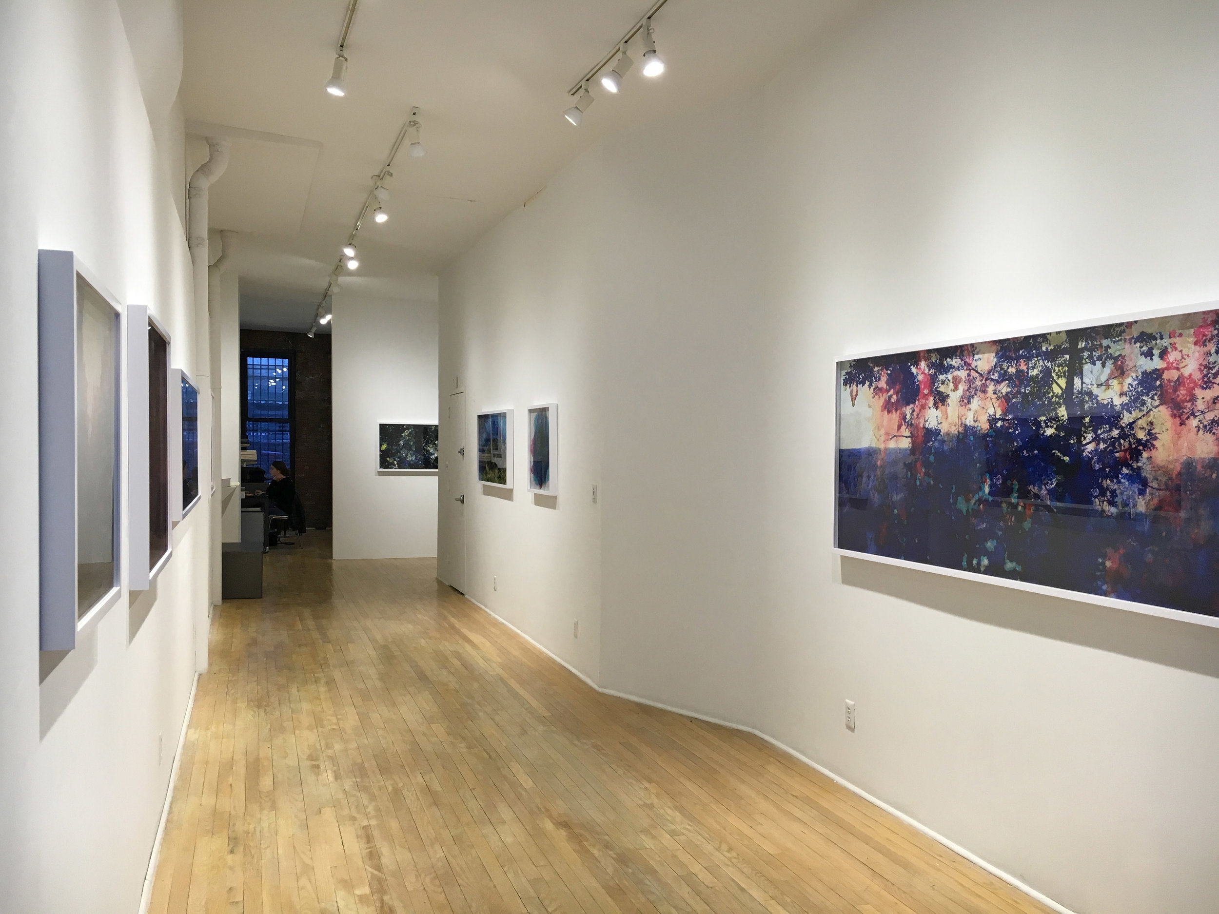
Creative Destruction / Sasha Wolf Gallery / NYC

Creative Destruction / Sasha Wolf Gallery / NYC
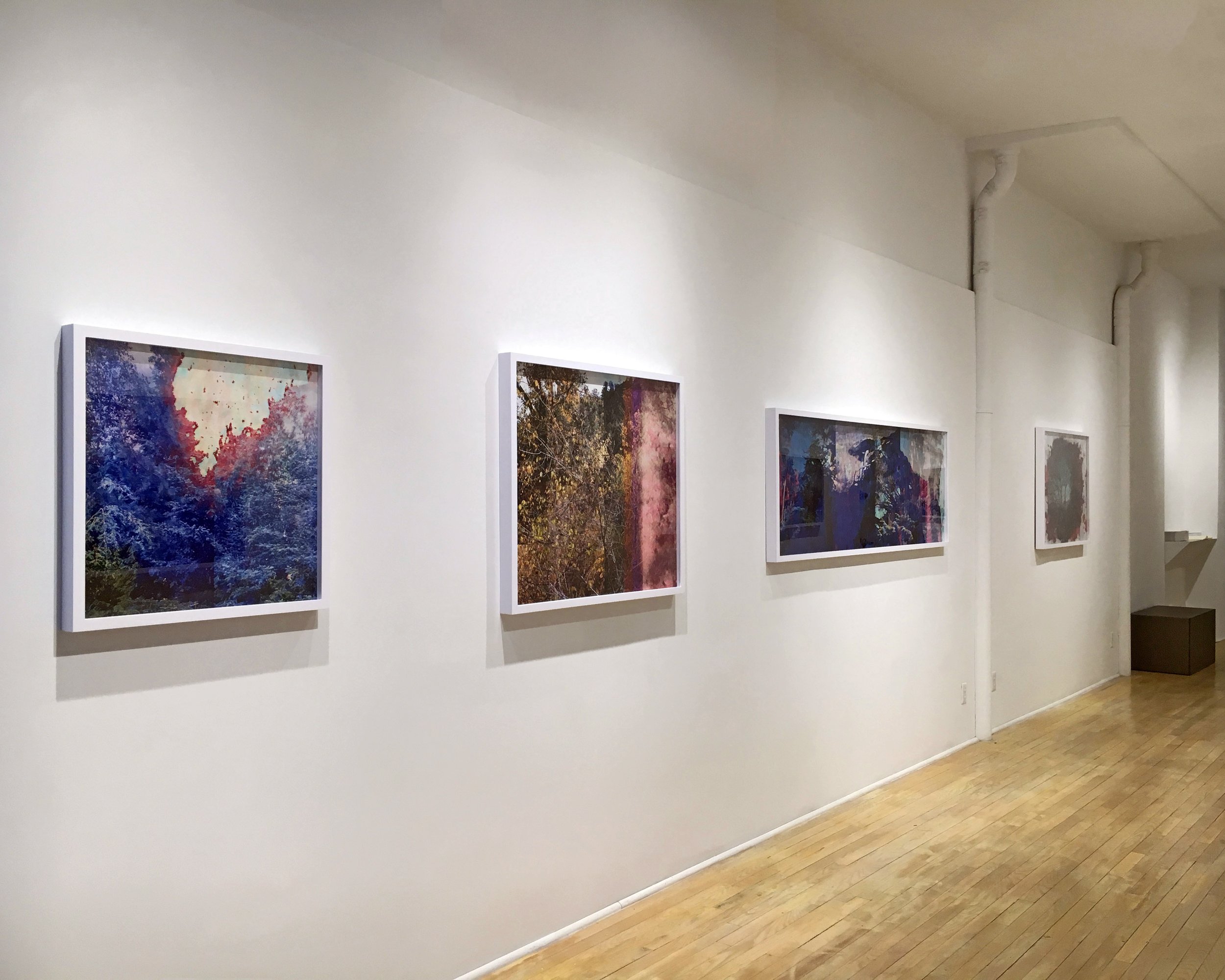
Creative Destruction / (reverse view)
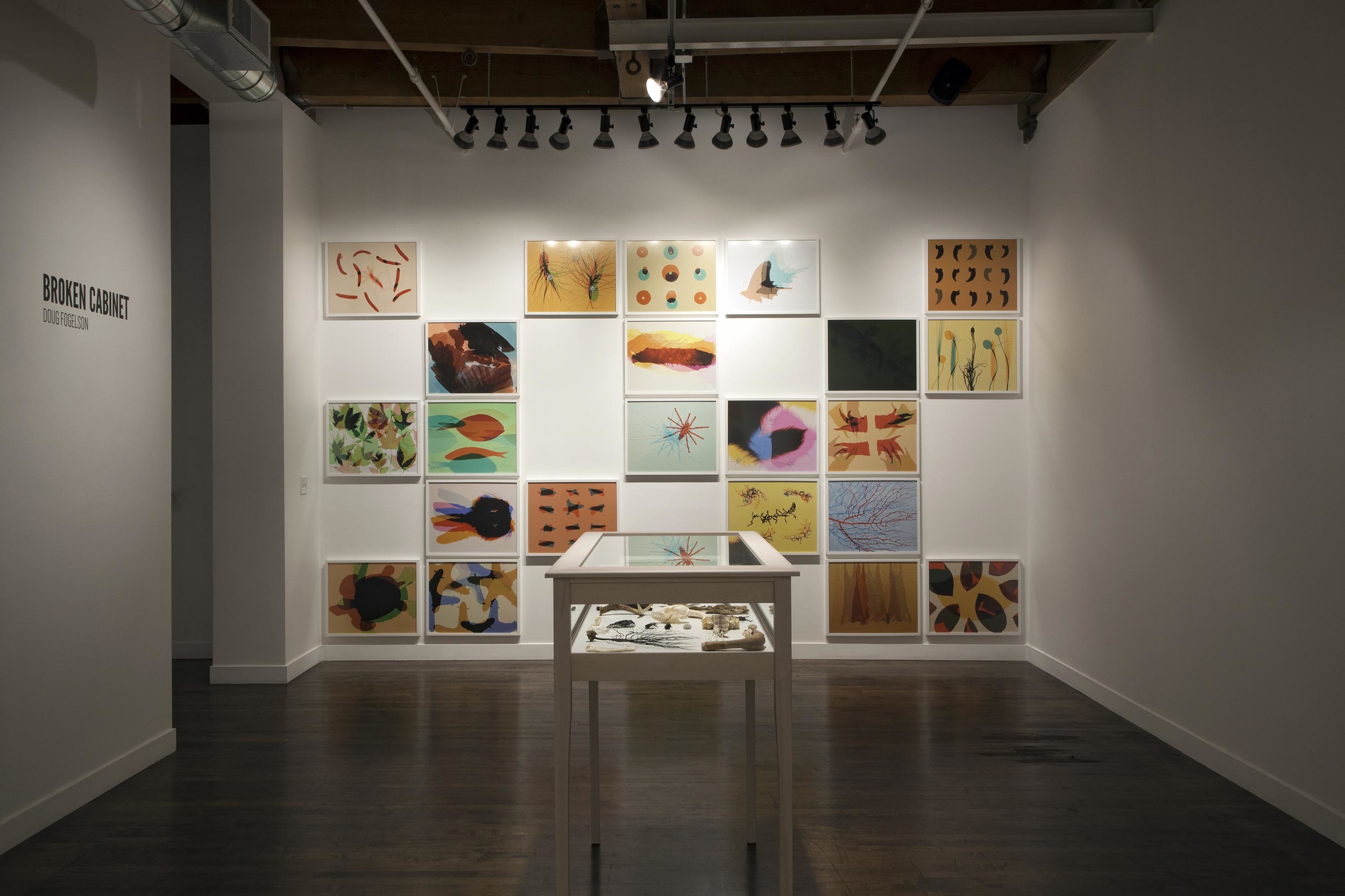
Broken Cabinet / Linda Warren Projects / Chicago, IL
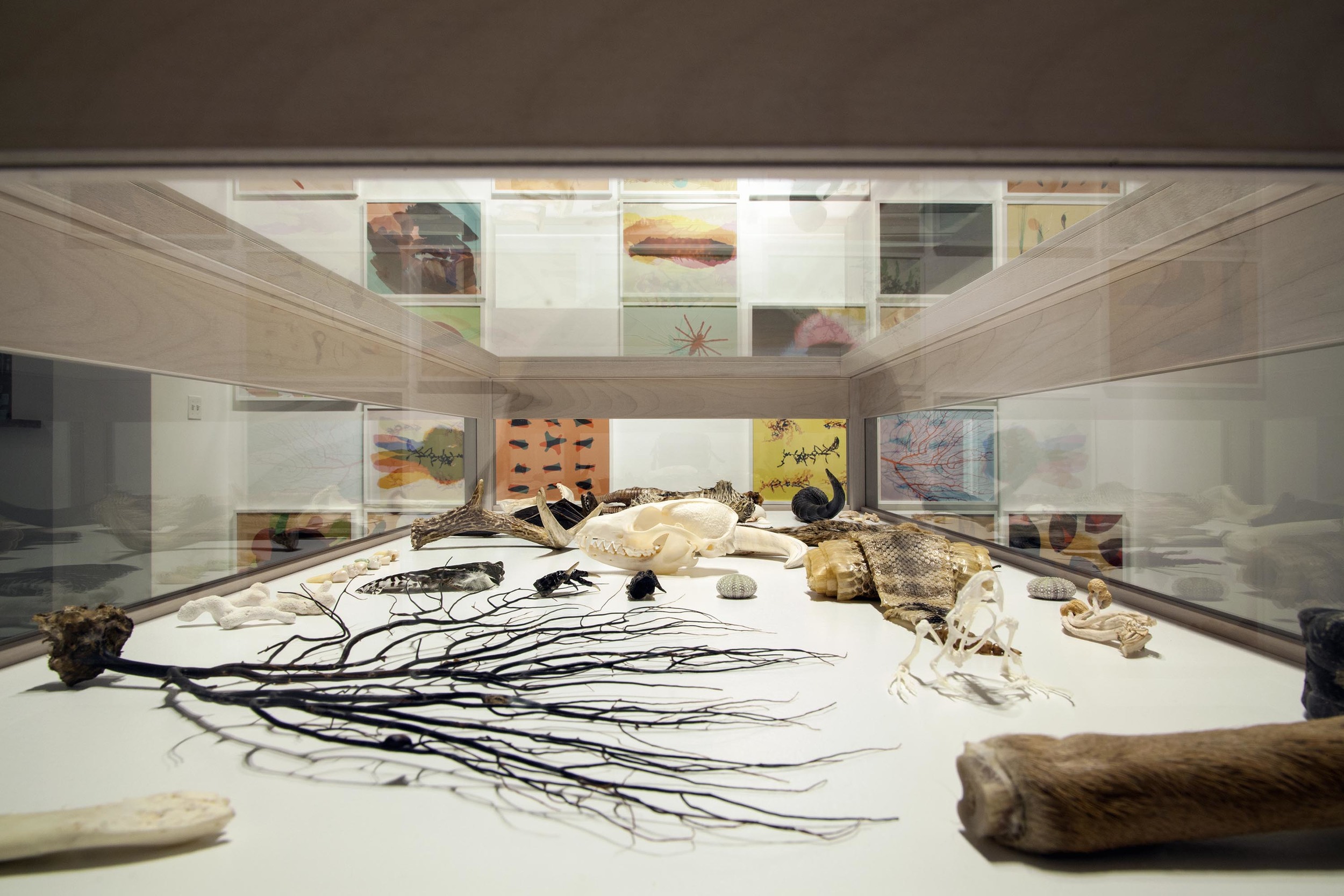
Broken Cabinet (detail)
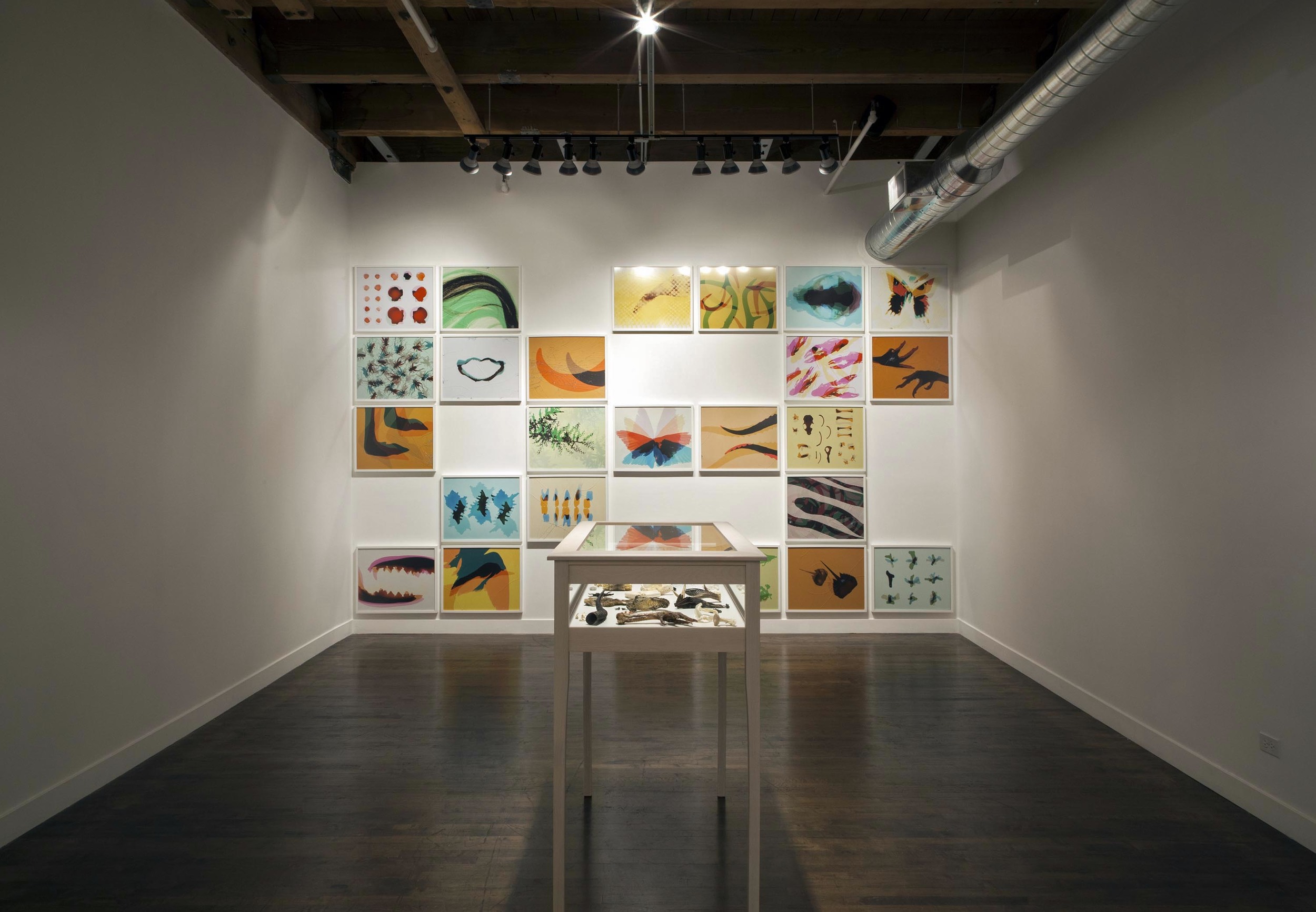
Broken Cabinet (reverse view)

Broken Cabinet (detail)
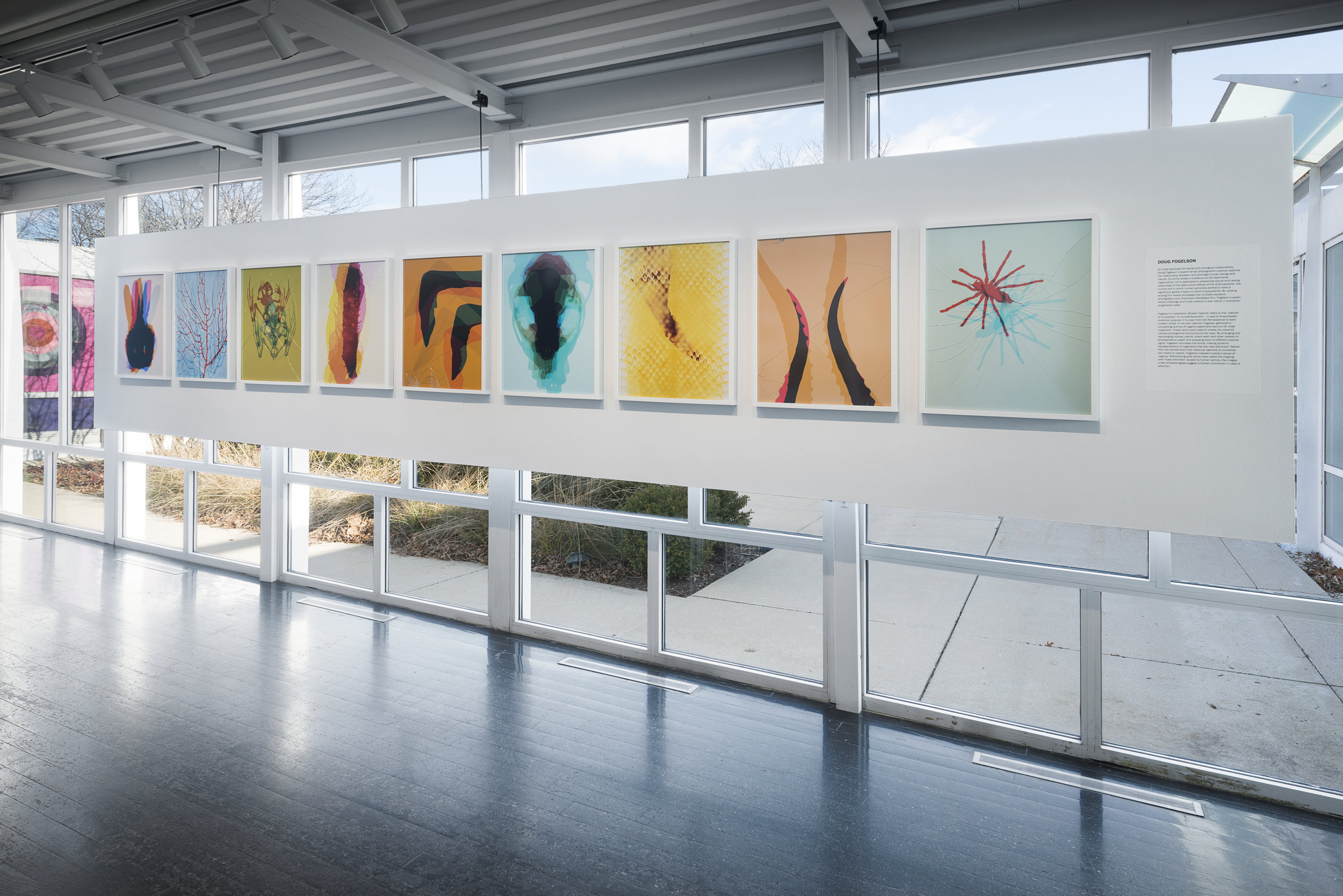
Broken Cabinet / Elmhurst Art Museum / Illinois
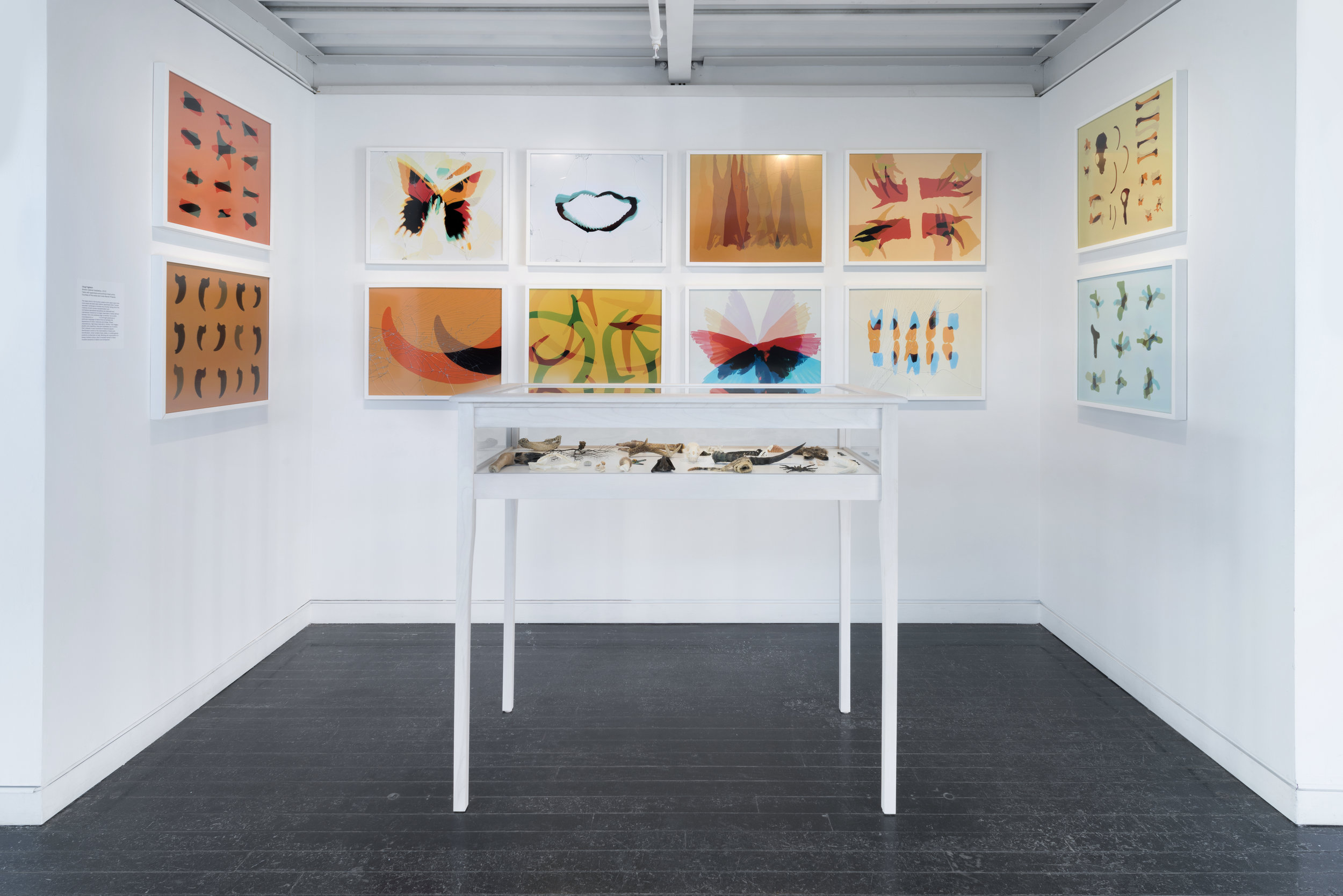
Broken Cabinet / Elmhurst Art Museum (reverse view)
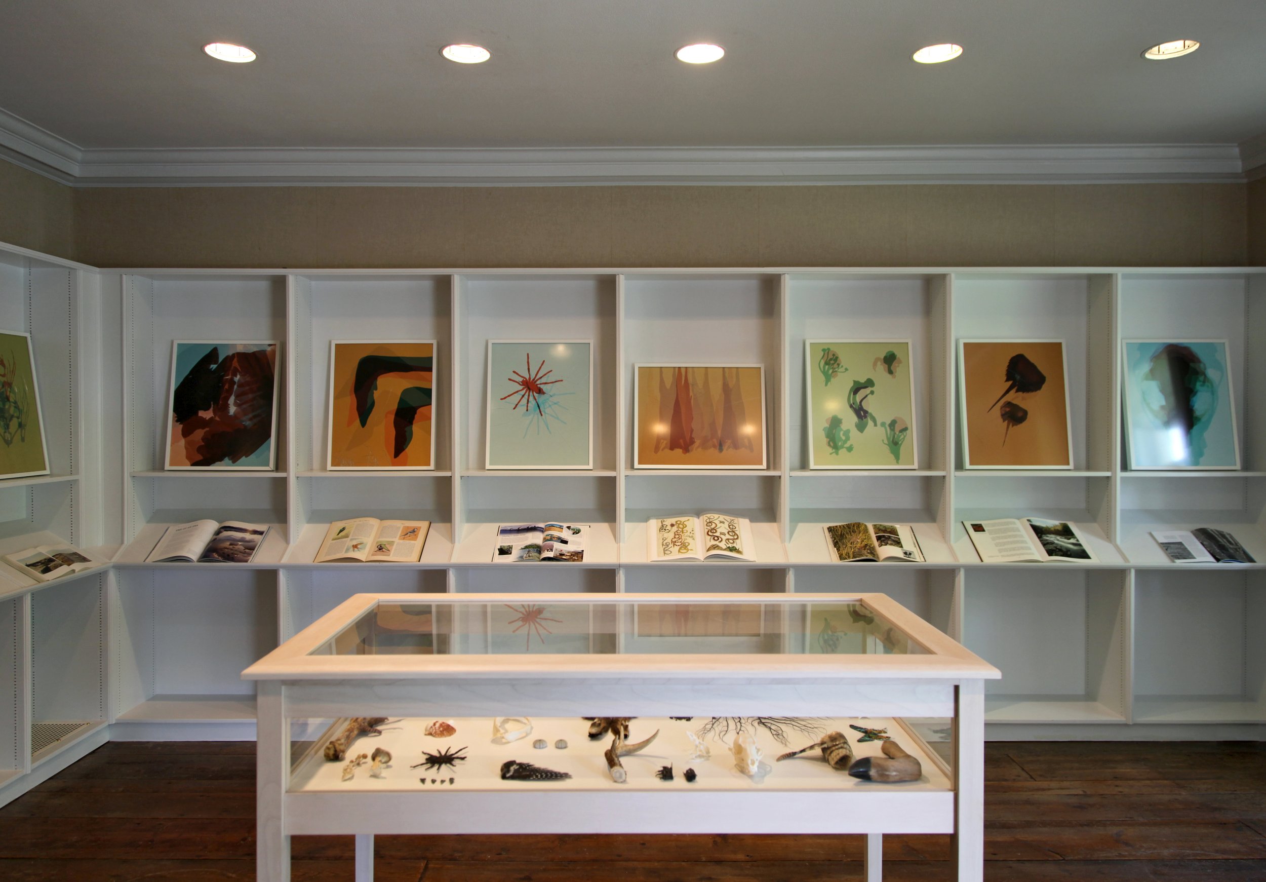
Broken Cabinet / Brushwood Center / Riverwoods, IL

Period (of time) / Wicker Park/Bucktown Public Library / Chicago, IL

Period (of time) / Commission (detail)
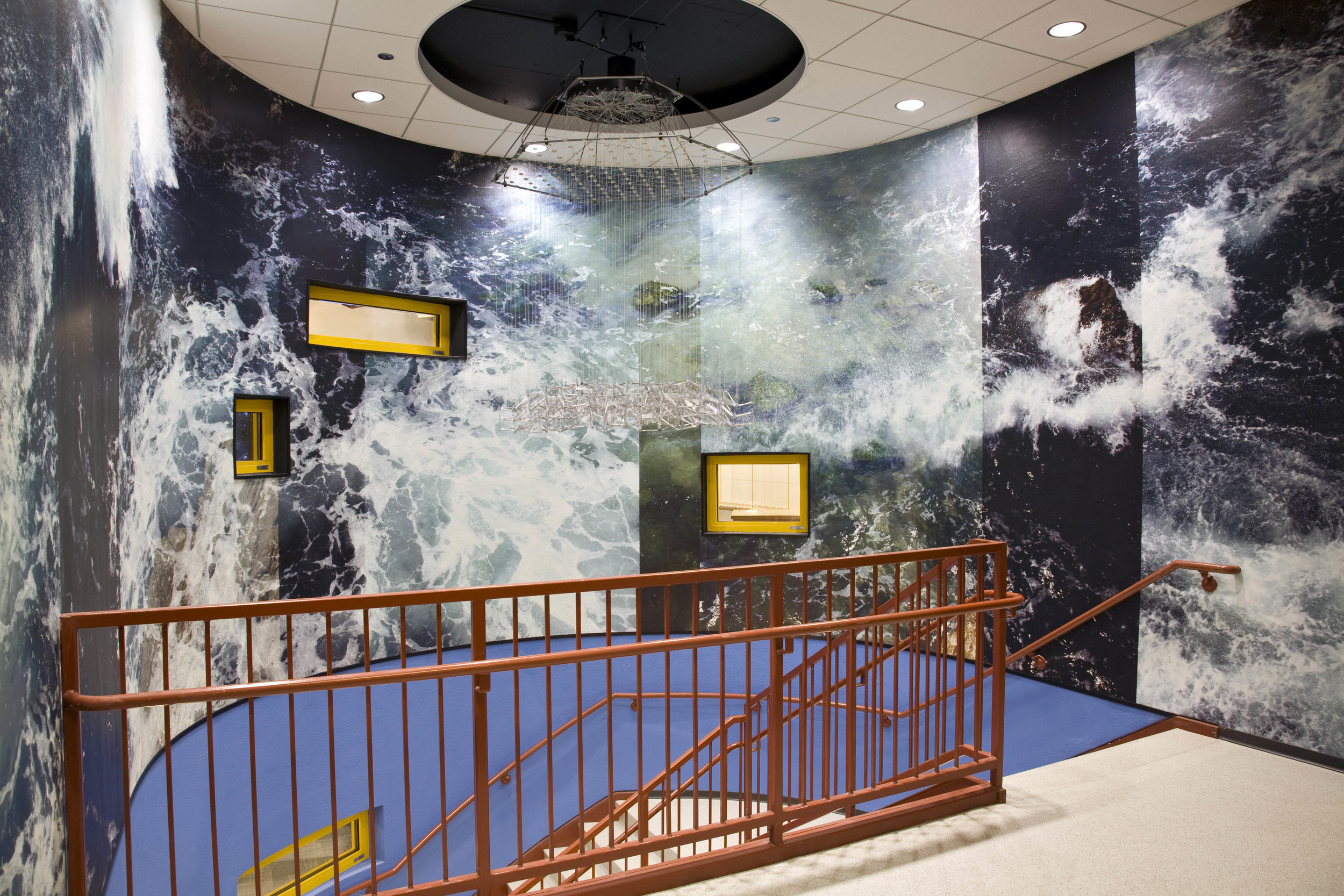
Ventura / The Latin School of Chicago (Photographic Wallpaper)
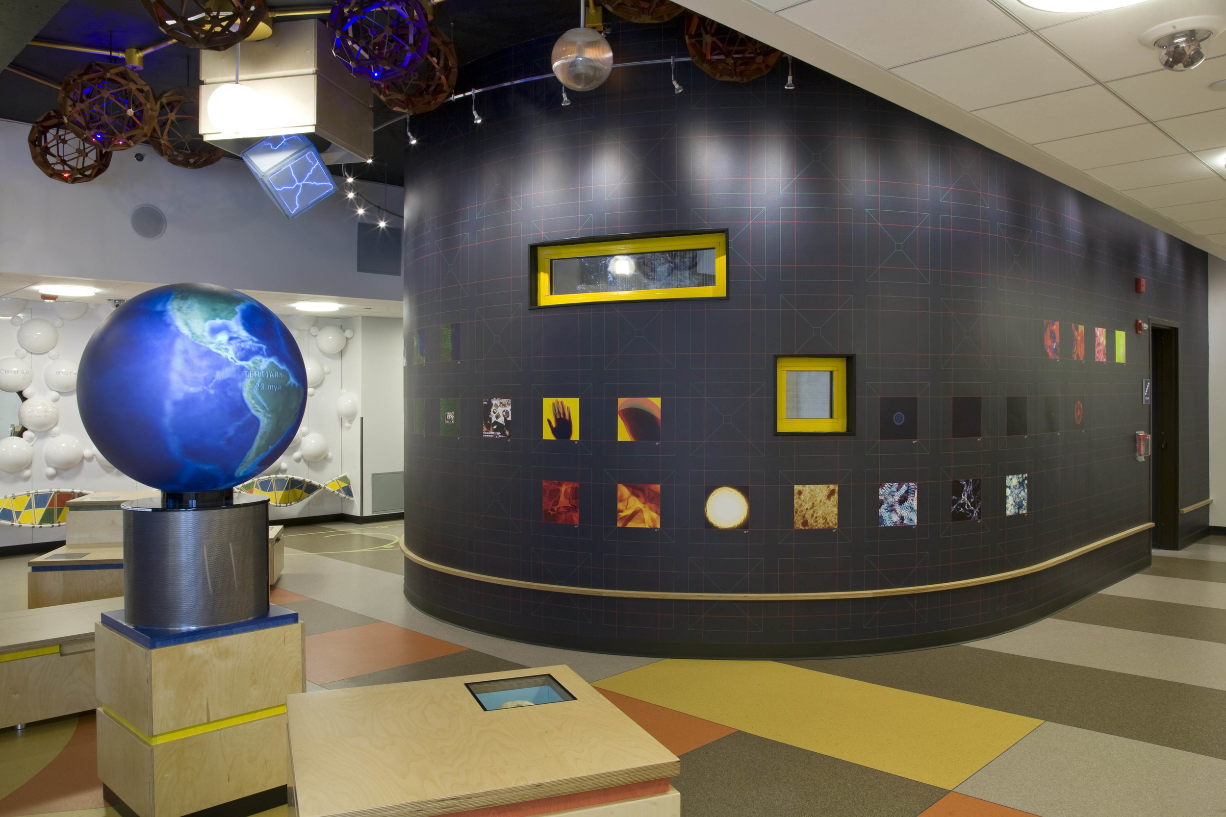
Involution (Adventures in an Ultimate Commonality) / The Latin School of Chicago
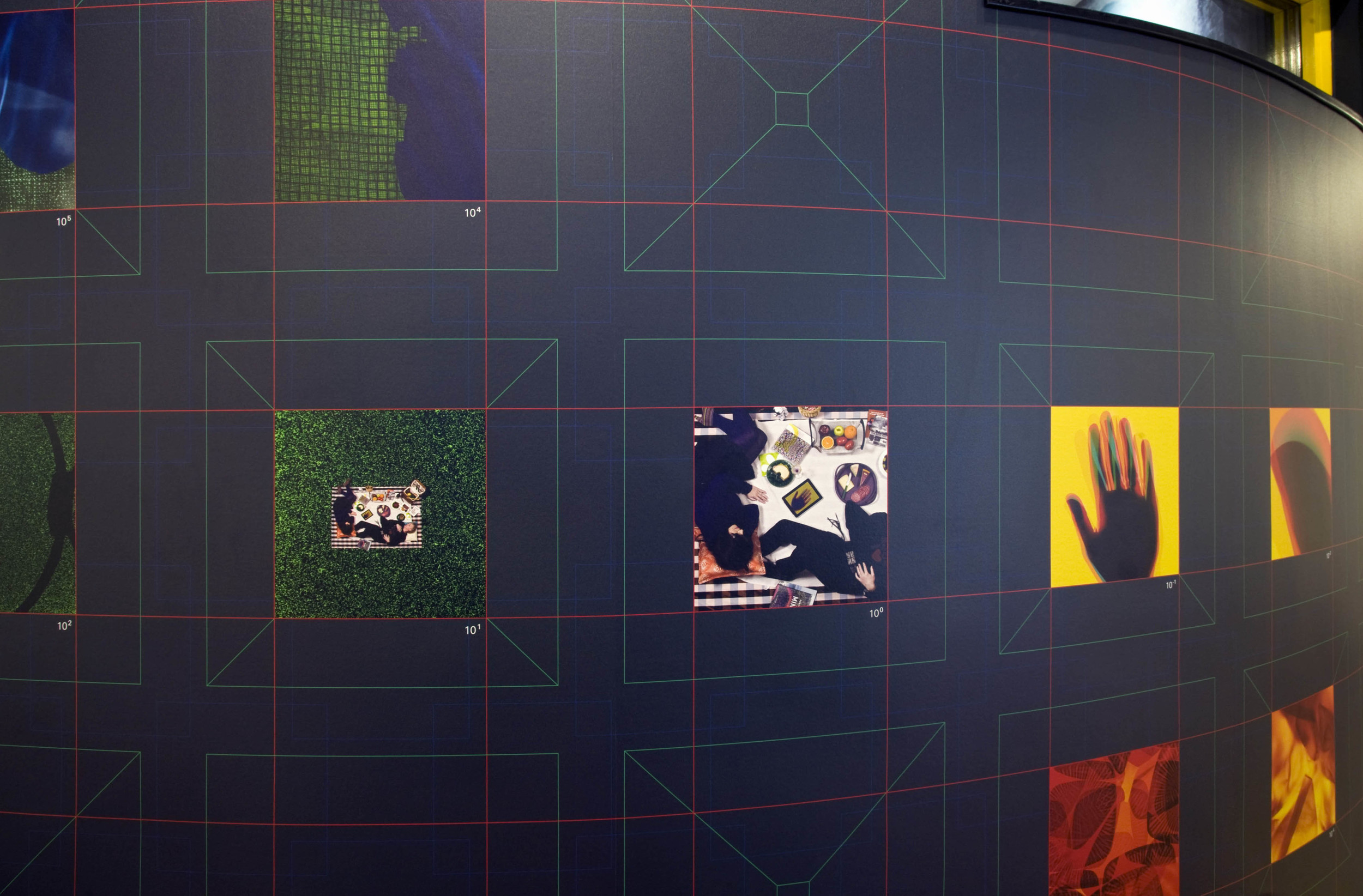
Involution (Adventures in an Ultimate Commonality) (detail)
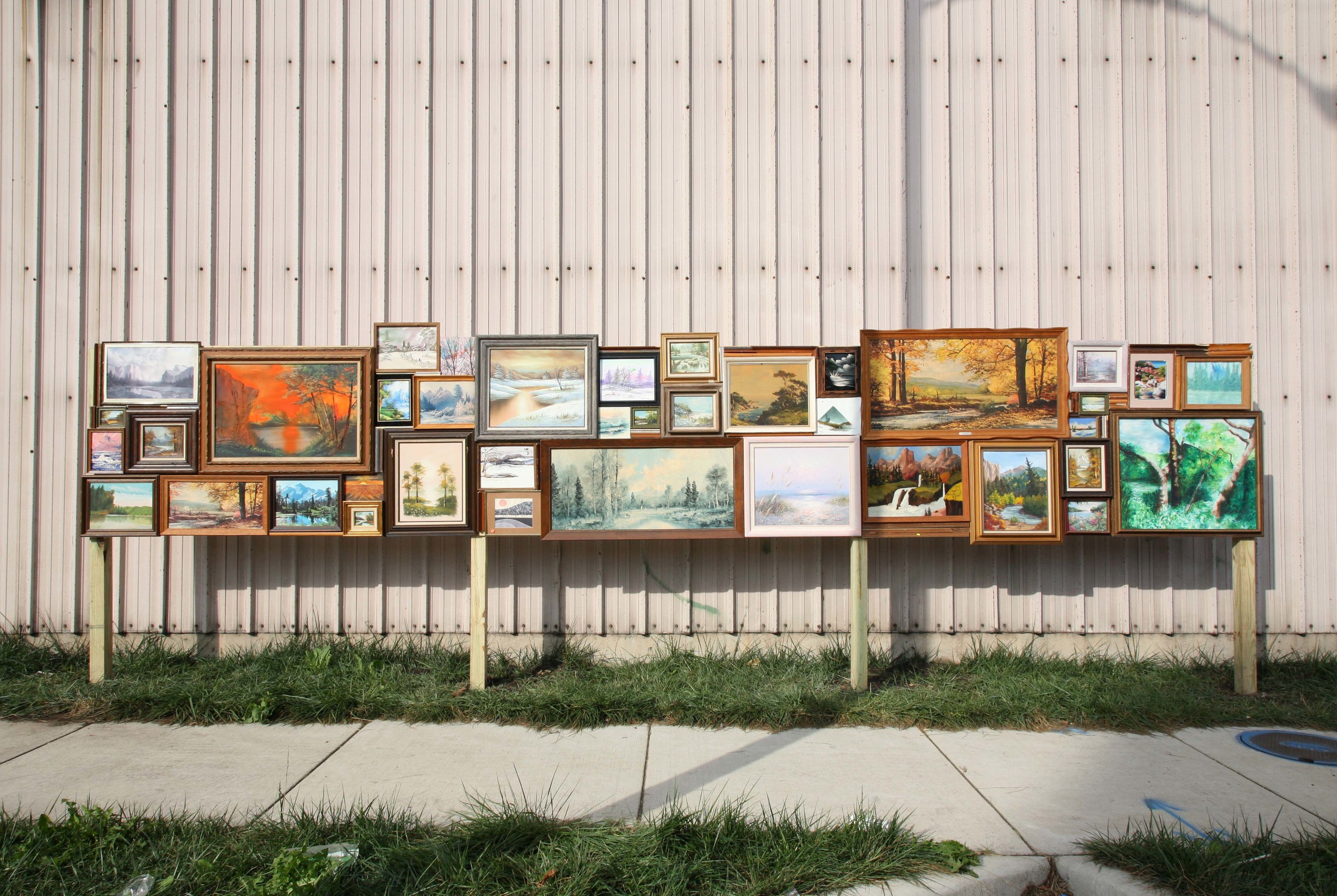
Thriftscape / Chicago, IL
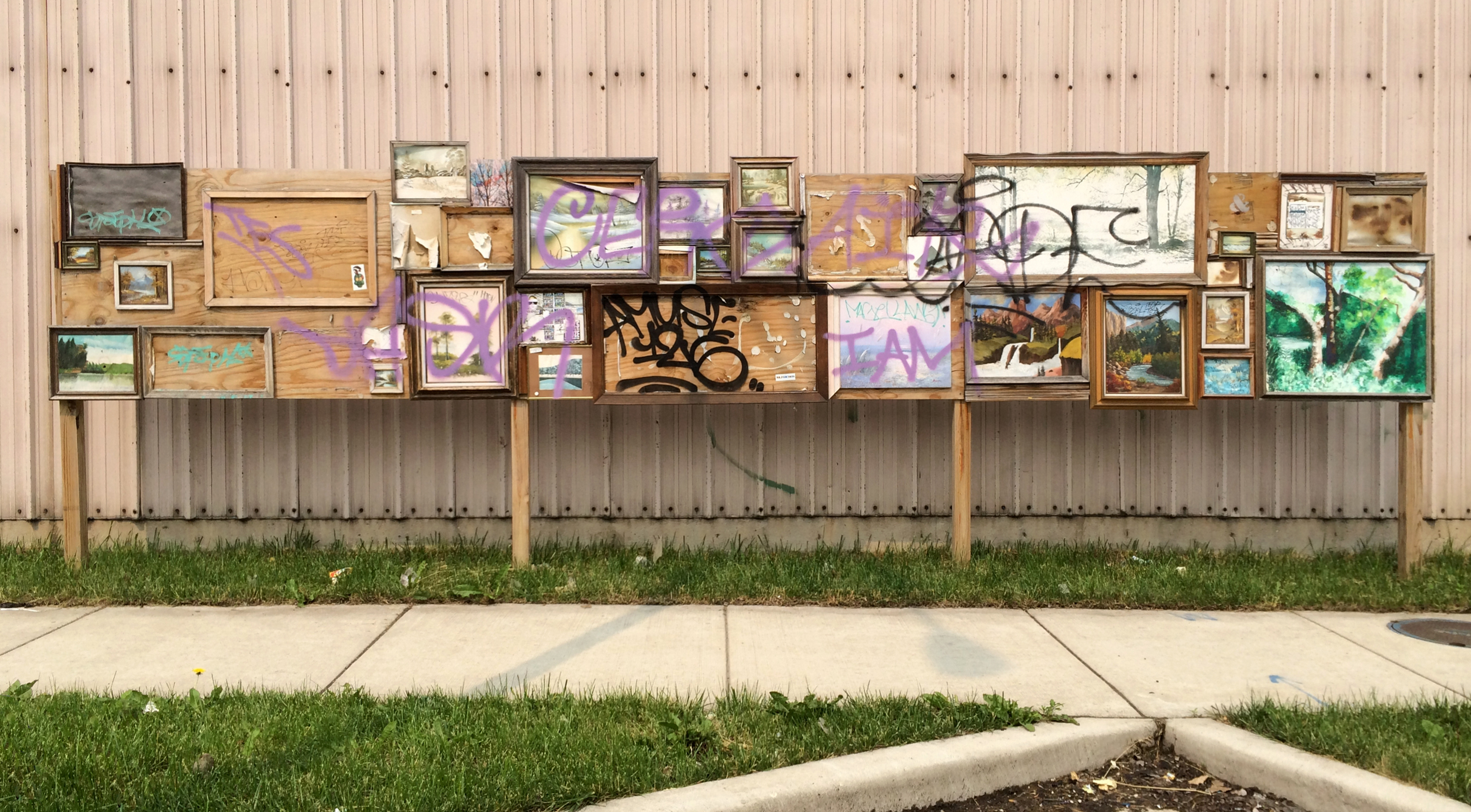
Thriftscape / Chicago, IL / 20 months after install (Sept. '13 - June '15)
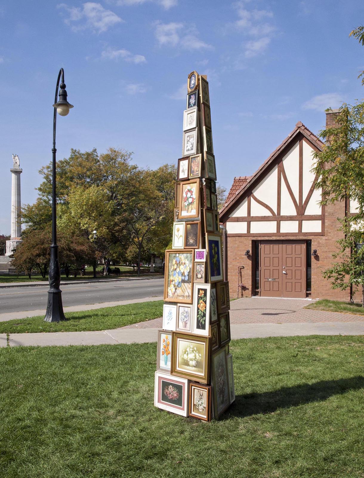
Flower Tower / Comfort Station Gallery / Chicago
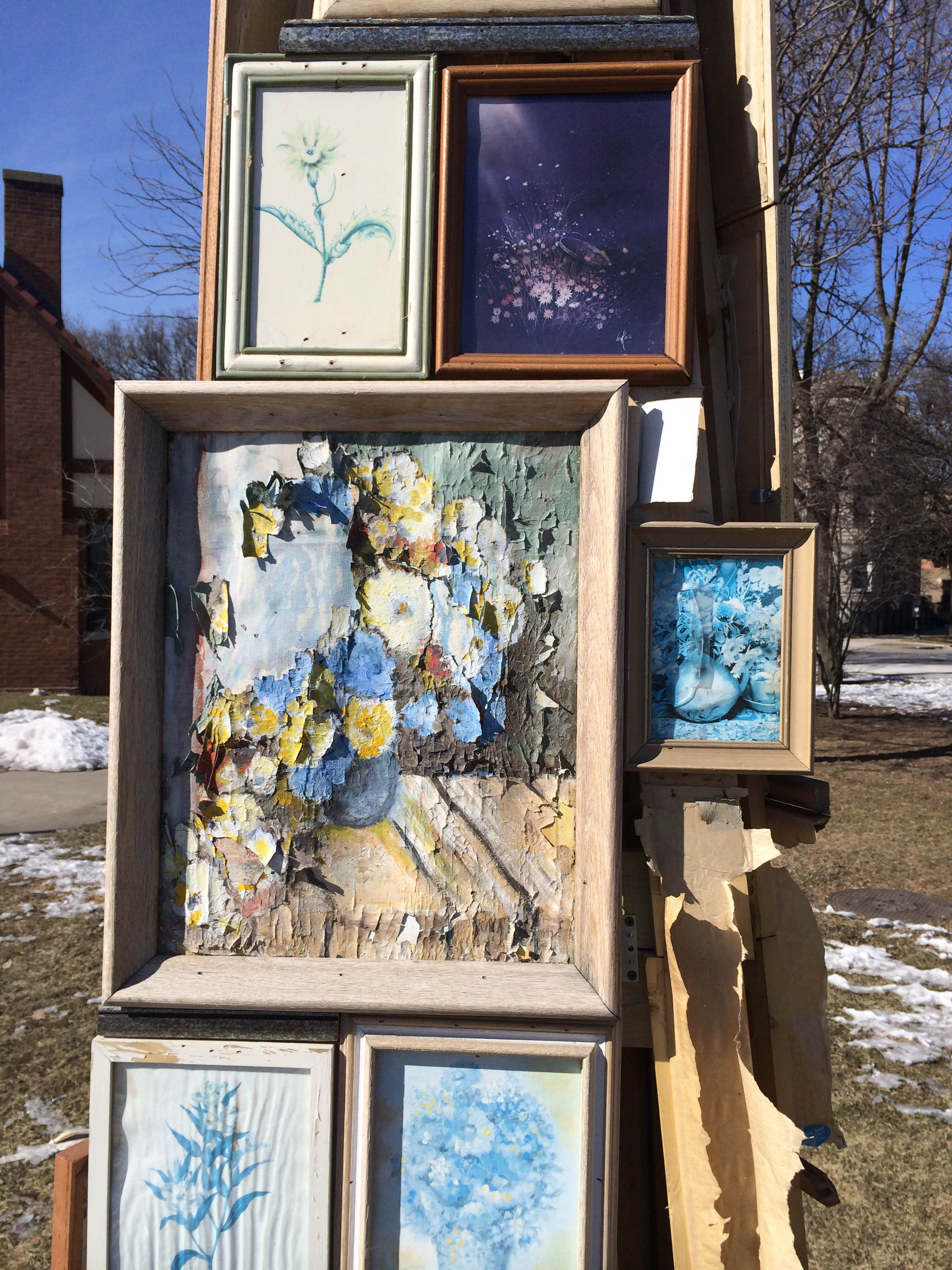
Flower Tower (detail, six months later)
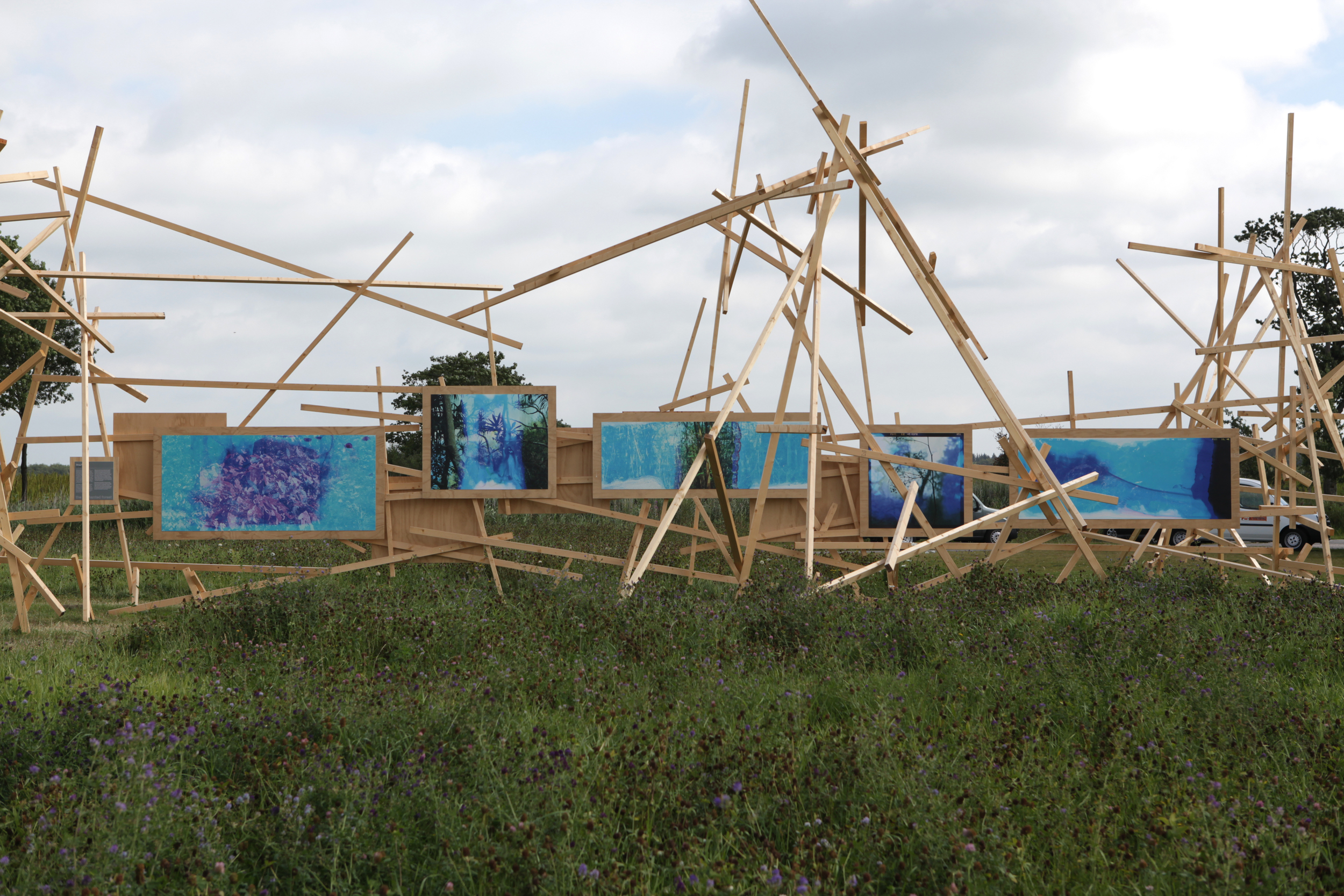
Terra Cognita / Museum Belvedere / Heerenveen, Netherlands

Exit Eden / Quintenz & Co Gallery / Aspen, CO
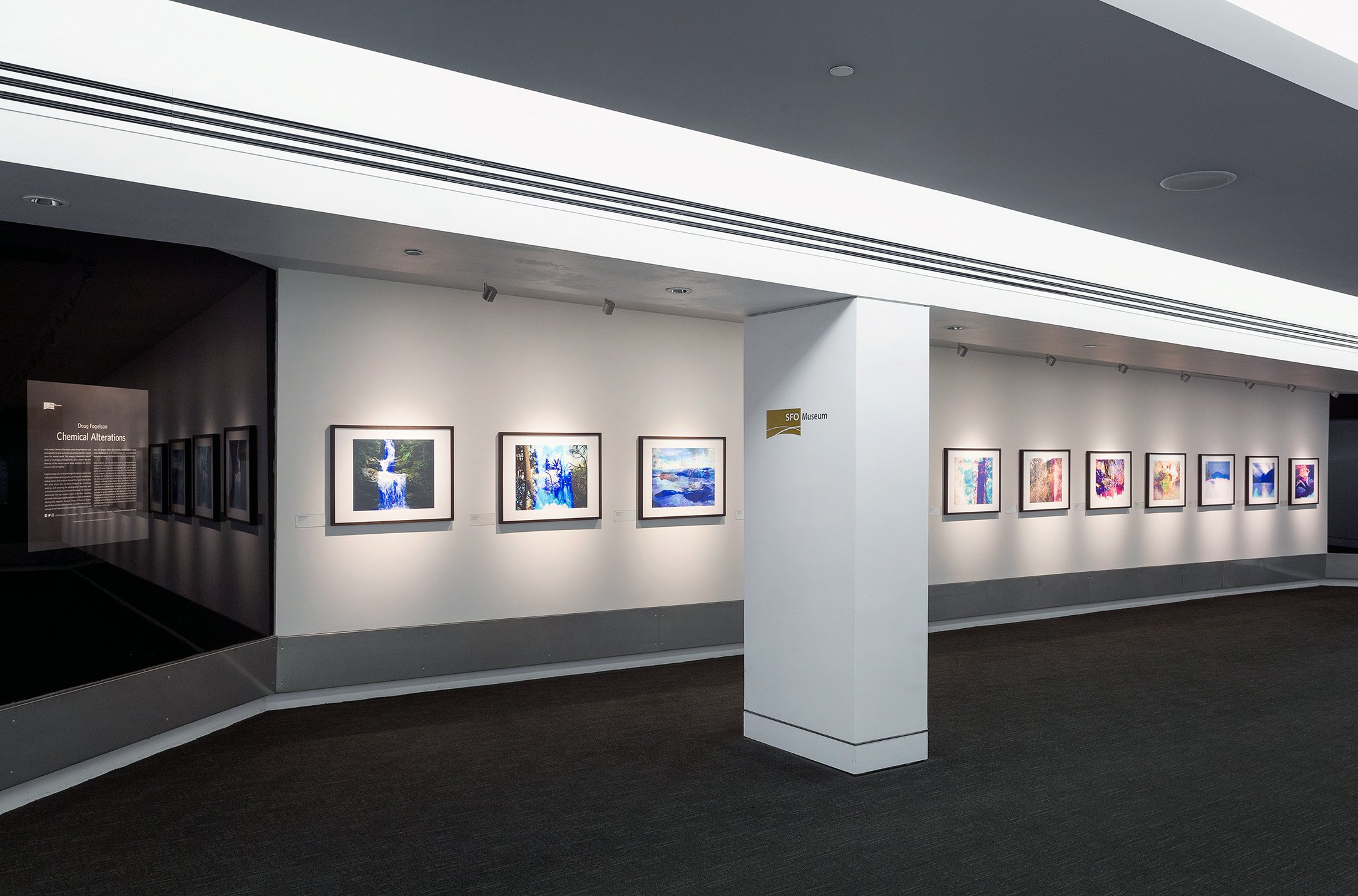
Chemical Alterations / SFO Museum / San Francisco
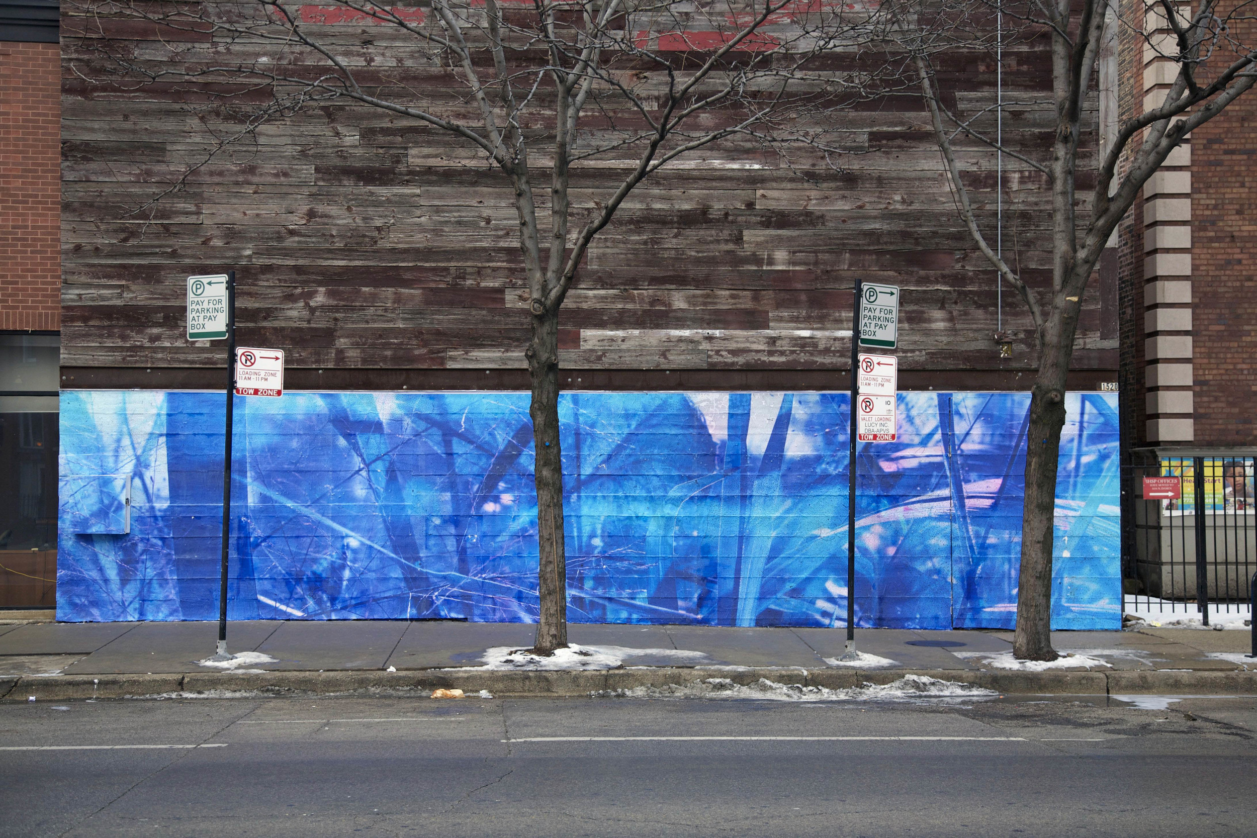
Violet Hour Mural / Chicago, IL
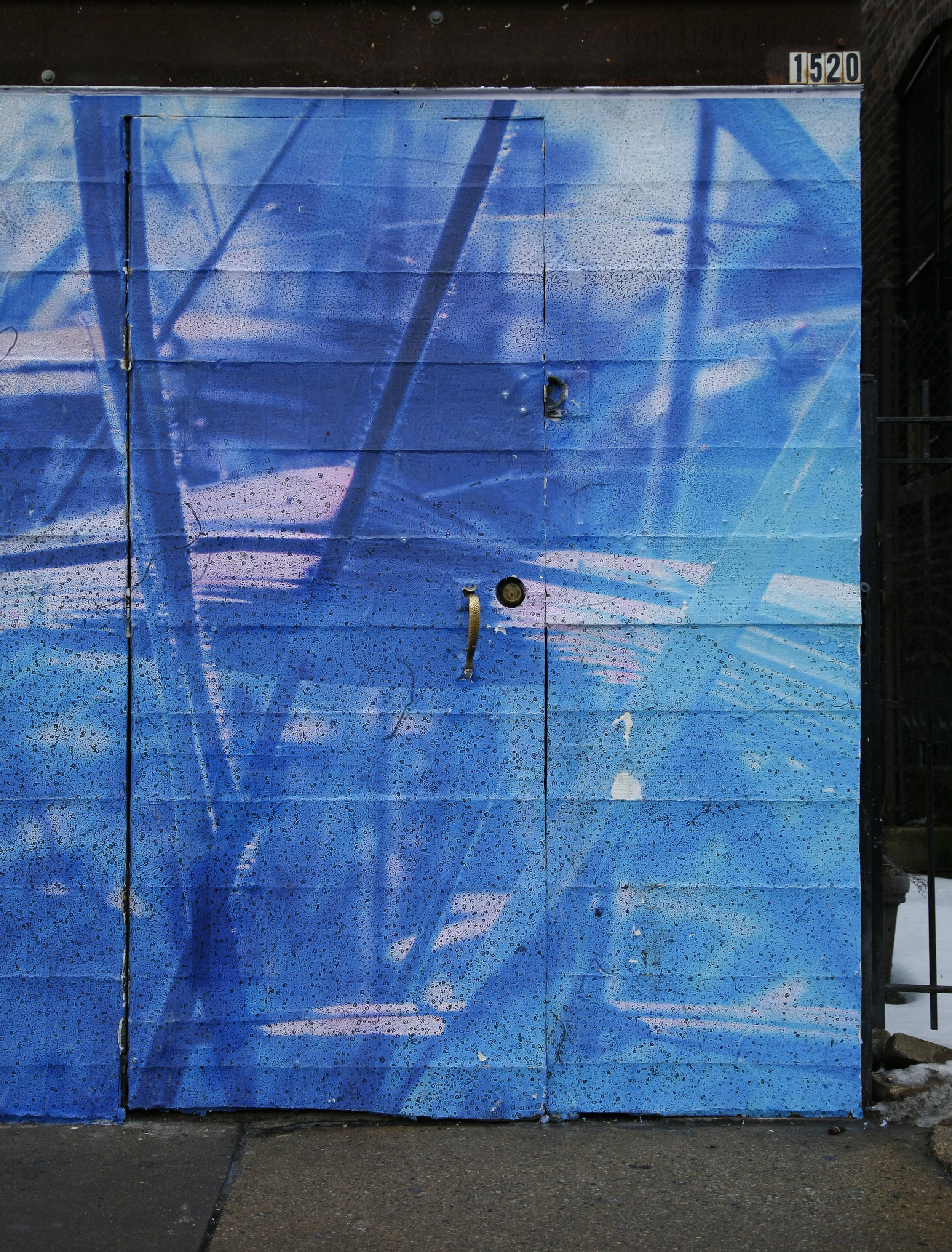
Violet Hour Mural (detail)
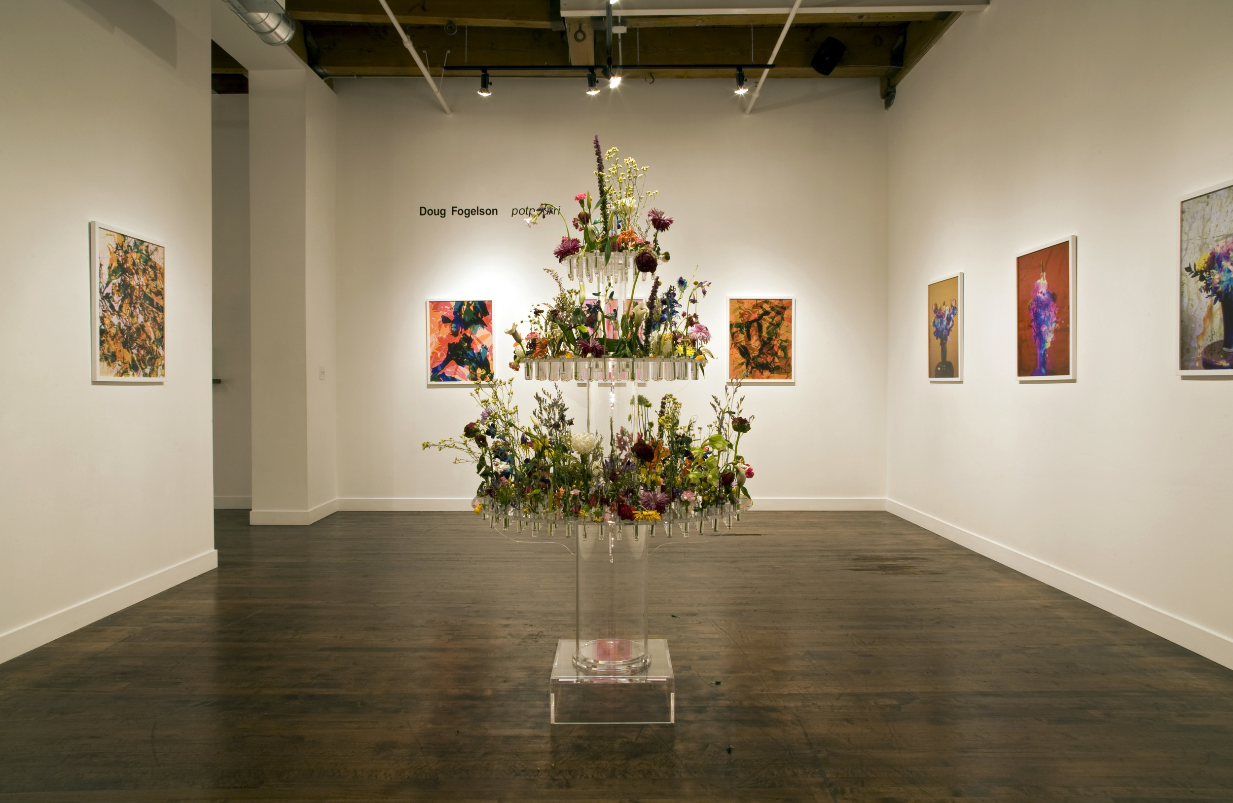
Potpourri / Linda Warren Projects / Chicago, IL
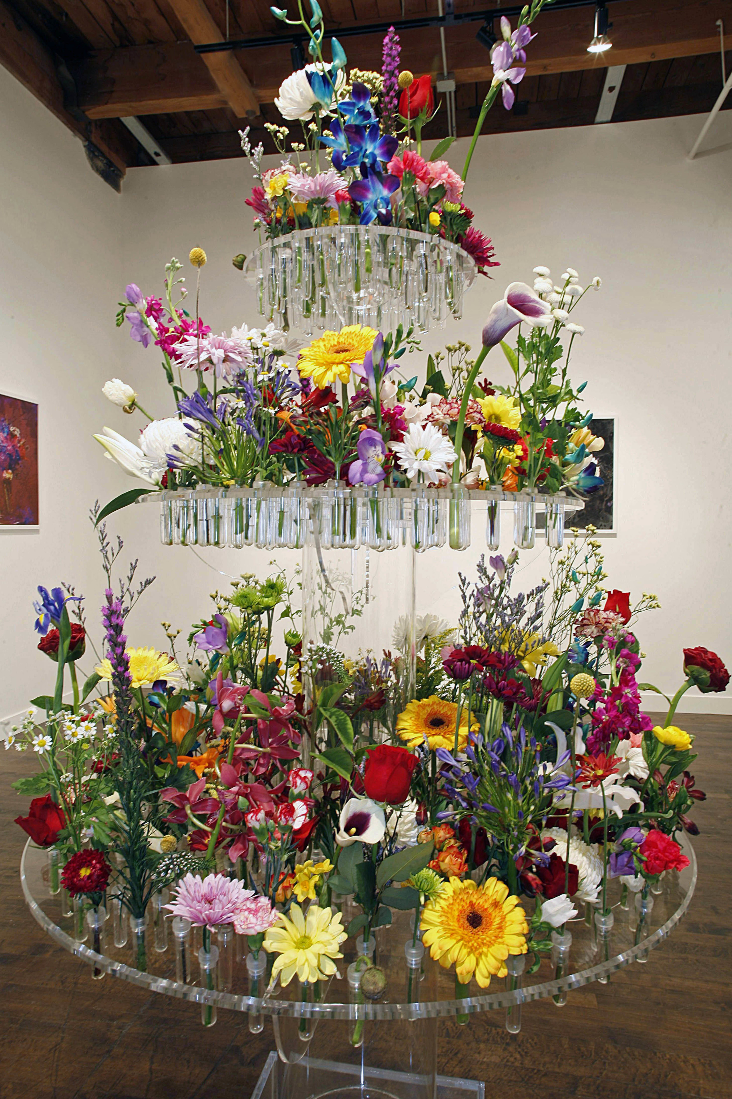
Potpourri “Baudelaire’s Fountain” (Day 1)
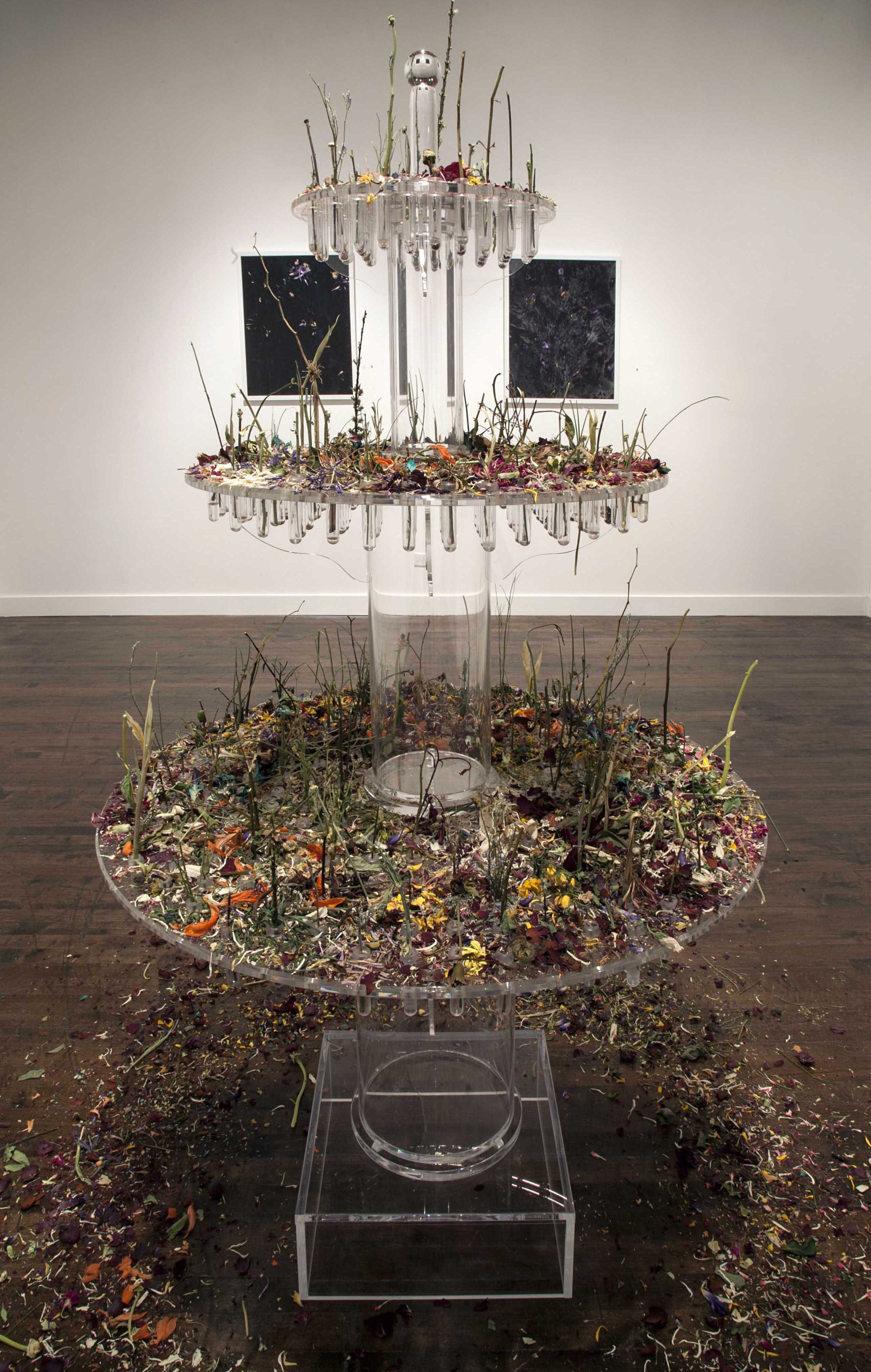
Potpourri “Baudelaire’s Fountain” (Day 51)
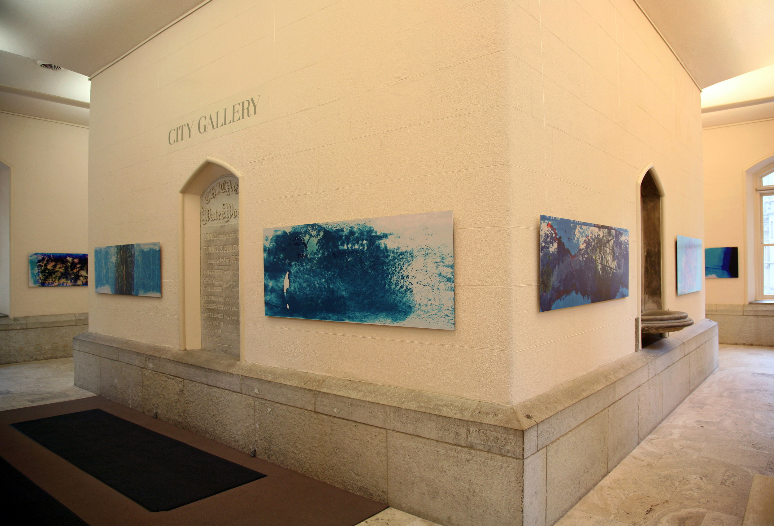
Exit Eden / City Gallery at The Historic Water Tower / Chicago, IL
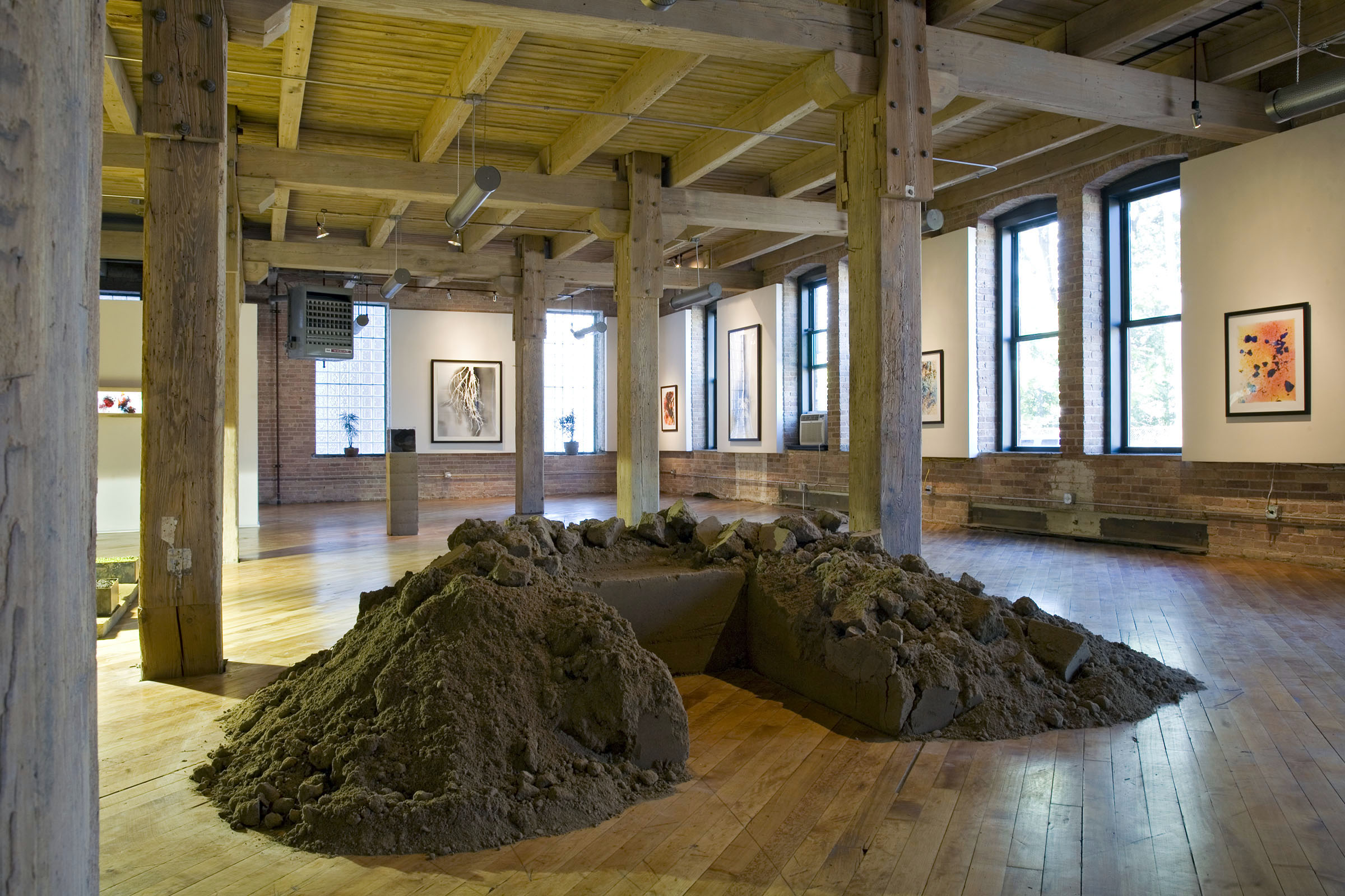
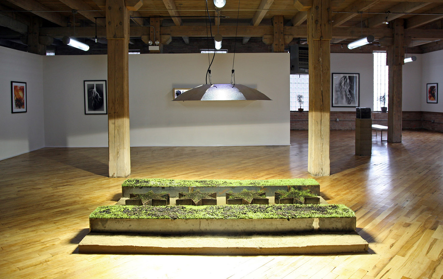
Field Work / Chicago Urban Art Society / Chicago, IL
Shikako Flag / Field Work
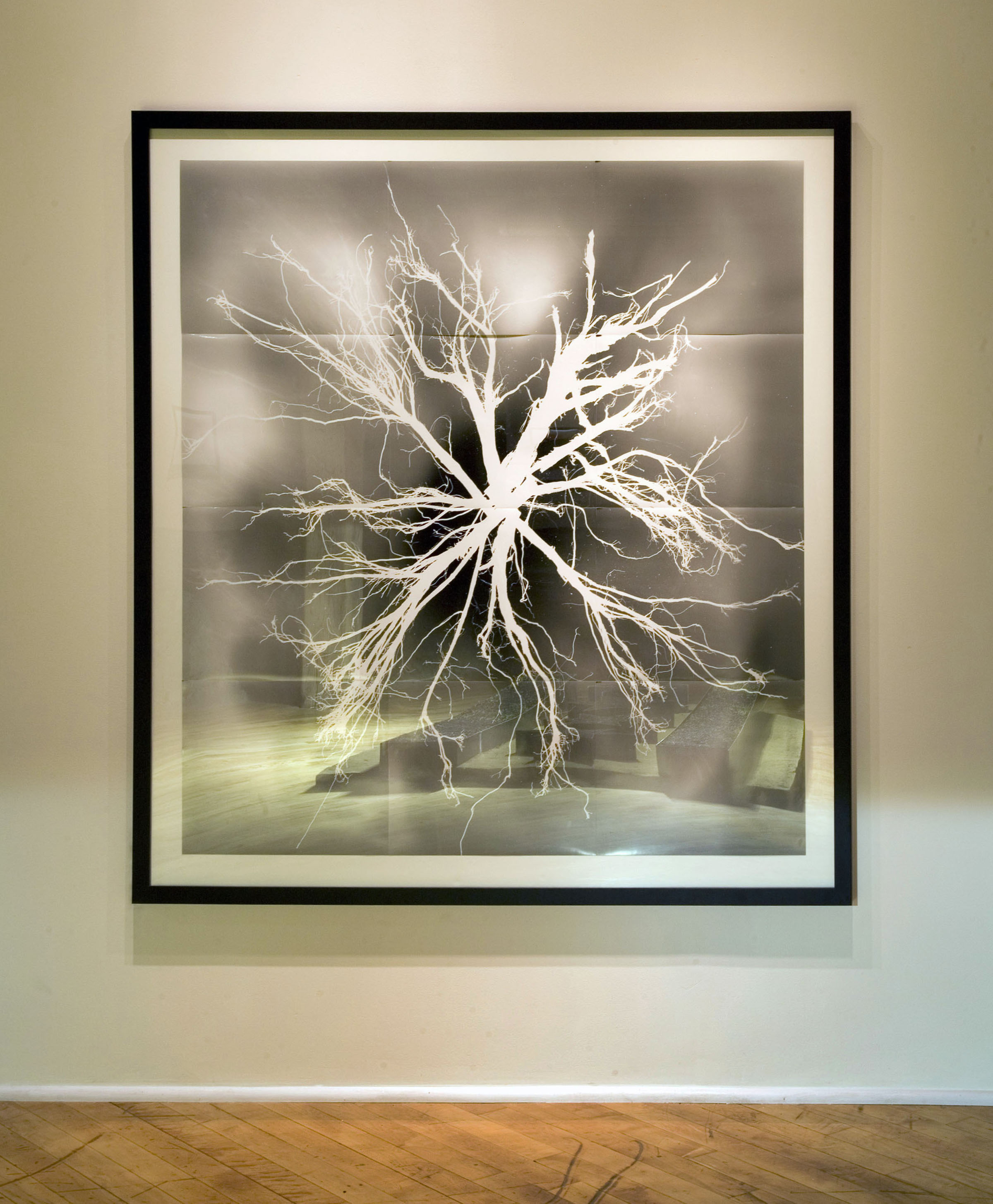
Root No. 2 / Field Work
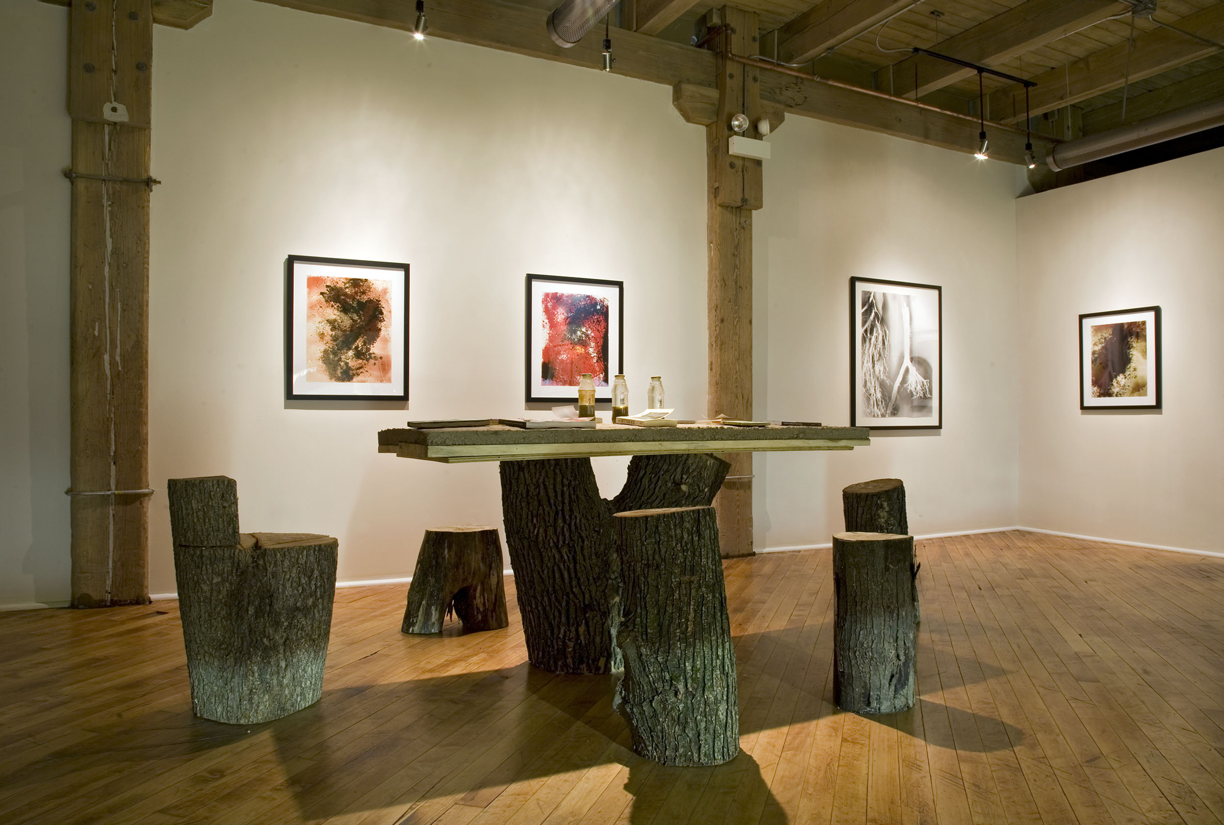
Study Table / Field Work
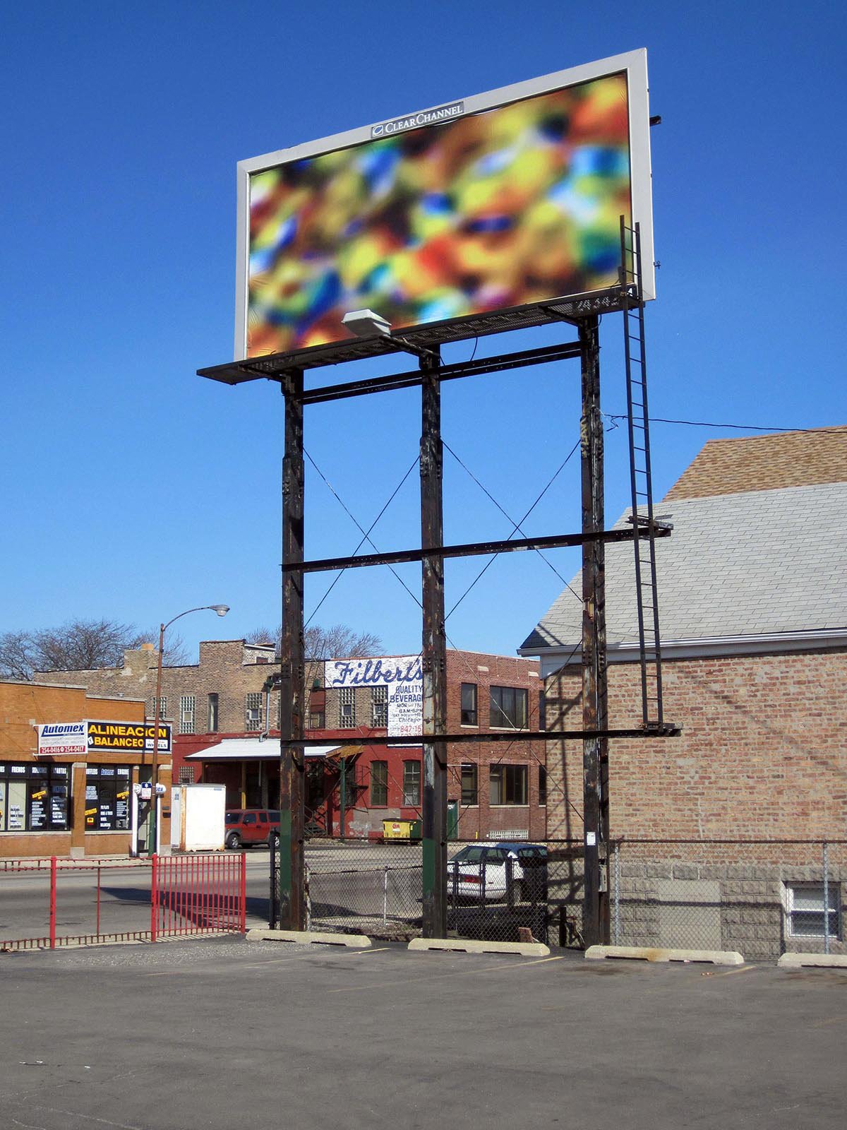
Three Billboards / 35th & Ashland / Chicago, IL
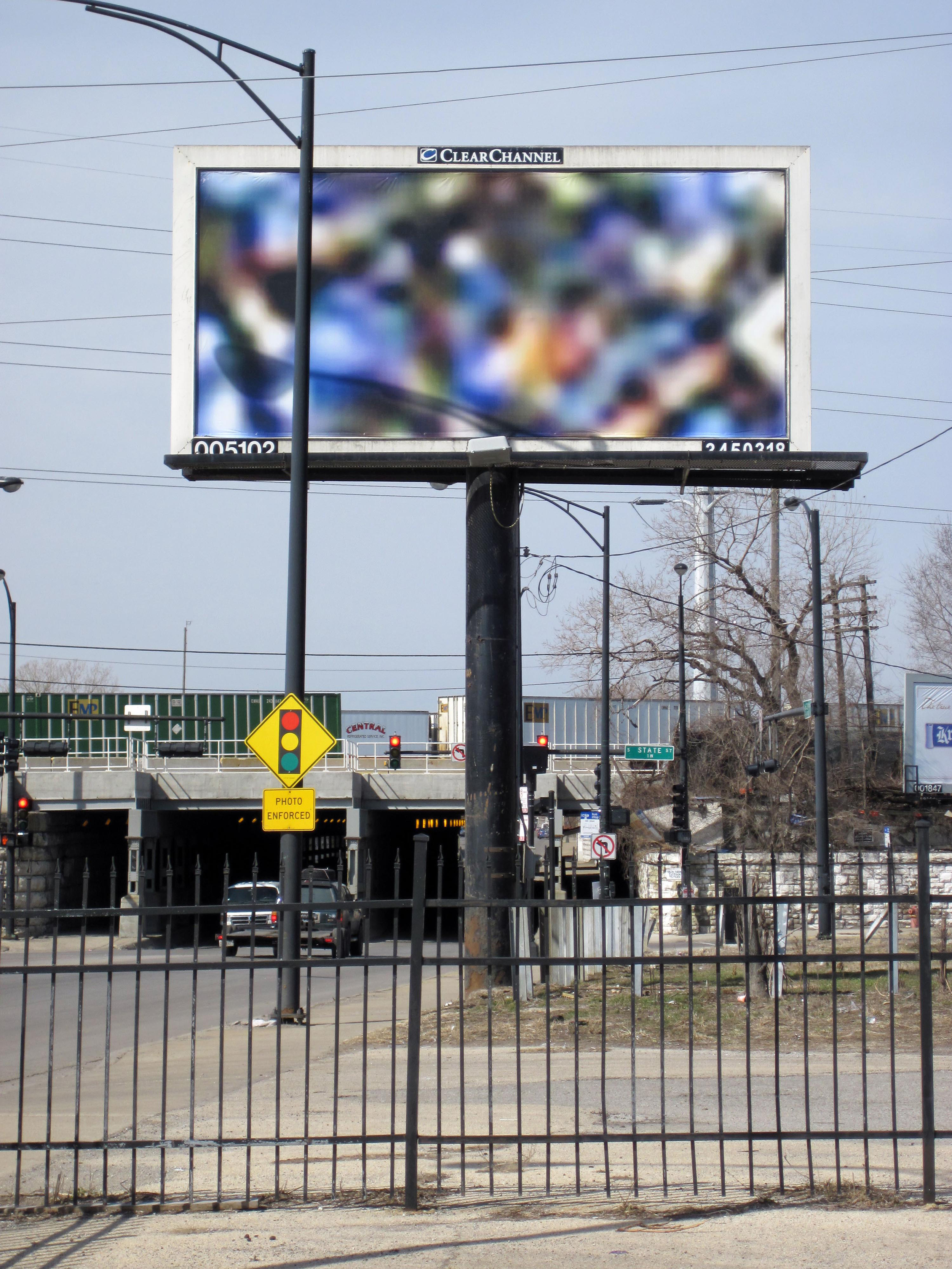
Three Billboards / 63rd & State St. / Chicago, IL
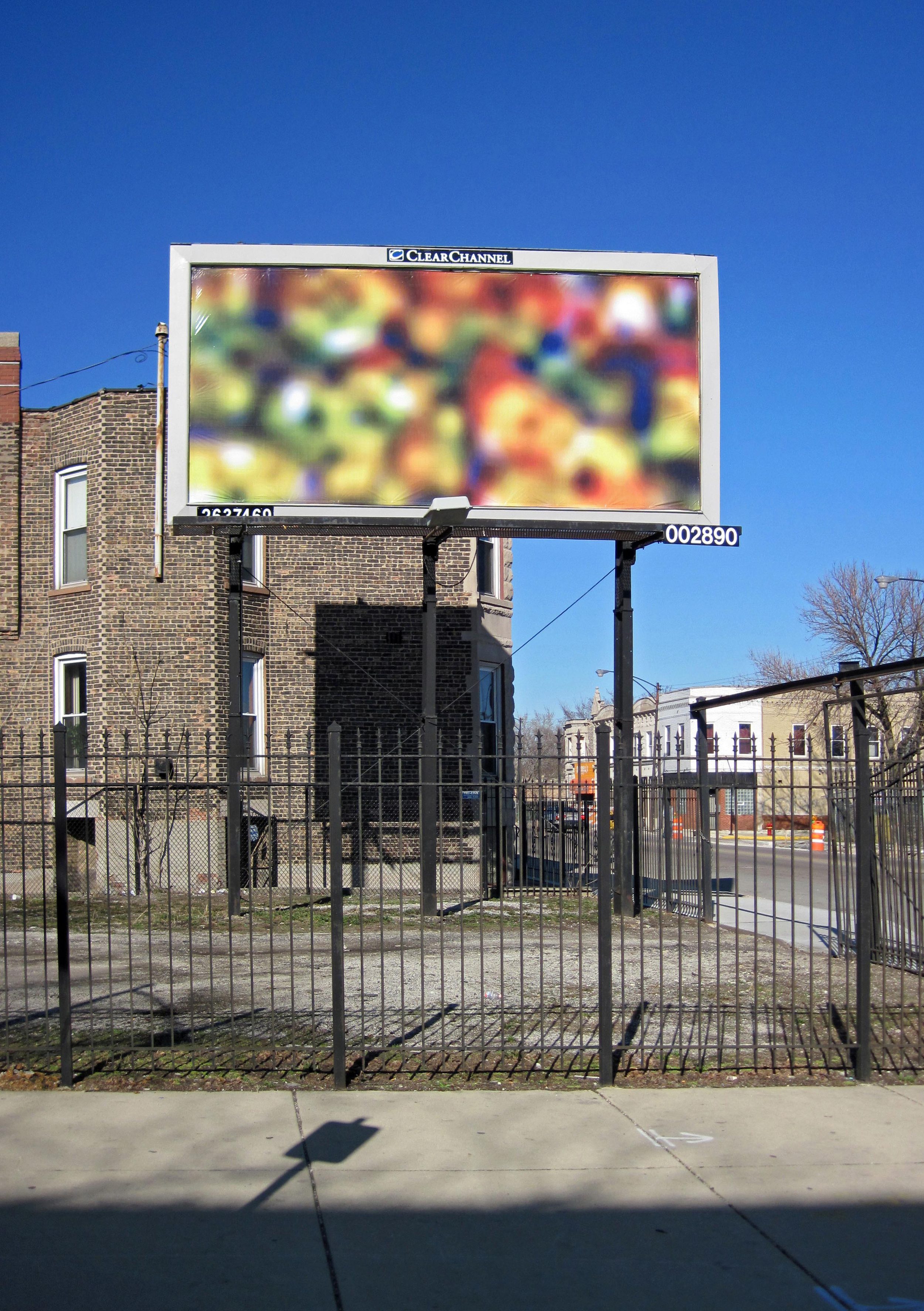
Three Billboards / Chicago Ave & Spaulding / Chicago, IL
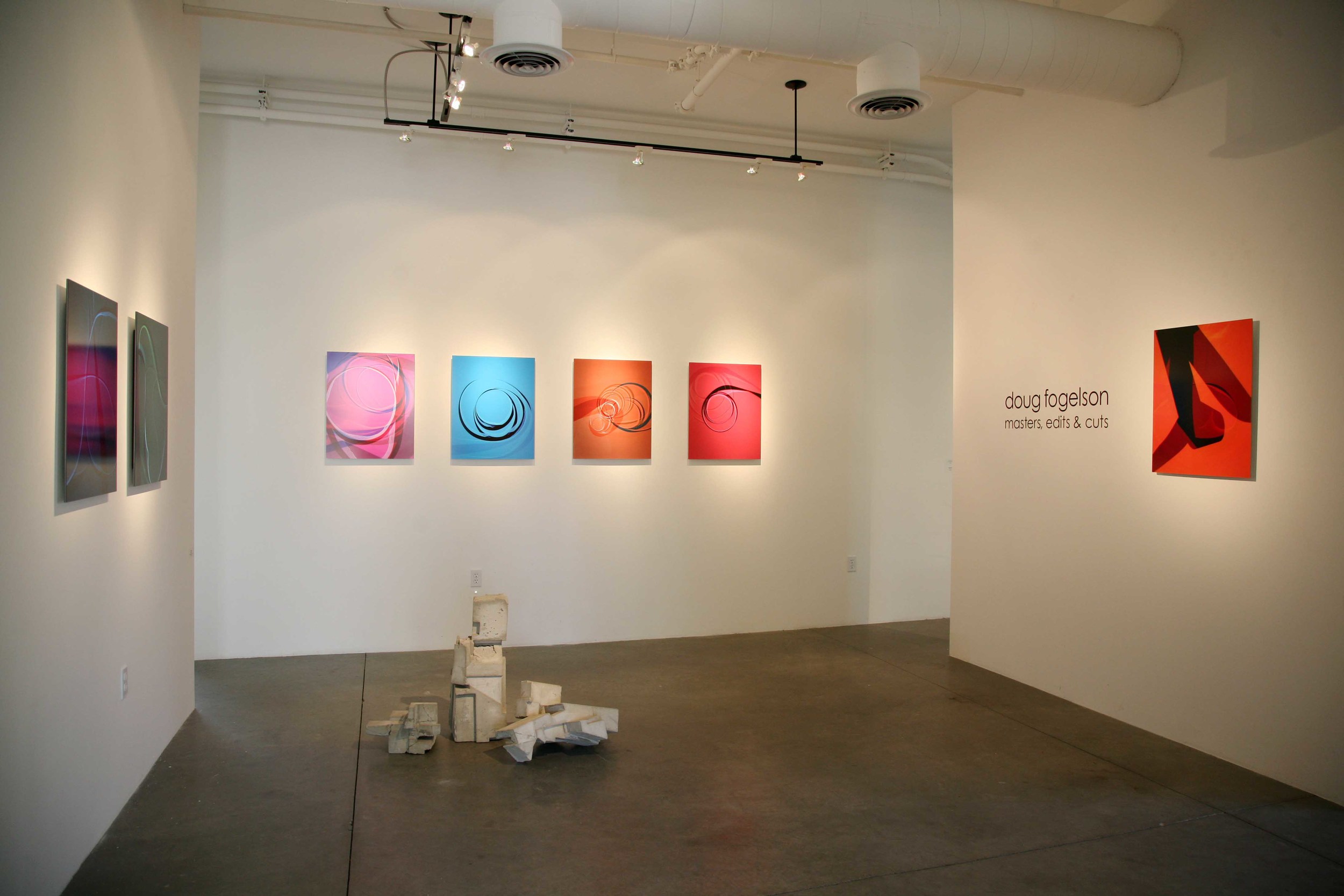
Masters, Edits, and Cuts / Royale Projects / Indian Wells, CA
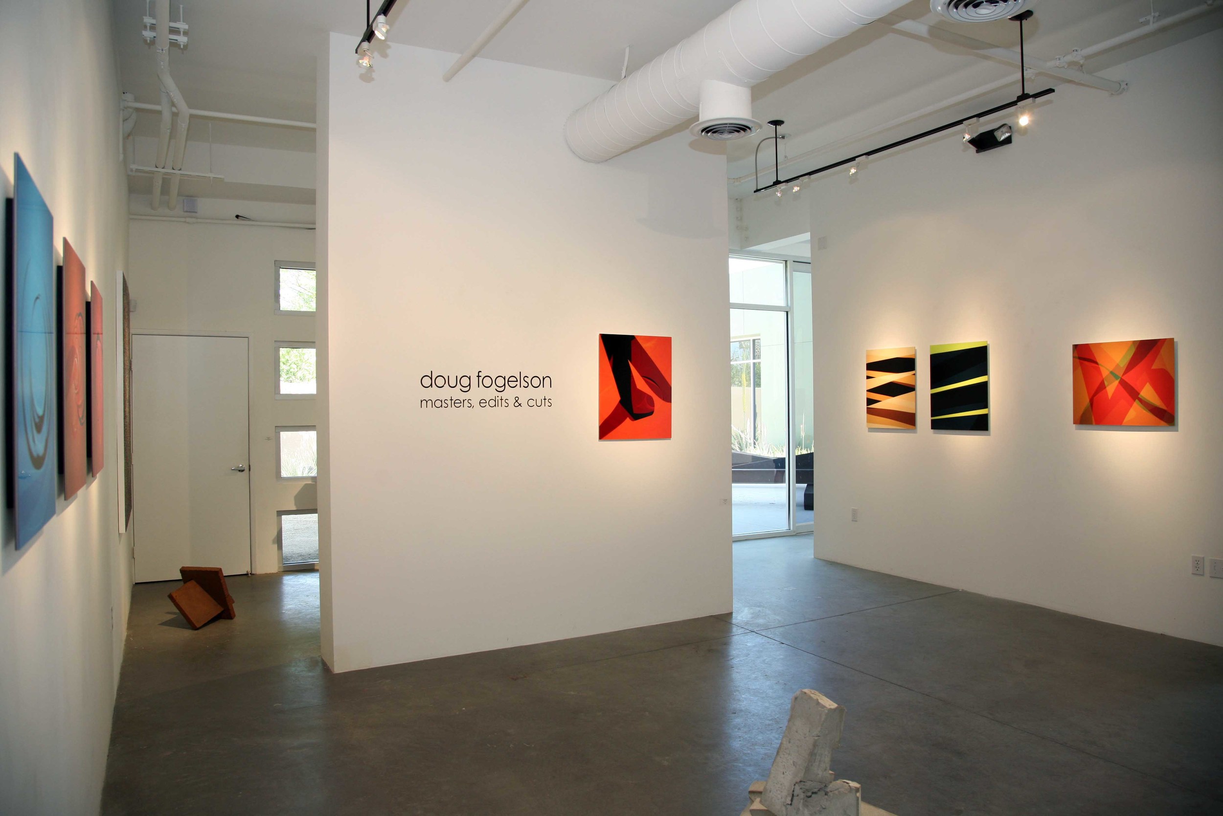
Masters, Edits, and Cuts (reverse view)
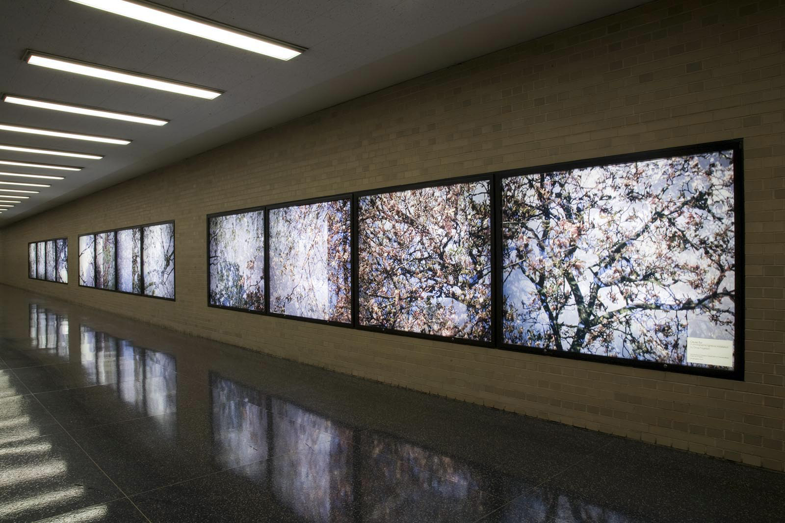
Causa Sui / Daley Plaza / Chicago, IL

Causa Sui / Daley Plaza (reverse view)
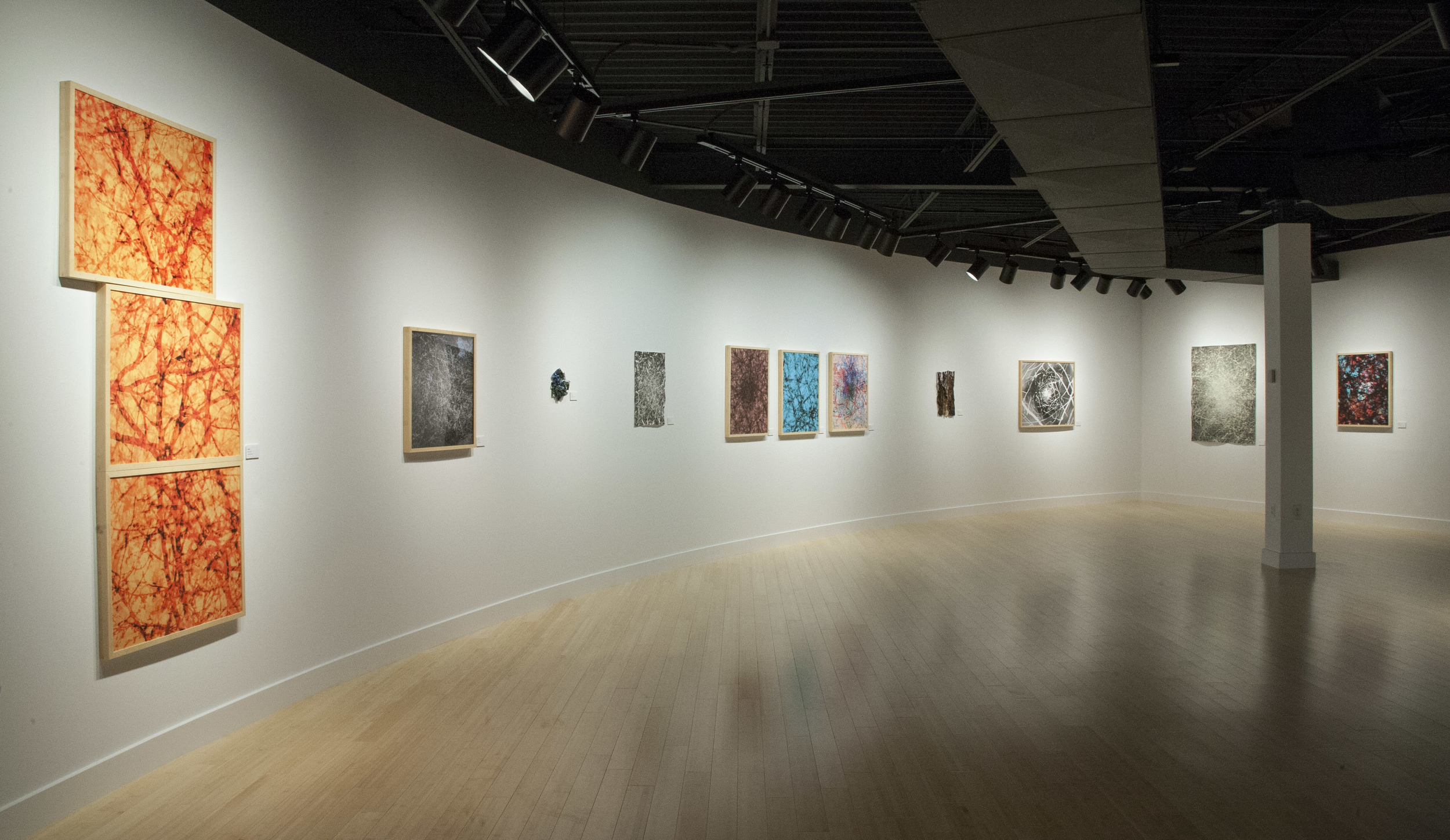
Woodland (What is Left Unspoken) / Lubeznik Center for the Arts / Michigan City, IN

Woodland (reverse view)
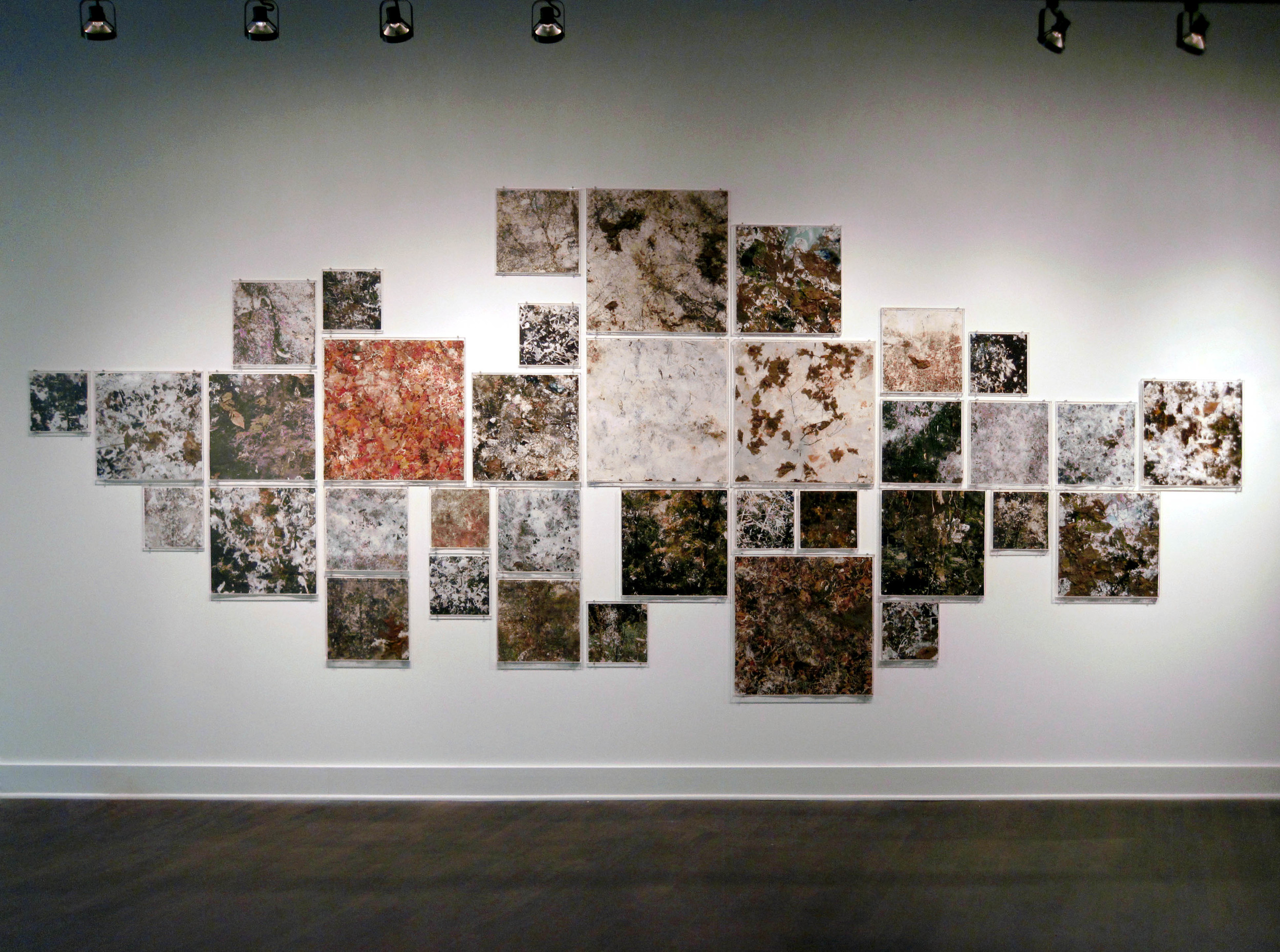
Castings / Walnut Ink Gallery / Michigan City, IN
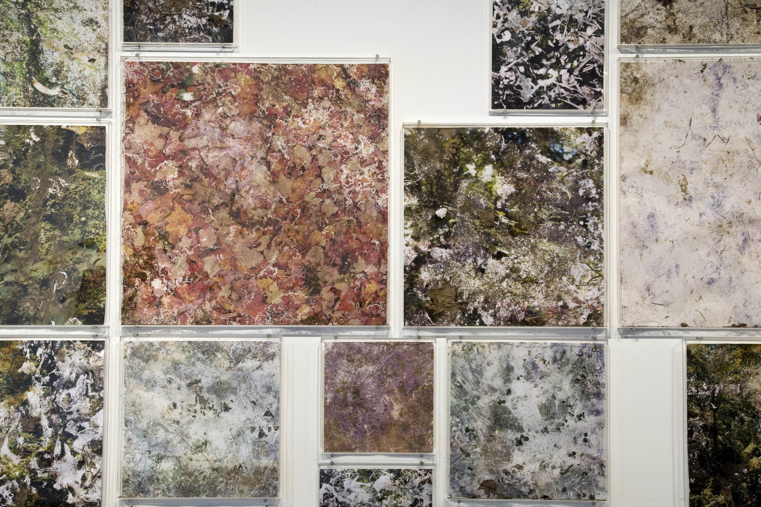
Castings (detail)
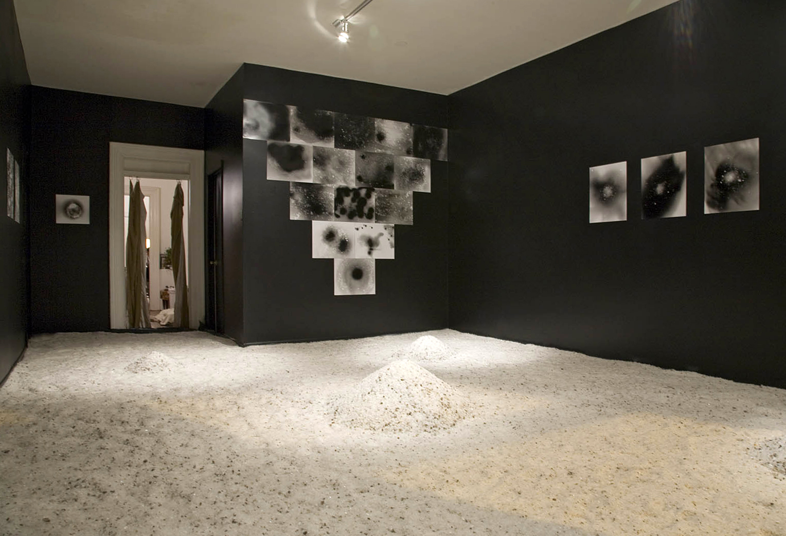
Salt Room (winter on the moon) / Studio 1020 / Chicago, IL
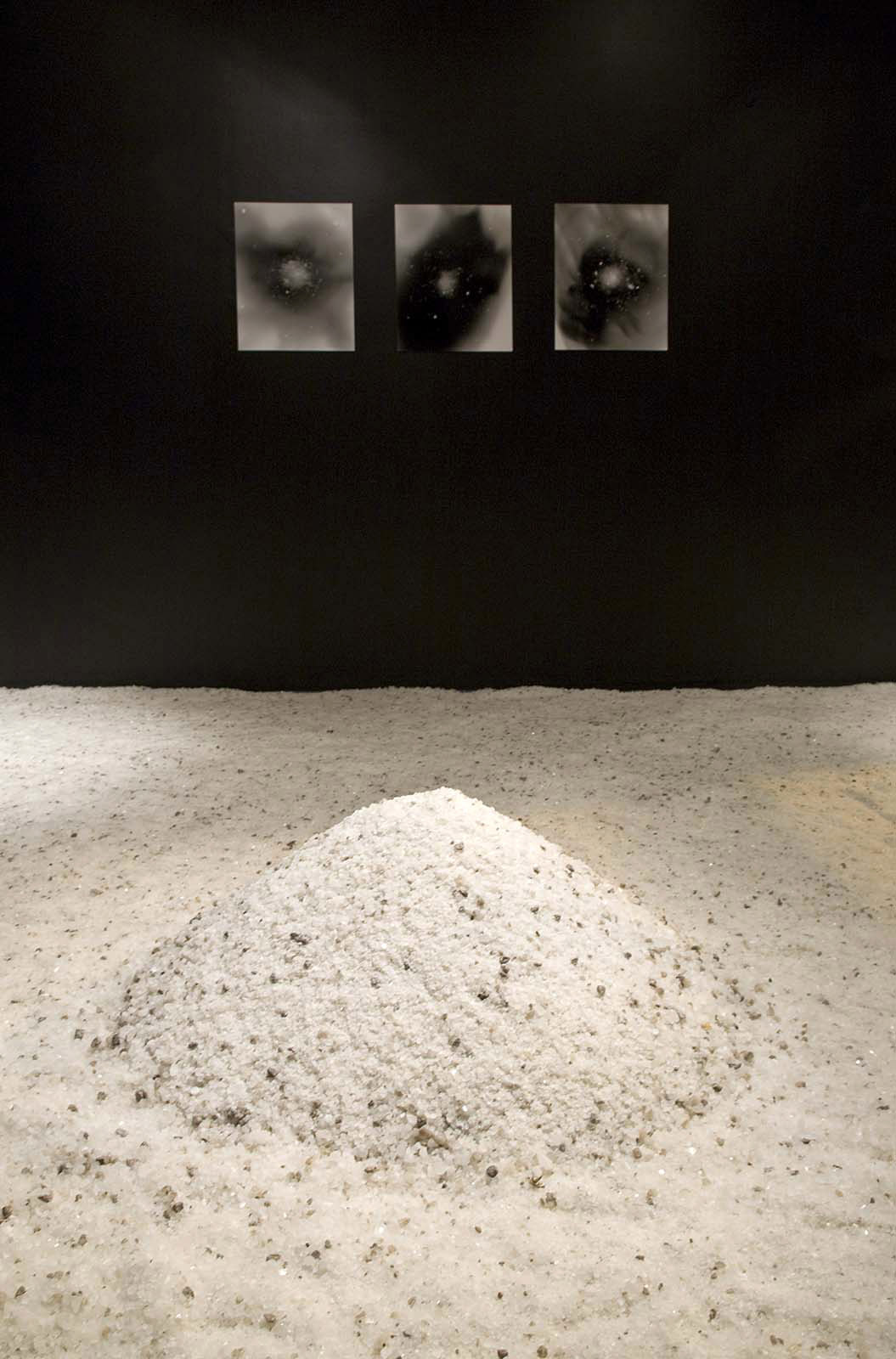
Salt Room (winter on the moon) (detail)

Salt Room (winter on the moon) (detail)

Etheria / Elmhurst Art Museum / Elmhurst, IL

Etheria (reverse view)
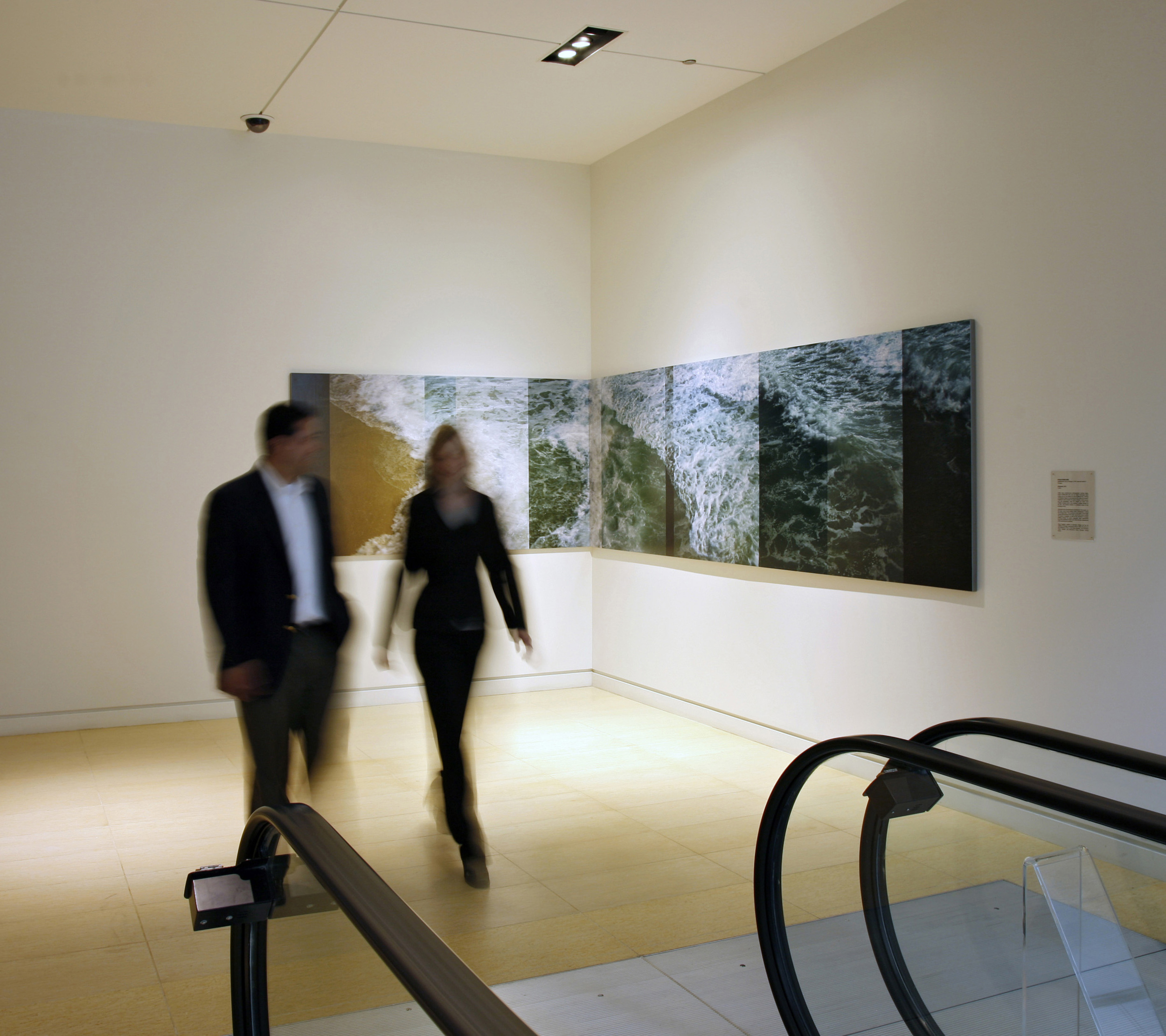
Backwash / 300 N. LaSalle / Chicago, IL
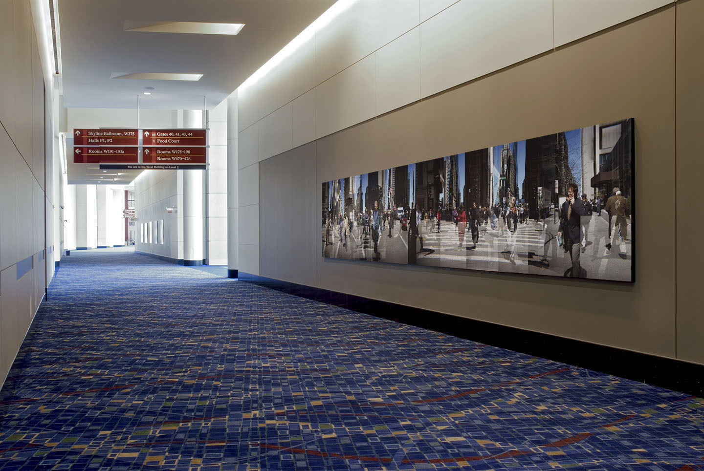
Chicago Loop / McCormick Place Convention Center West / Chicago, IL

Neon Wilderness (Redux) Room I / Heaven Gallery / Chicago, IL
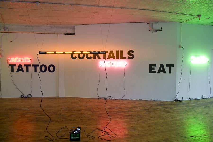
Neon Wilderness (Redux) (detail)

Neon Wilderness (Redux) Room II / Heaven Gallery / Chicago, IL
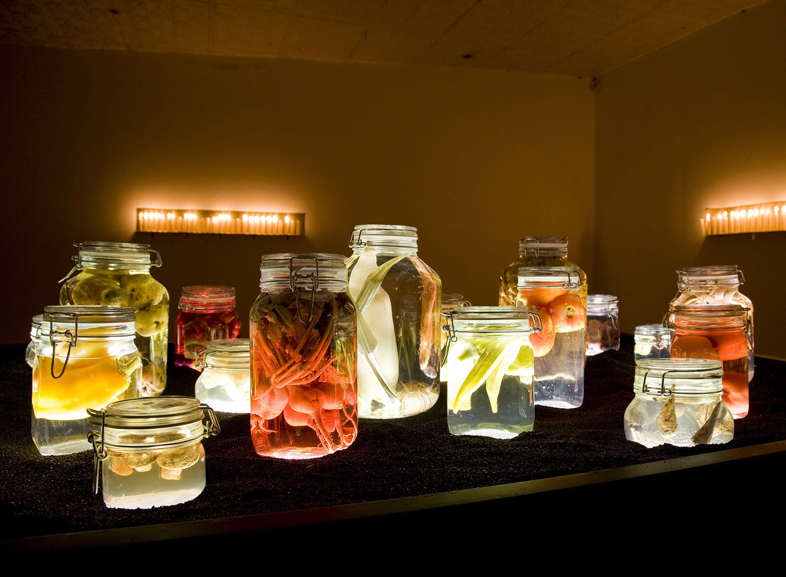
Neon Wilderness (Redux) (detail)
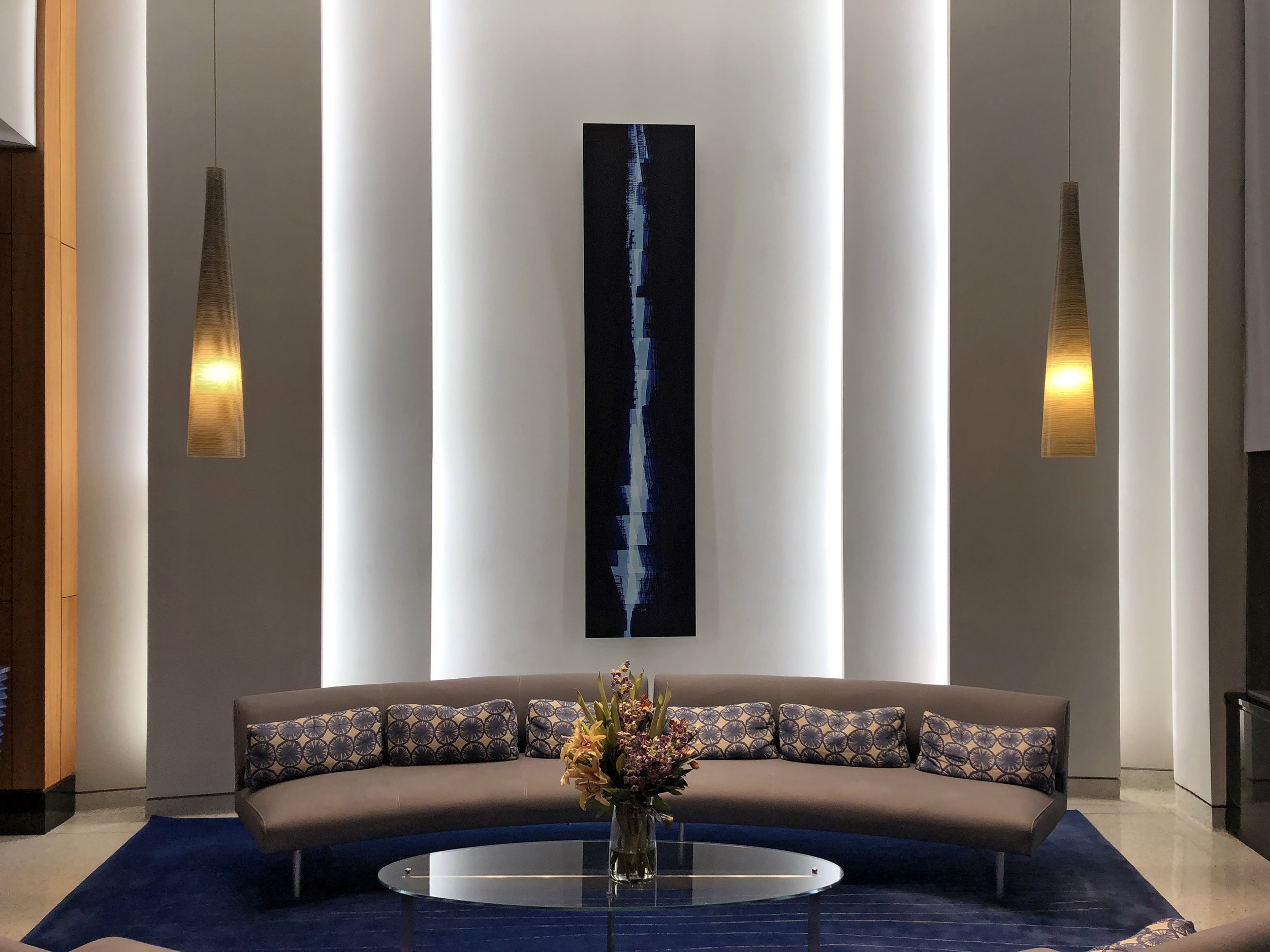
Installation / (Private)

"Neil's Branches" / Peter Cooper Village Stuyvesant Town, NYC

Camouflage and Biosemiotics / Hejfina / Chicago, IL

Camouflage and Biosemiotics / Hejfina / Chicago, IL

Stockweave / Skyway Billboard / Gary, IN

Stockweave (context)
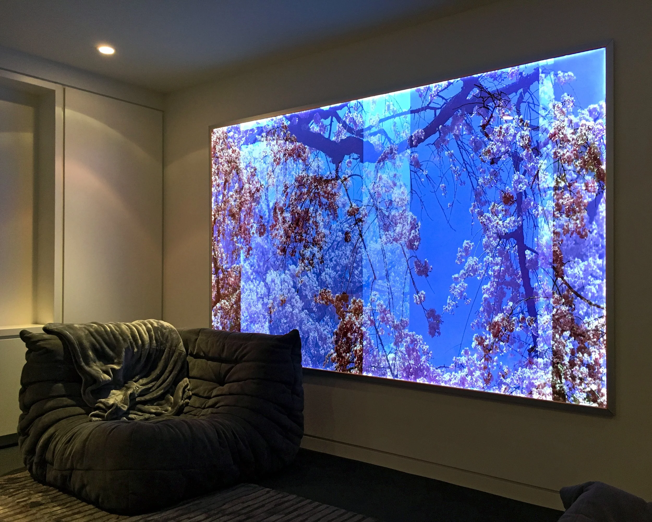
Sakura / Lightbox (private)

Sakura / Pagoda Red / Chicago, IL


Signal/Noise Video / Old Friends Gallery / Chicago, IL
Signal/Noise Video (detail)
Terroir / Land + Sky / Oxnard, CA
Terroir / Land + Sky / Oxnard, CA
Terroir (detail)
In The Groves / Land + Sky / Oxnard, CA
In The Groves / Land + Sky / Oxnard, CA
In The Groves / Land + Sky / Oxnard, CA
In The Groves (detail)
Intermezzo / Private Office / Washington D.C.
Intermezzo (reverse view)
Intermezzo (detail)
The Witness / Bert Green Fine Art / Chicago, IL
The Witness / Bert Green Fine Art / Chicago, IL
Watershed / University of Michigan Museum of Art / Ann Arbor, MI
Watershed / University of Michigan Museum of Art / Ann Arbor, MI
Beyond the Frame / Museum of Contemporary Photography / Chicago, IL
Beyond the Frame / Museum of Contemporary Photography / Chicago, IL
Dissolution / Bert Green Fine Art / Chicago, IL
Dissolution / Bert Green Fine Art / Chicago, IL
Sanctuary / 69th Street Red Line Station / Chicago Transit Authority
Sanctuary / 69th Street Red Line Station / Chicago Transit Authority
Sanctuary / 69th Street Red Line Station / Chicago Transit Authority
Anthem / Klompching Gallery / Brooklyn, NY
Anthem / Klompching Gallery / Brooklyn, NY
Reverb / Indiana University Northwest School of the Arts / Gary, IN
Reverb / Indiana University Northwest School of the Arts / Gary, IN
Reverb / Indiana University Northwest School of the Arts / Gary, IN
Nature Now / Lubeznik Center for the Arts / Michigan City, IN
On Plane View / Klompching Gallery / Dumbo, Brooklyn
On Plane View / Klompching Gallery / Dumbo, Brooklyn
Bauhaus und die Fotografie / NRW Forum / Düsseldorf, Germany
Bauhaus und die Fotografie (detail)
Metric 1:50 “Touchstones” / Para Foundation / Berlin
Metric 1:50 Touchstones (detail)
Physis / Brushwood Center at Ryerson Woods / Riverwoods, IL
Physis (detail)
Nature Is Dirty / Alpineum Produzentengalerie / Lucerne, CH
Nature Is Dirty (detail)
A Future for Birds and Fish / Alpineum Produzentengalerie / Lucerne, CH
A Future for Birds and Fish (detail)
New Bauhaus Chicago: Experiment Photography and Film / Bauhaus Archiv Museum / Berlin
New Bauhaus Chicago: Experiment Photography and Film (detail)
New Bauhaus Chicago: Experiment Photography and Film (detail)
Open Land Art & Fact Team (O.L.A.F.T.) / Hyde Park Art Center / Chicago, IL
Open Land Art & Fact Team (O.L.A.F.T.) / Hyde Park Art Center / Chicago, IL
Study Desk / Open Land Art & Fact Team (detail)
Color Photogram (private residence)
Creative Destruction / Sasha Wolf Gallery / NYC
Creative Destruction / Sasha Wolf Gallery / NYC
Creative Destruction / (reverse view)
Broken Cabinet / Linda Warren Projects / Chicago, IL
Broken Cabinet (detail)
Broken Cabinet (reverse view)
Broken Cabinet (detail)
Broken Cabinet / Elmhurst Art Museum / Illinois
Broken Cabinet / Elmhurst Art Museum (reverse view)
Broken Cabinet / Brushwood Center / Riverwoods, IL
Period (of time) / Wicker Park/Bucktown Public Library / Chicago, IL
Period (of time) / Commission (detail)
Ventura / The Latin School of Chicago (Photographic Wallpaper)
Involution (Adventures in an Ultimate Commonality) / The Latin School of Chicago
Involution (Adventures in an Ultimate Commonality) (detail)
Thriftscape / Chicago, IL
Thriftscape / Chicago, IL / 20 months after install (Sept. '13 - June '15)
Flower Tower / Comfort Station Gallery / Chicago
Flower Tower (detail, six months later)
Terra Cognita / Museum Belvedere / Heerenveen, Netherlands
Exit Eden / Quintenz & Co Gallery / Aspen, CO
Chemical Alterations / SFO Museum / San Francisco
Violet Hour Mural / Chicago, IL
Violet Hour Mural (detail)
Potpourri / Linda Warren Projects / Chicago, IL
Potpourri “Baudelaire’s Fountain” (Day 1)
Potpourri “Baudelaire’s Fountain” (Day 51)
Exit Eden / City Gallery at The Historic Water Tower / Chicago, IL
Field Work / Chicago Urban Art Society / Chicago, IL
Shikako Flag / Field Work
Root No. 2 / Field Work
Study Table / Field Work
Three Billboards / 35th & Ashland / Chicago, IL
Three Billboards / 63rd & State St. / Chicago, IL
Three Billboards / Chicago Ave & Spaulding / Chicago, IL
Masters, Edits, and Cuts / Royale Projects / Indian Wells, CA
Masters, Edits, and Cuts (reverse view)
Causa Sui / Daley Plaza / Chicago, IL
Causa Sui / Daley Plaza (reverse view)
Woodland (What is Left Unspoken) / Lubeznik Center for the Arts / Michigan City, IN
Woodland (reverse view)
Castings / Walnut Ink Gallery / Michigan City, IN
Castings (detail)
Salt Room (winter on the moon) / Studio 1020 / Chicago, IL
Salt Room (winter on the moon) (detail)
Salt Room (winter on the moon) (detail)
Etheria / Elmhurst Art Museum / Elmhurst, IL
Etheria (reverse view)
Backwash / 300 N. LaSalle / Chicago, IL
Chicago Loop / McCormick Place Convention Center West / Chicago, IL
Neon Wilderness (Redux) Room I / Heaven Gallery / Chicago, IL
Neon Wilderness (Redux) (detail)
Neon Wilderness (Redux) Room II / Heaven Gallery / Chicago, IL
Neon Wilderness (Redux) (detail)
Installation / (Private)
"Neil's Branches" / Peter Cooper Village Stuyvesant Town, NYC
Camouflage and Biosemiotics / Hejfina / Chicago, IL
Camouflage and Biosemiotics / Hejfina / Chicago, IL
Stockweave / Skyway Billboard / Gary, IN
Stockweave (context)
Sakura / Lightbox (private)
Sakura / Pagoda Red / Chicago, IL